
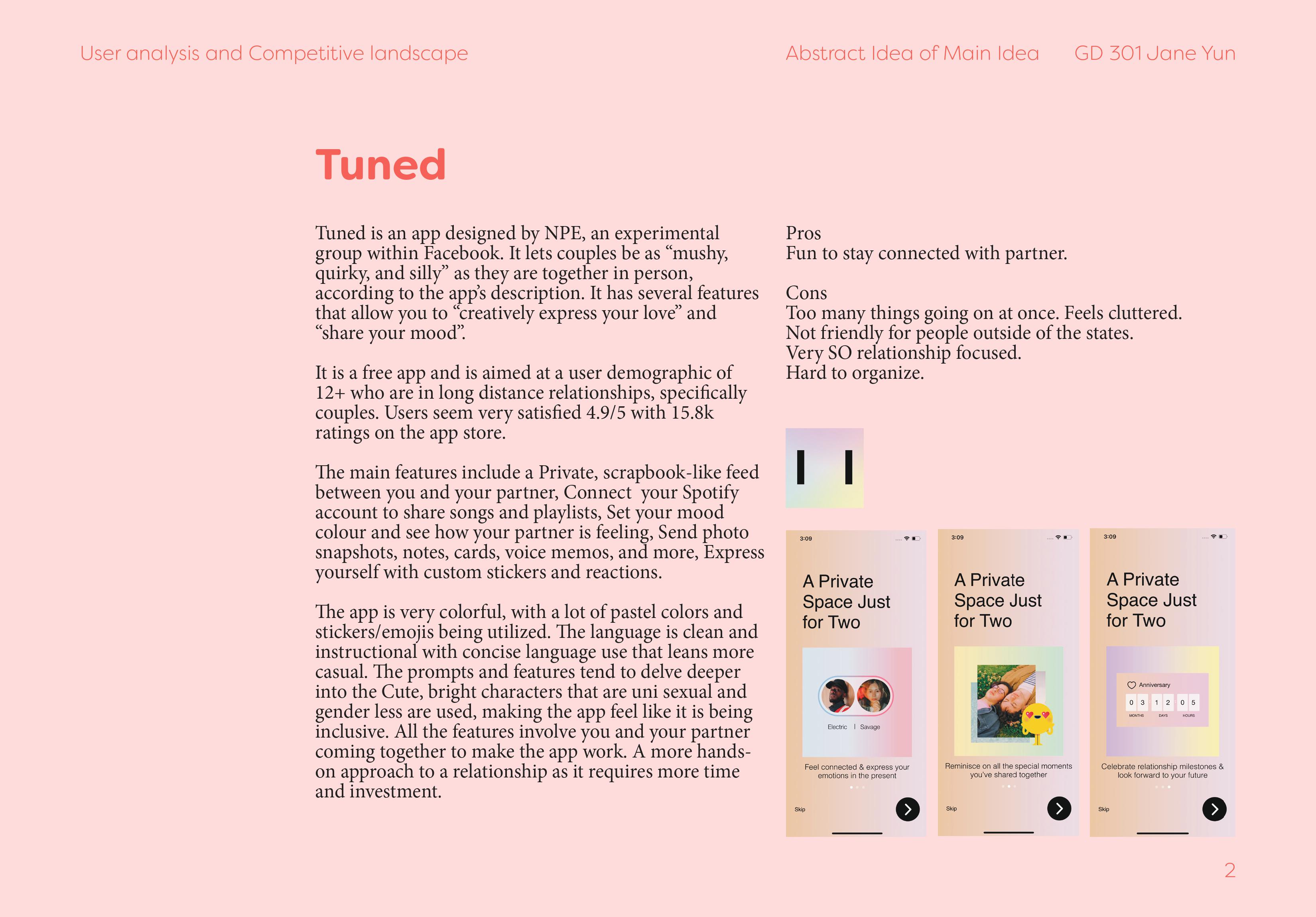
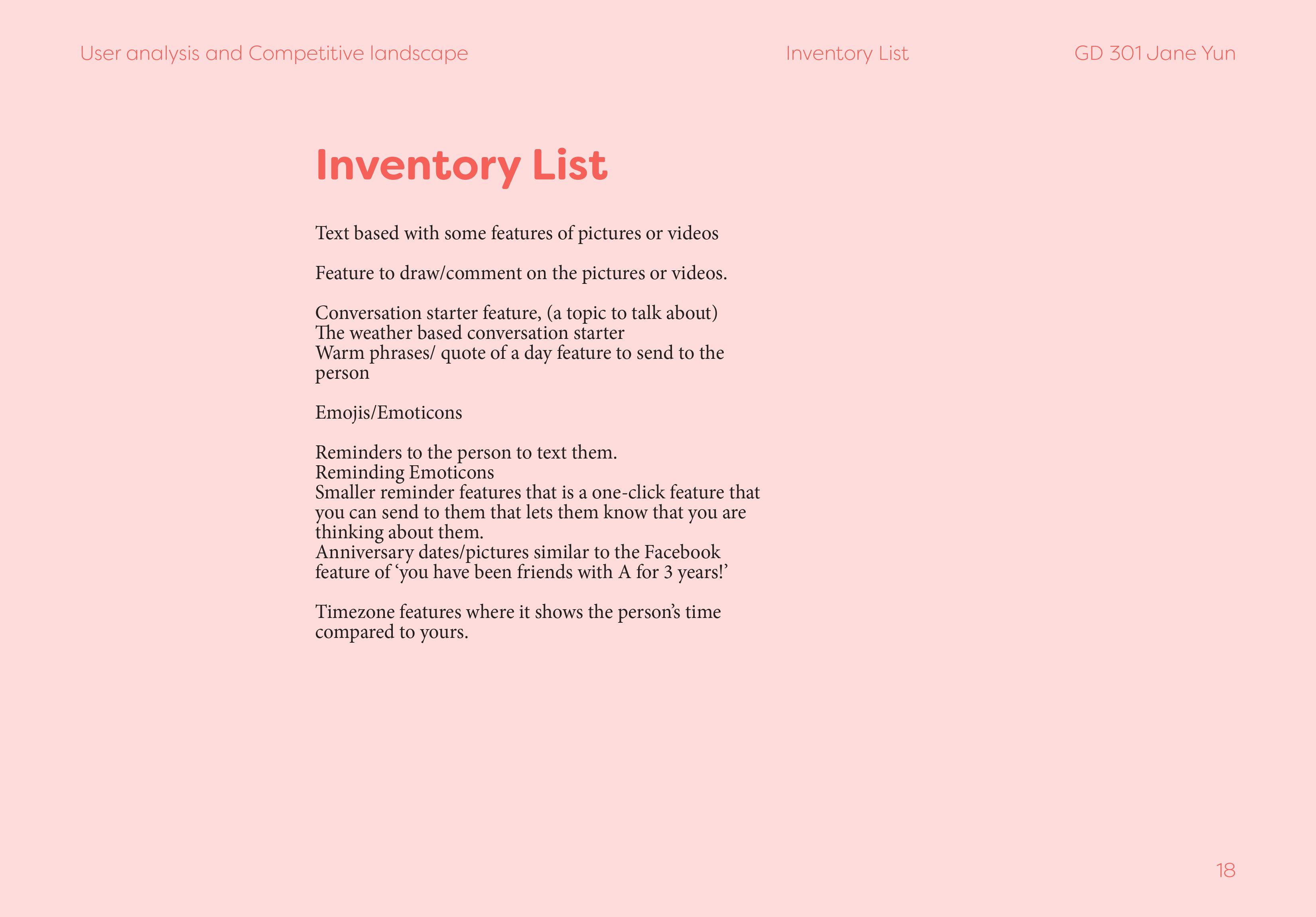
LIFEWTR
한국어LIFEWTR Campaign Design
15 week project
15 week project
Challenge
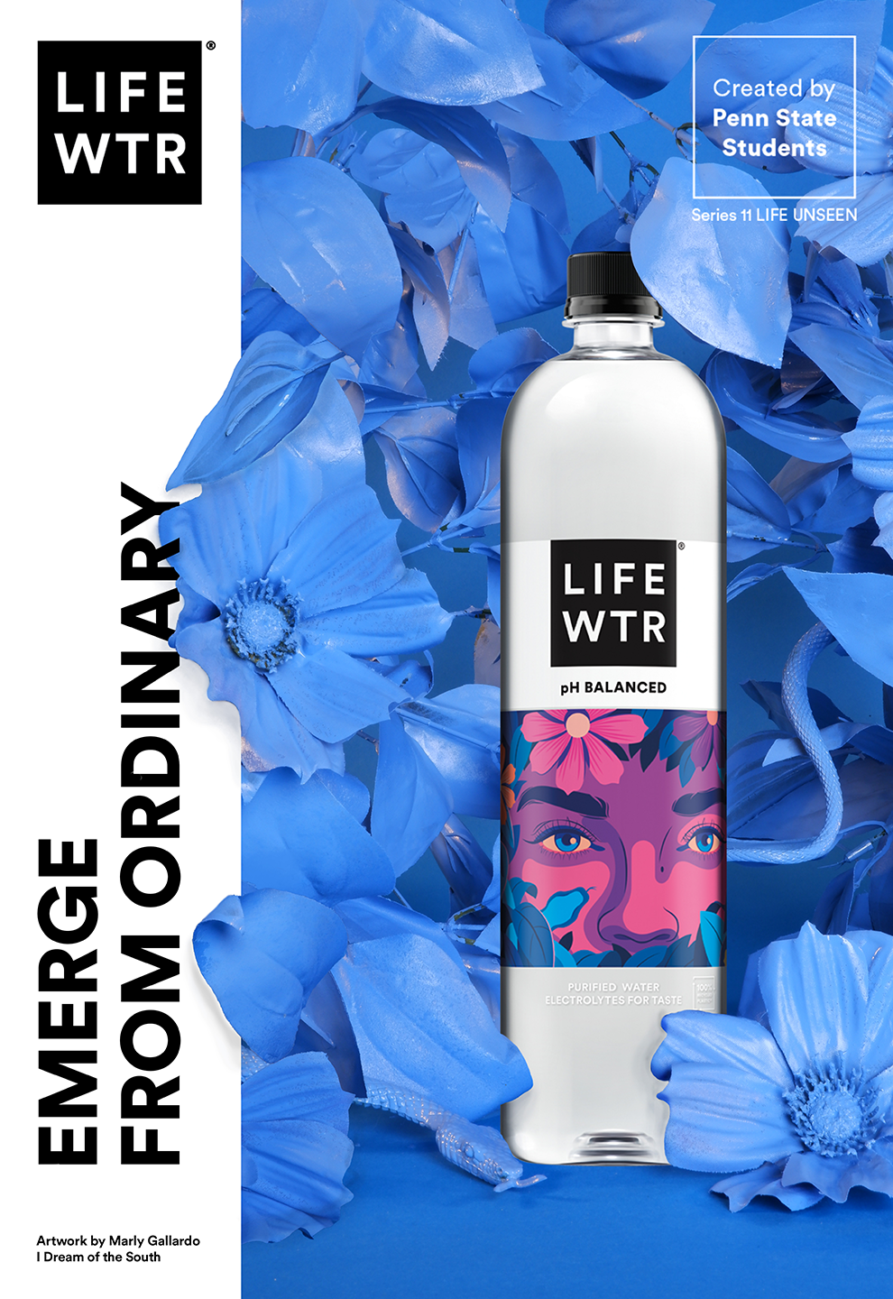
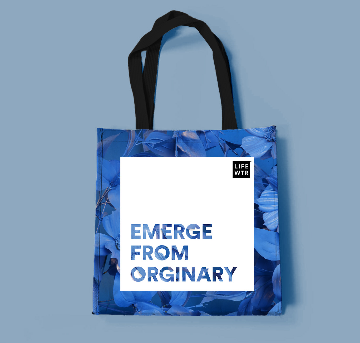
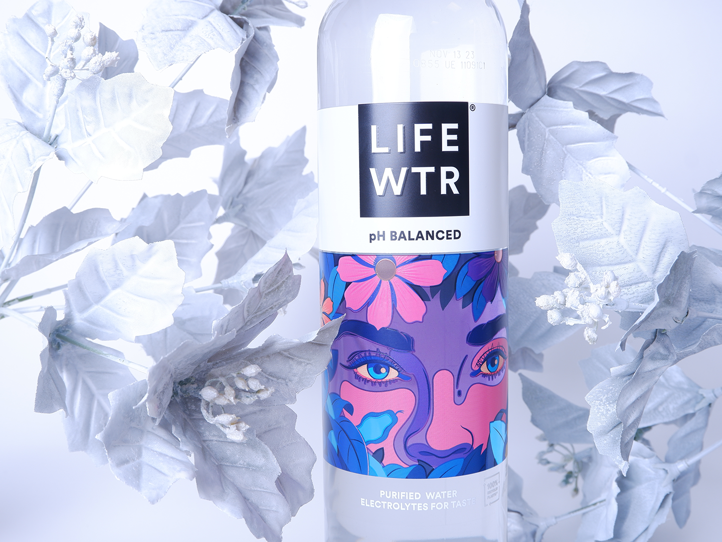
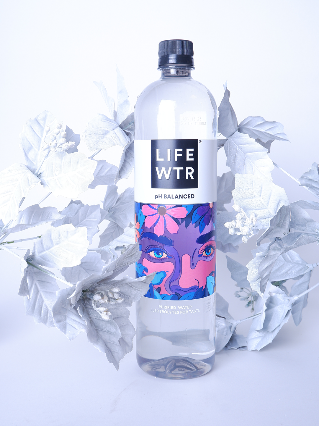
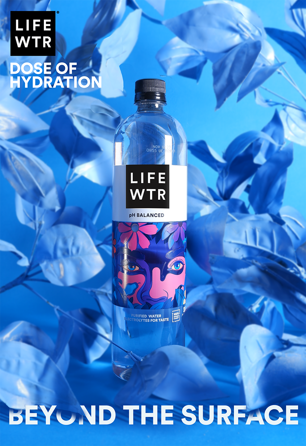
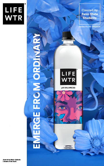
©2022 LIFEWTR and the LIFEWTR Logo are registered trademarks.Students from Penn State Graphic Design GD304: Practical Communications, in collaboration with PepsiCo Design and Innovation, LIFEWTR Brand and Design team and North Division Marketing, EMERGE FROM ORDINARY created a series of key visuals to accompany a brand campaign promoting a selected series 11 bottle made specifically for the Penn State University Park campus.
Taking place over a 15-week semester, this student project allowed our group to expand upon our experience as Graphic Design students and create a hyper localized campaign for the Penn State University Park Campus.
Branding, UX, UI
Photoshop, Lightroom, After Effects, XD
Photoshop, Lightroom, After Effects, XD
Solution
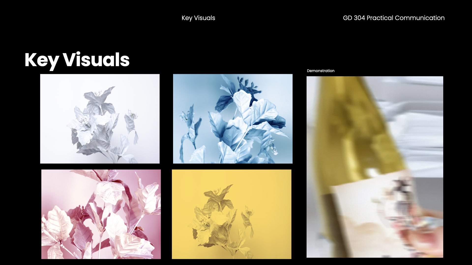
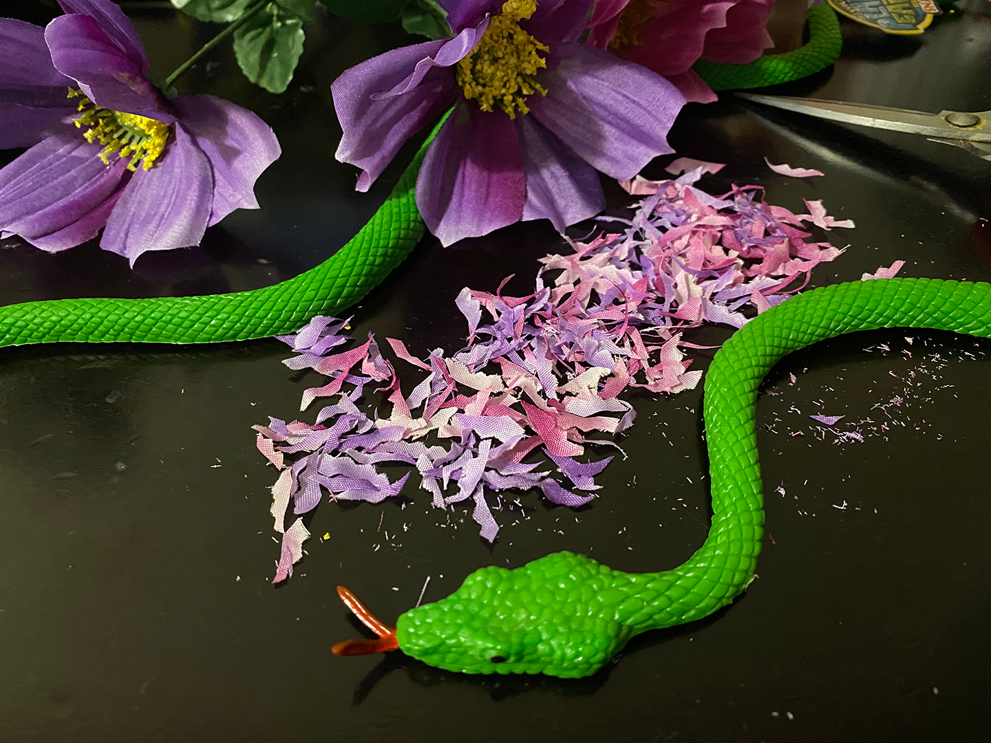
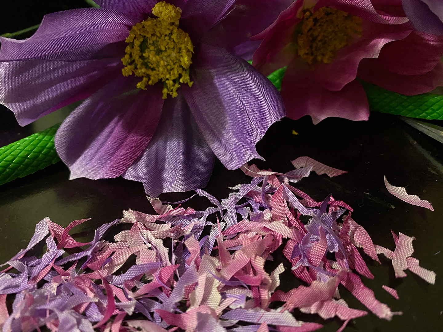
EMERGE FROM ORDINARY is a campaign for the bottle of “I DREAM OF SOUTH” by Marly Gallardo, LIFEWTR brand series 11 bottle.We utilized a monochromatic scene with the elements of the artwork on the bottle such as flowers, snakes, leaves to bring the bottle forward and emphasize our message of emerging from the mundane.
In collaboration with PepsiCo Design and Innovation, LIFEWTR Brand and Design team and North Division Marketing & Kimi Mate
Design responsiblites included Key visuals, Menuboard sizzle reel, Immersive experience, Presentation, Statement of work
Design responsiblites included Key visuals, Menuboard sizzle reel, Immersive experience, Presentation, Statement of work
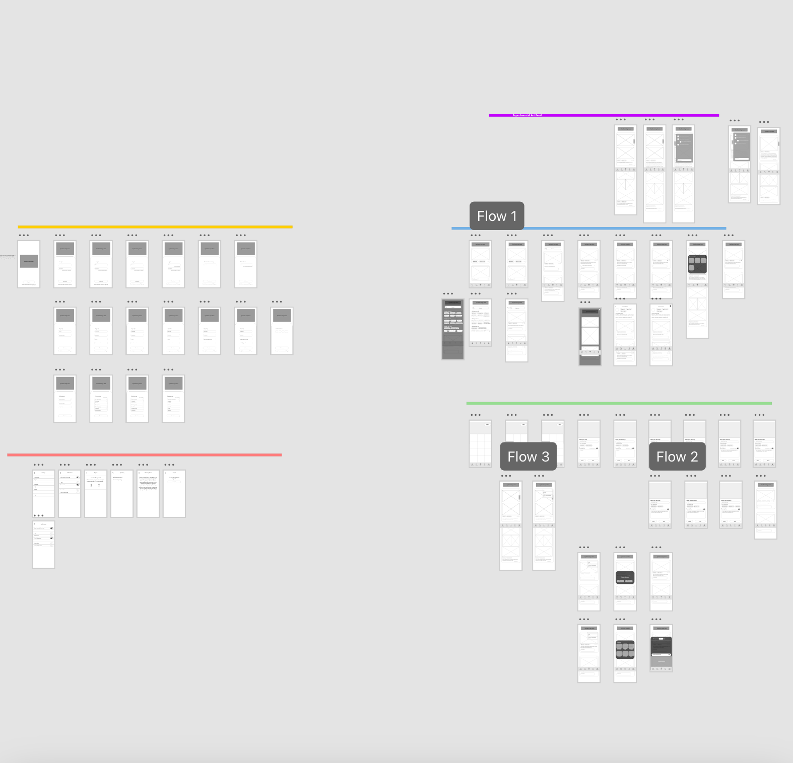
Project Components
This was a multi faceted project with multiple deliverables.Key Visuals (Horizontal, Vertical)
Social Media posts (Instagram posts, Instagram Stories, Instagram Ad, Facebook Ad, TikTok Post)
Menu Board Sizzle Reel
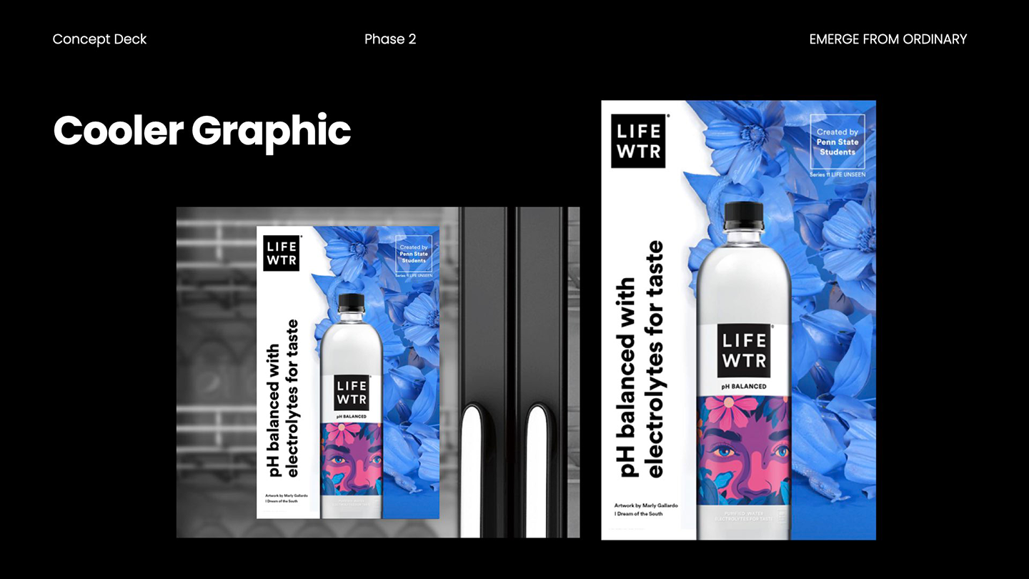
Point of Sale (Cooler Graphic & Table Tent)
Out Of Home (Billboard)
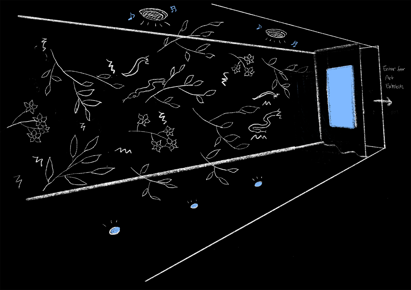
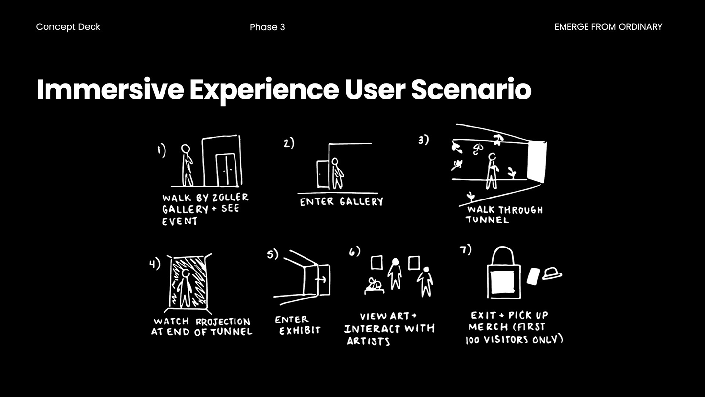
Immersive Experience
Merchandise
Presentation
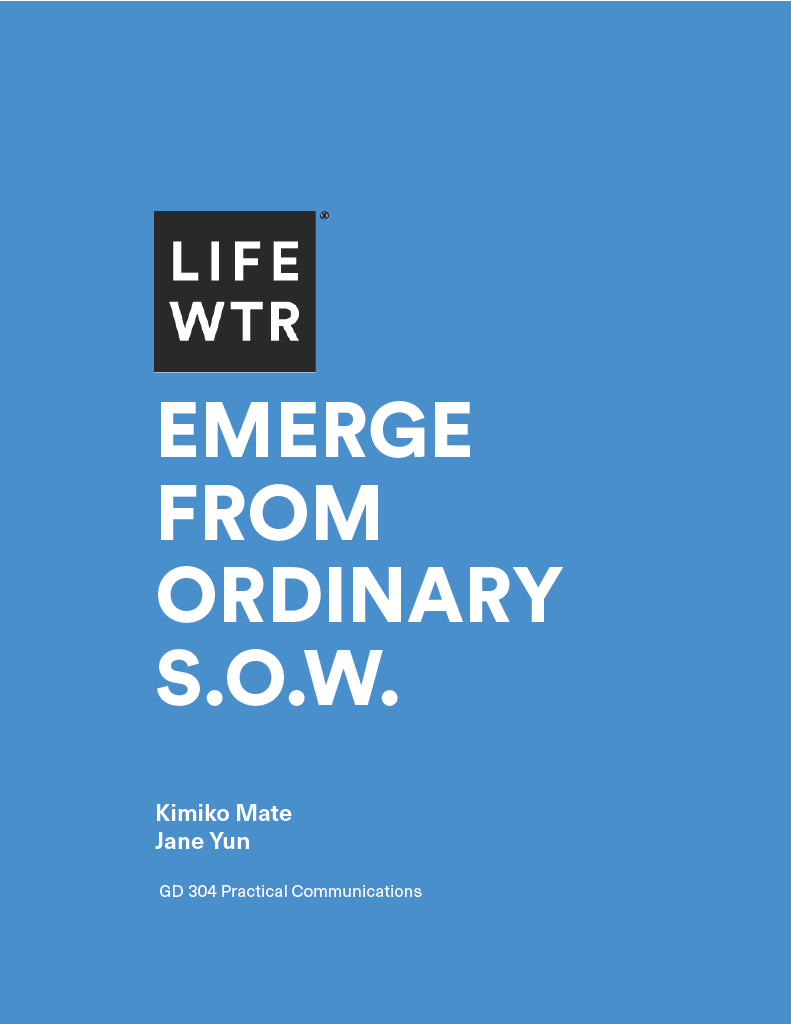
Statement of Work
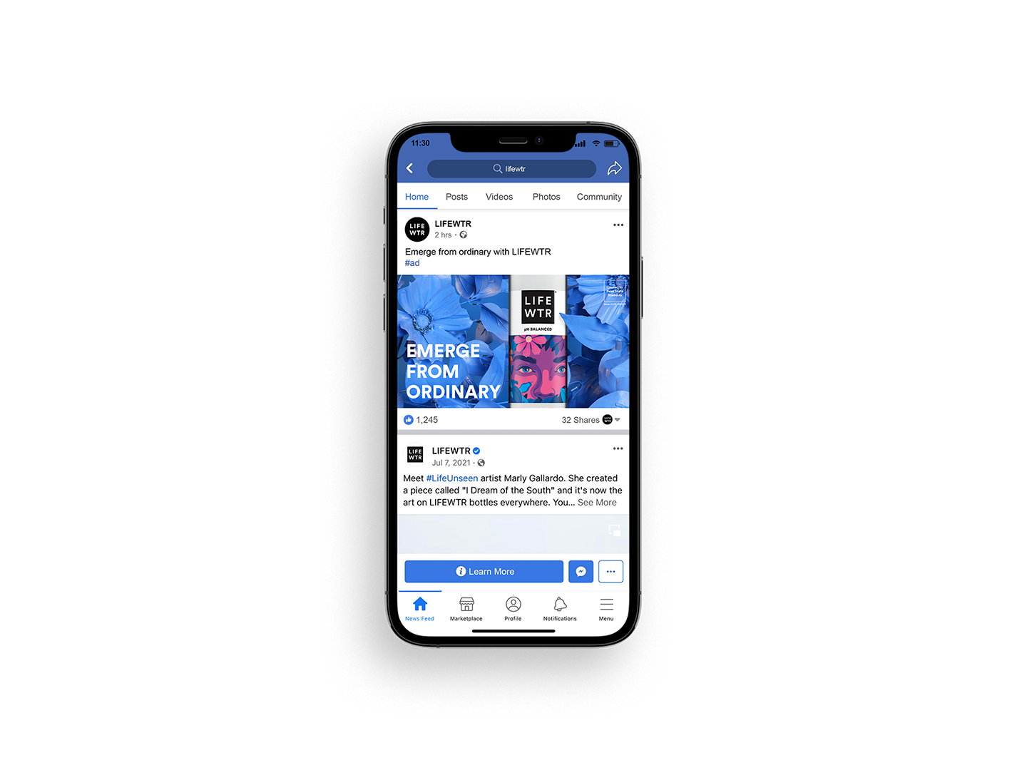

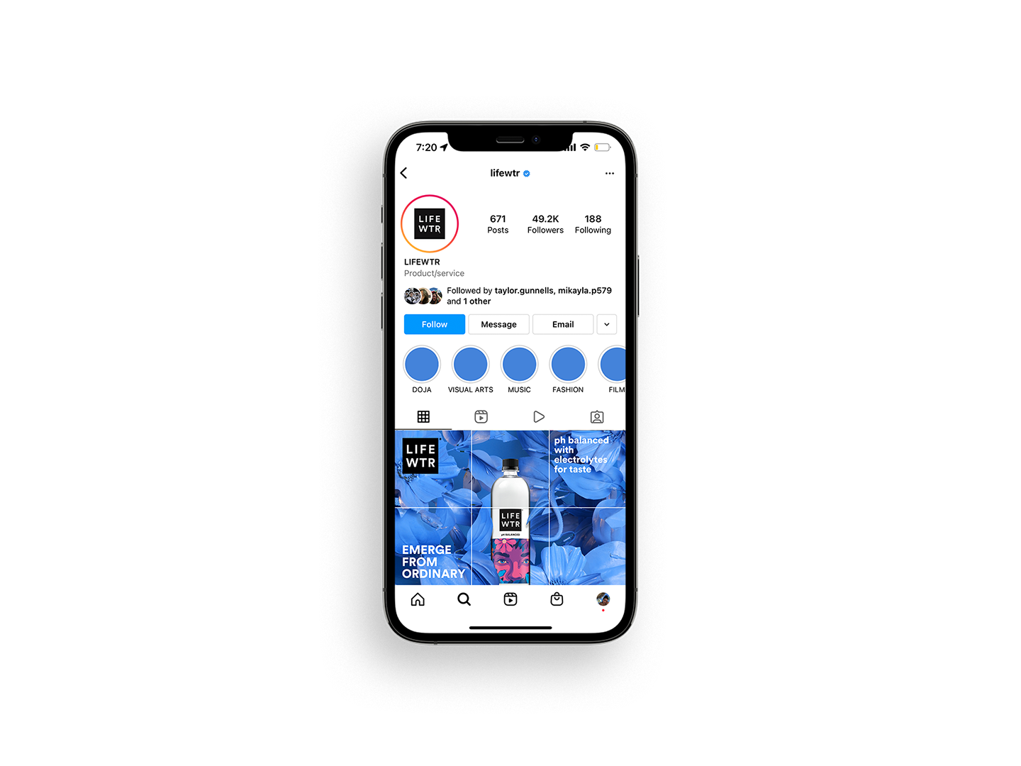
static social media posts & ad
animated social media posts
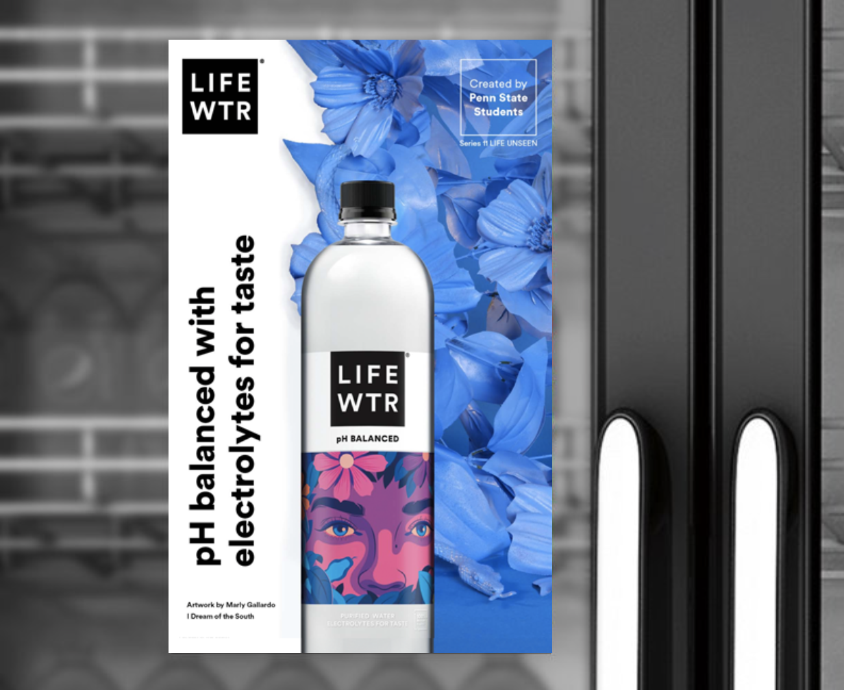

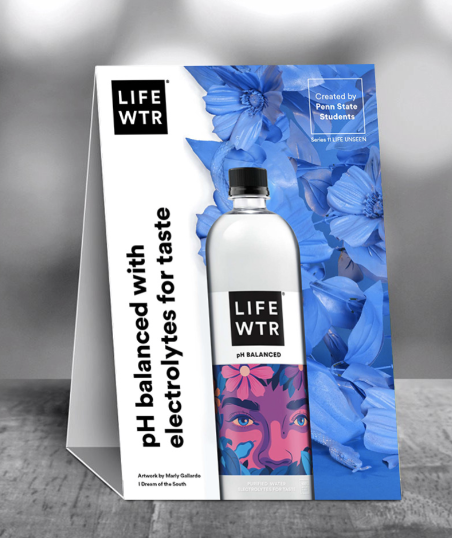
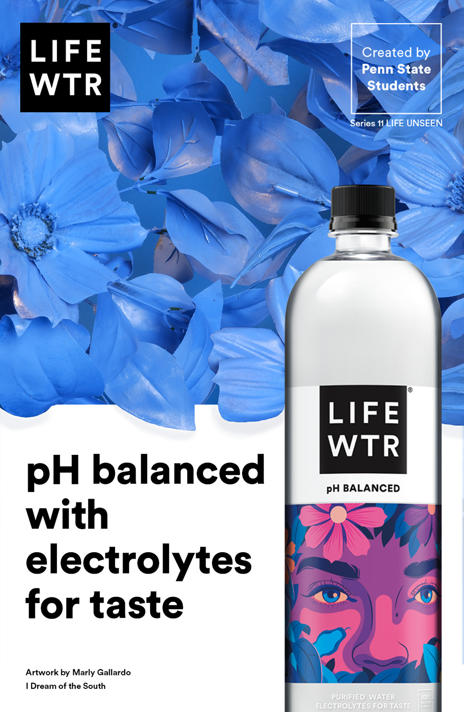
cooler graphic & table tent
menuboard sizzle reel

immersive experience


Research
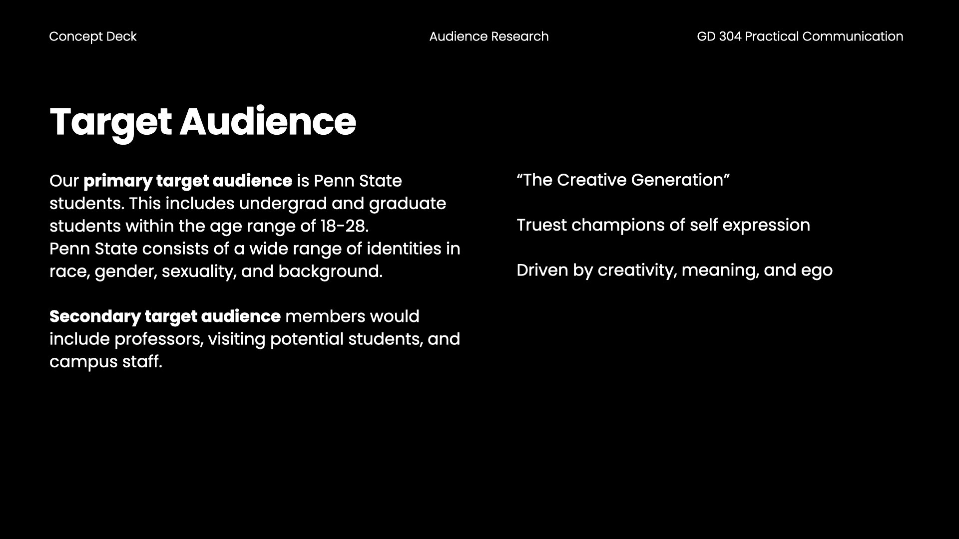
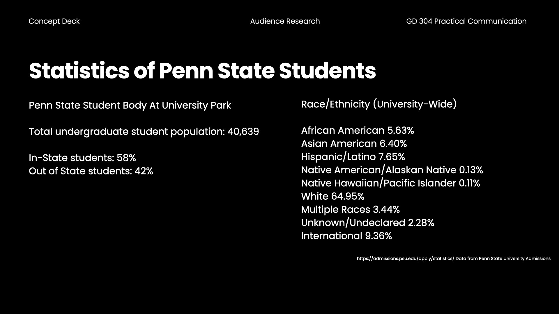
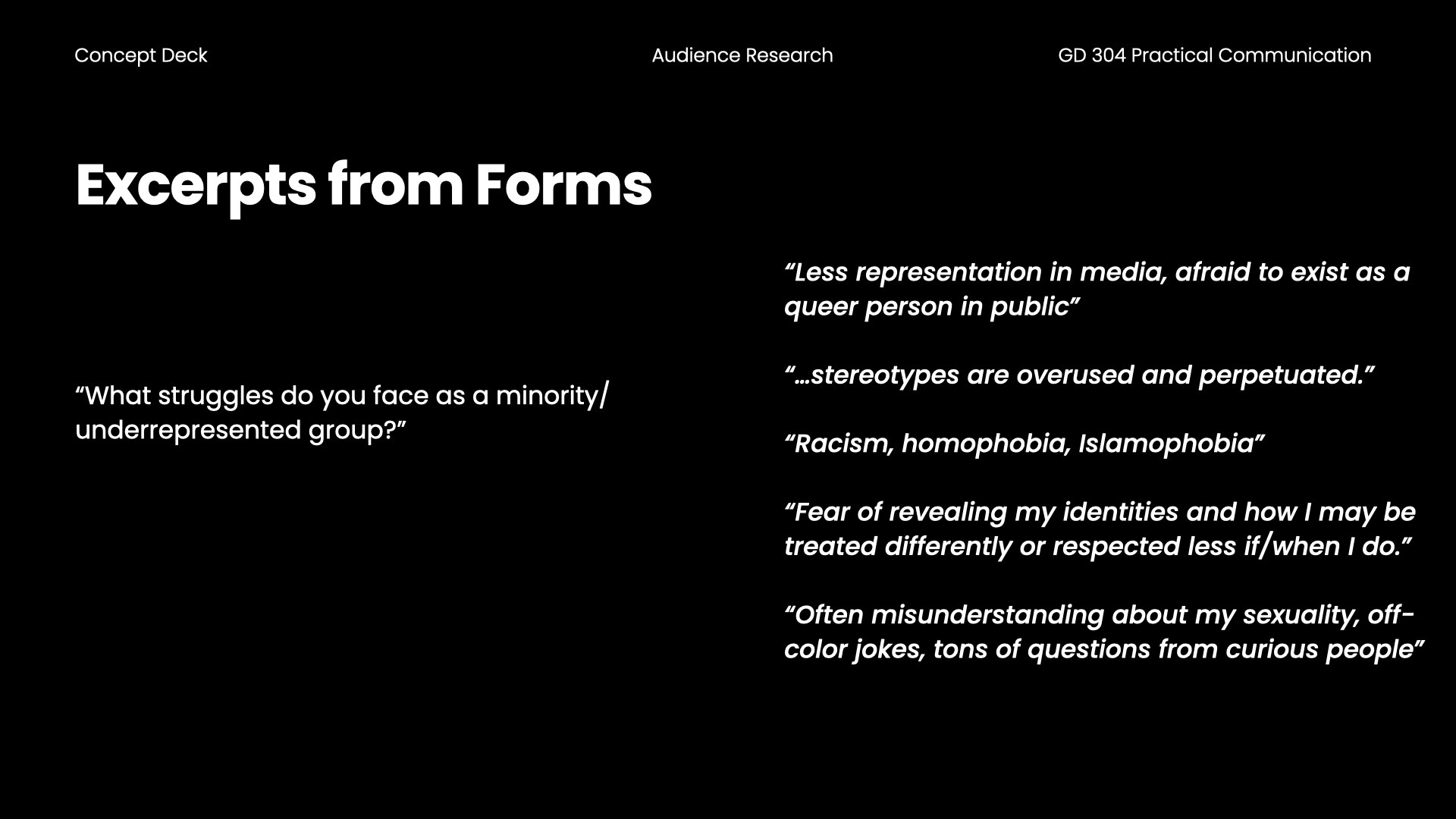
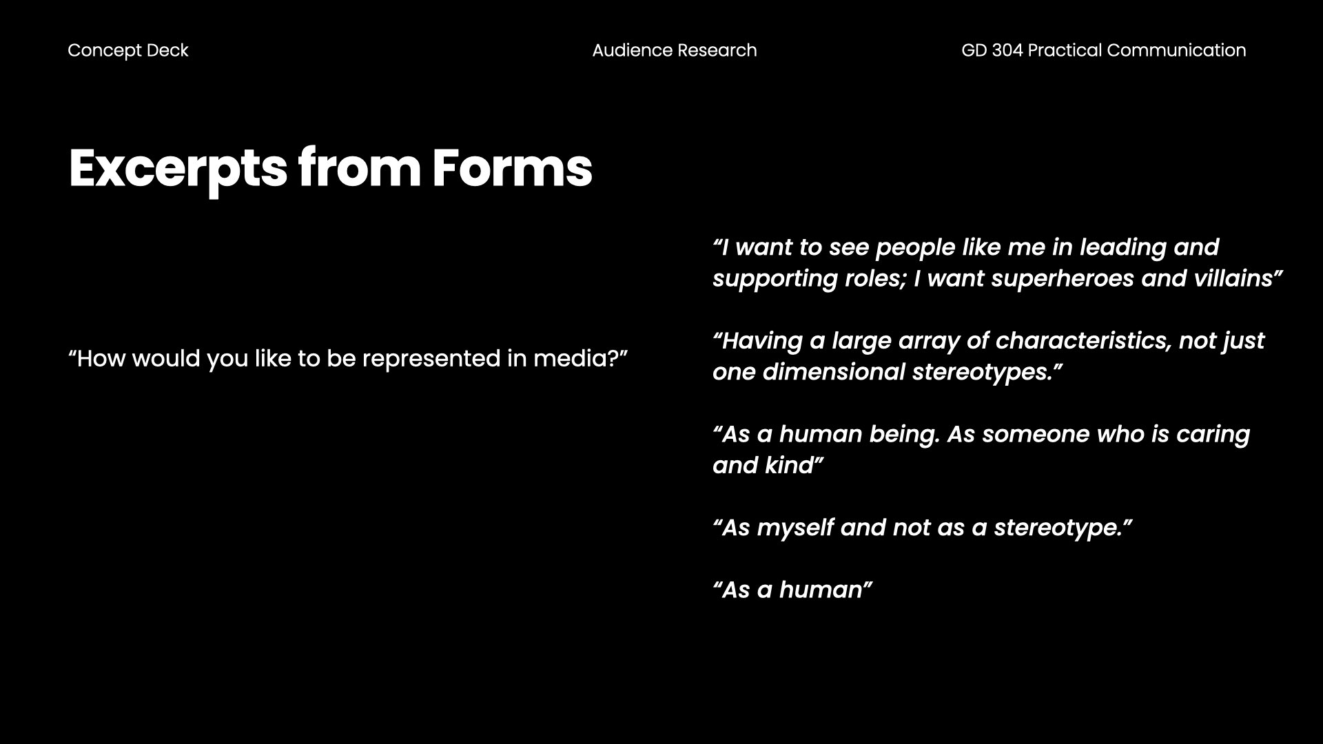
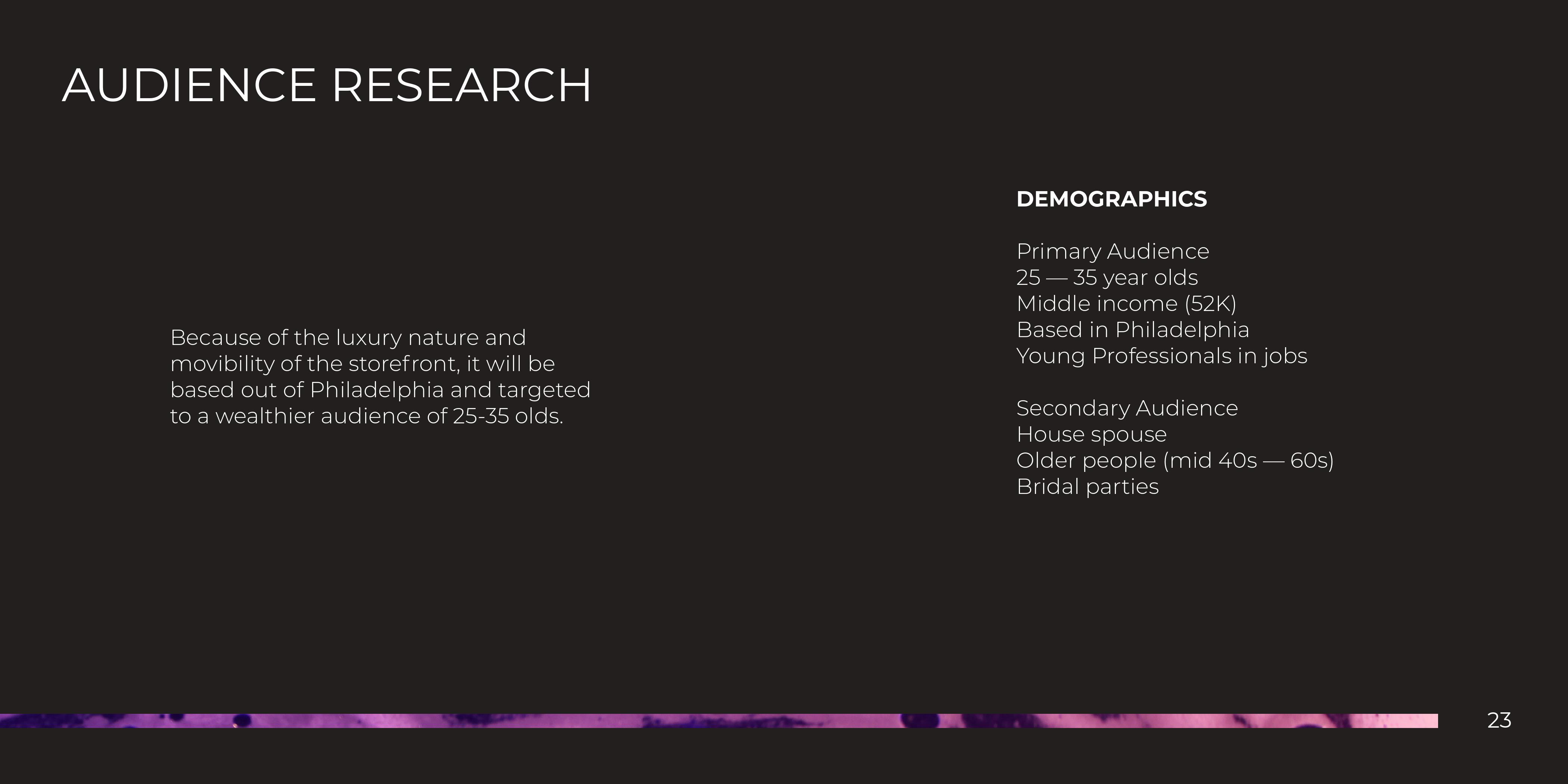
Research was composed of client research and audience research.Our audience research was based on the students of Penn State University Park as well as some individuals of underrepresented groups from the clubs members that include different ethnicities. gender identities, and sexual orientations.
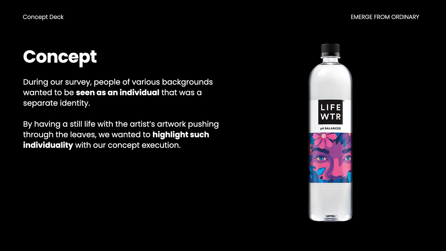
We concluded that people wanted to be seen as more than their stereotypes and be seen as an individual that is diverse as well as being represented in the general media.
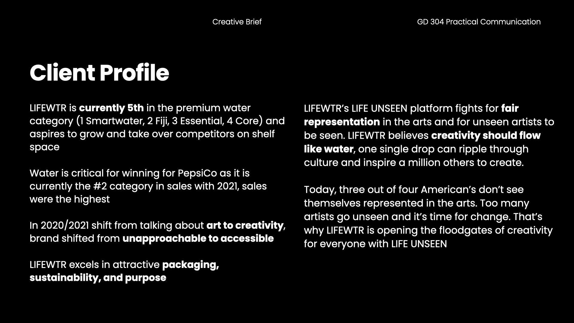
client rofile of LIFEWTR

Concept
We are more than stereotypes; we are more than meets the eye. We all come from various backgrounds, but when we come together we can create a new picture.We want to bring this dreamlike state into reality by contrasting the bottle with the artist’s art with a still-life background.
Inspiration
We were inspired by the bottle of Marly Gallardo. We felt both her artwork and narrative was very powerful.“I aim to achieve a dream-like experience with my artwork that will inspire a search for the surreal within the mundane.
In LIFEWTR’s Life Unseen collaboration I created an homage to my heritage and created a narrative that invites viewers into a vibrant experience.”
Credit: Quote taken from Marly Gallardo from the lifeunseen.lifewtr.com


Process
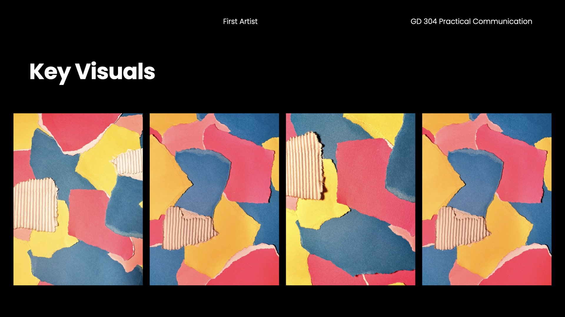
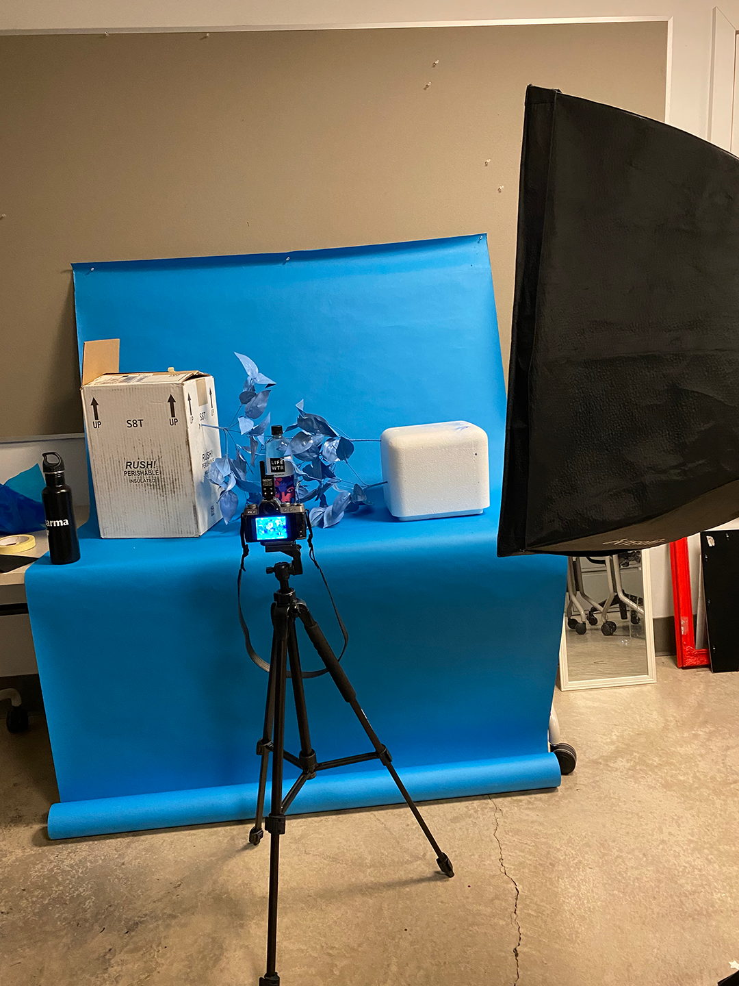
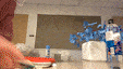
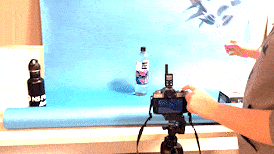
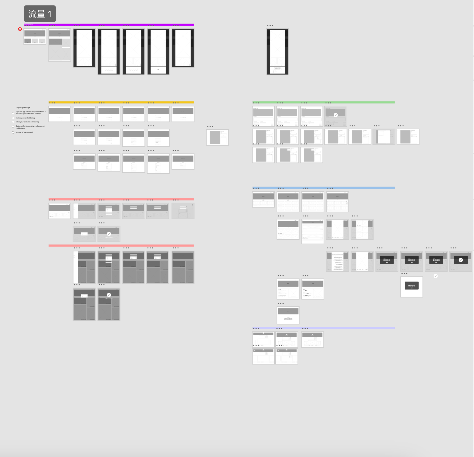
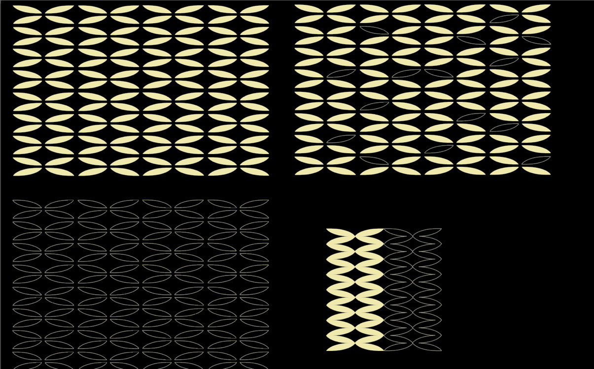
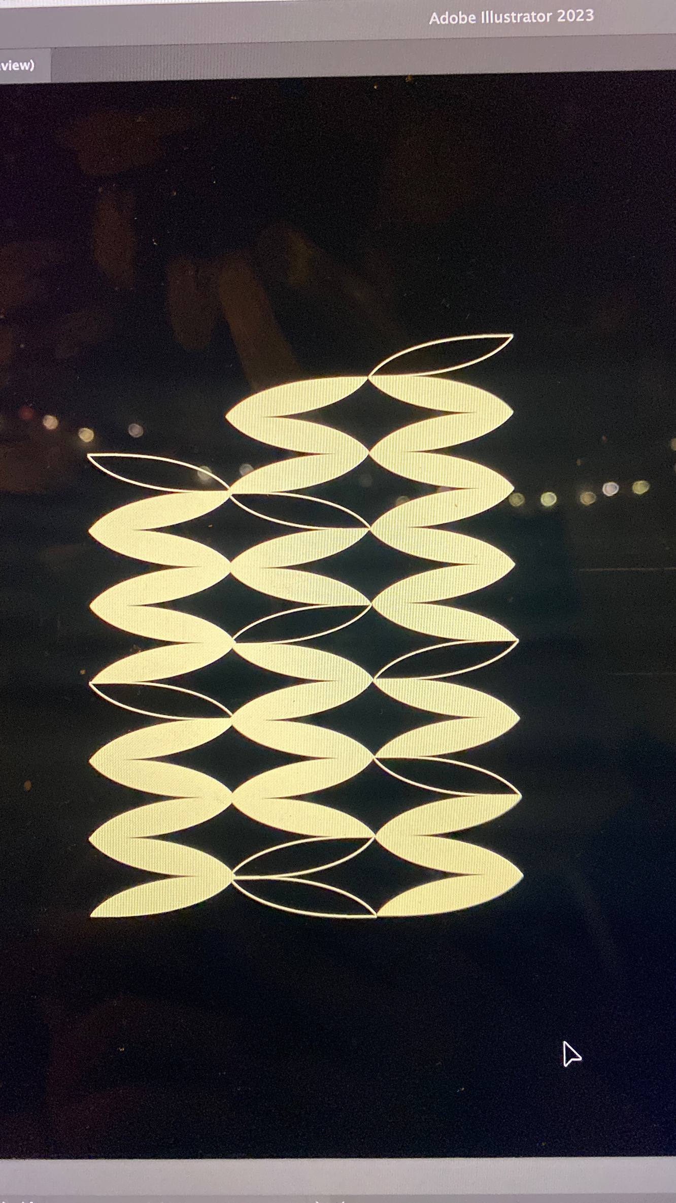
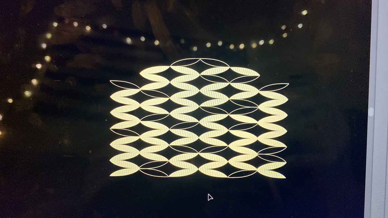
We incorporated the different critiques and feedback we got from the PepsiCo Design and Innovation, LIFEWTR Brand and Design team and North Division Marketing over the 15 weeks.Key Visuals
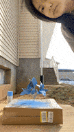
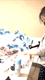
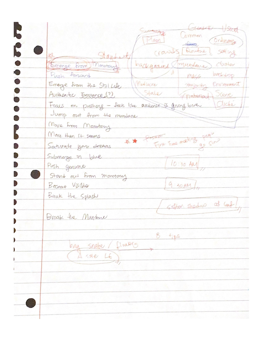
Seeing this was a 15 week project, we saw this as an opportunity to experiment with colors and different styles and getting the details of the background correct.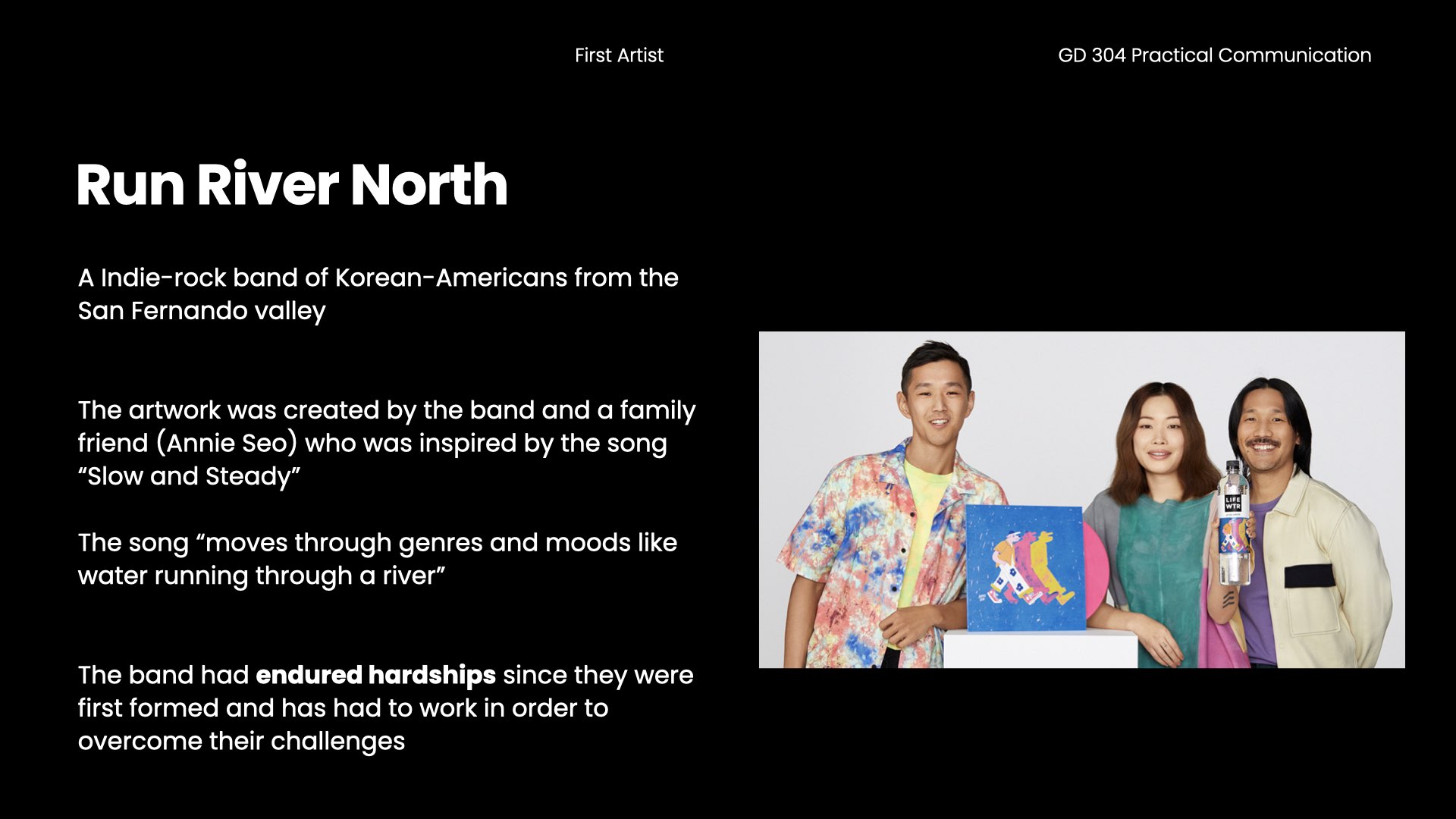


Cooler Graphic & Table Tent

Immersive Experience


Final Presentation


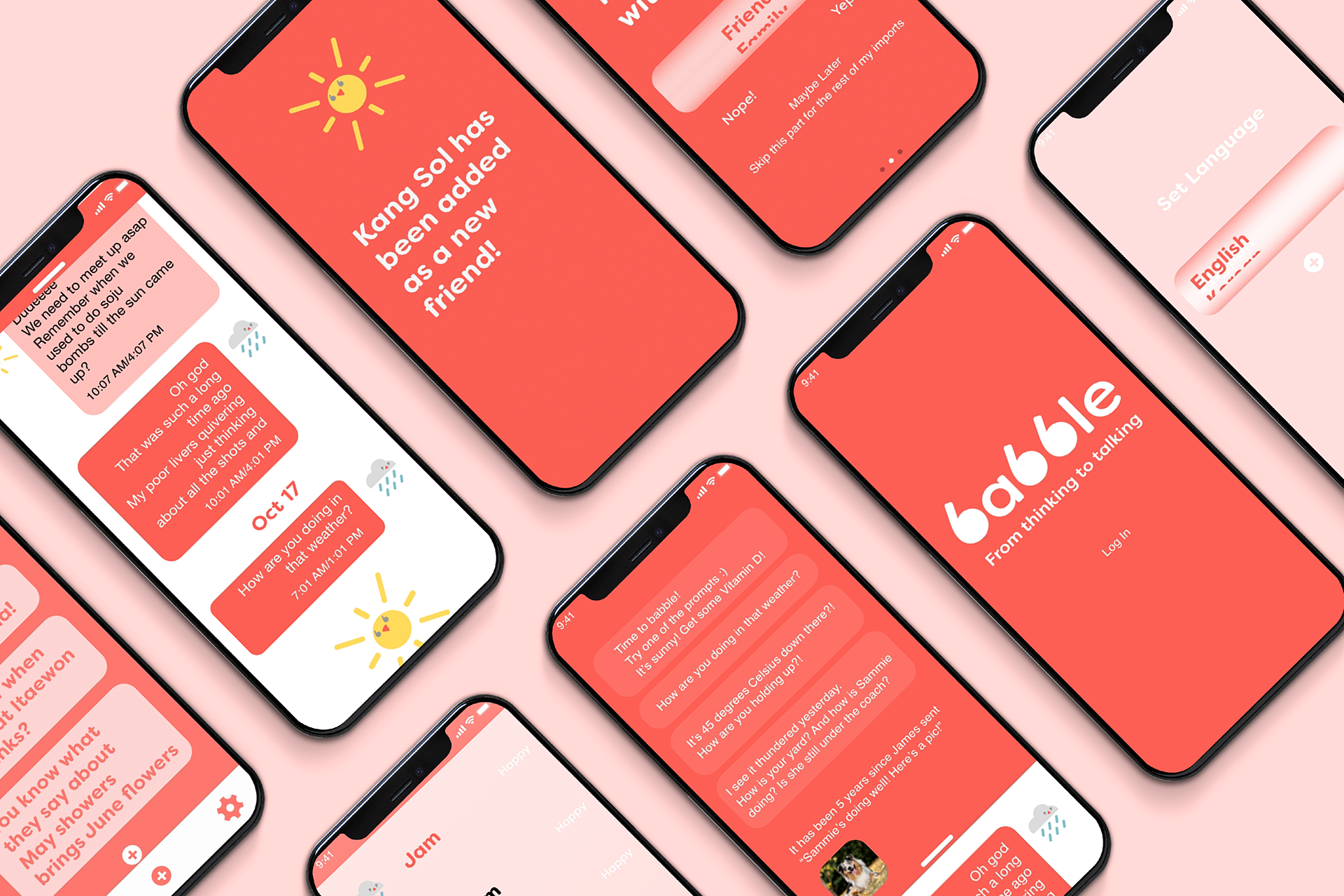
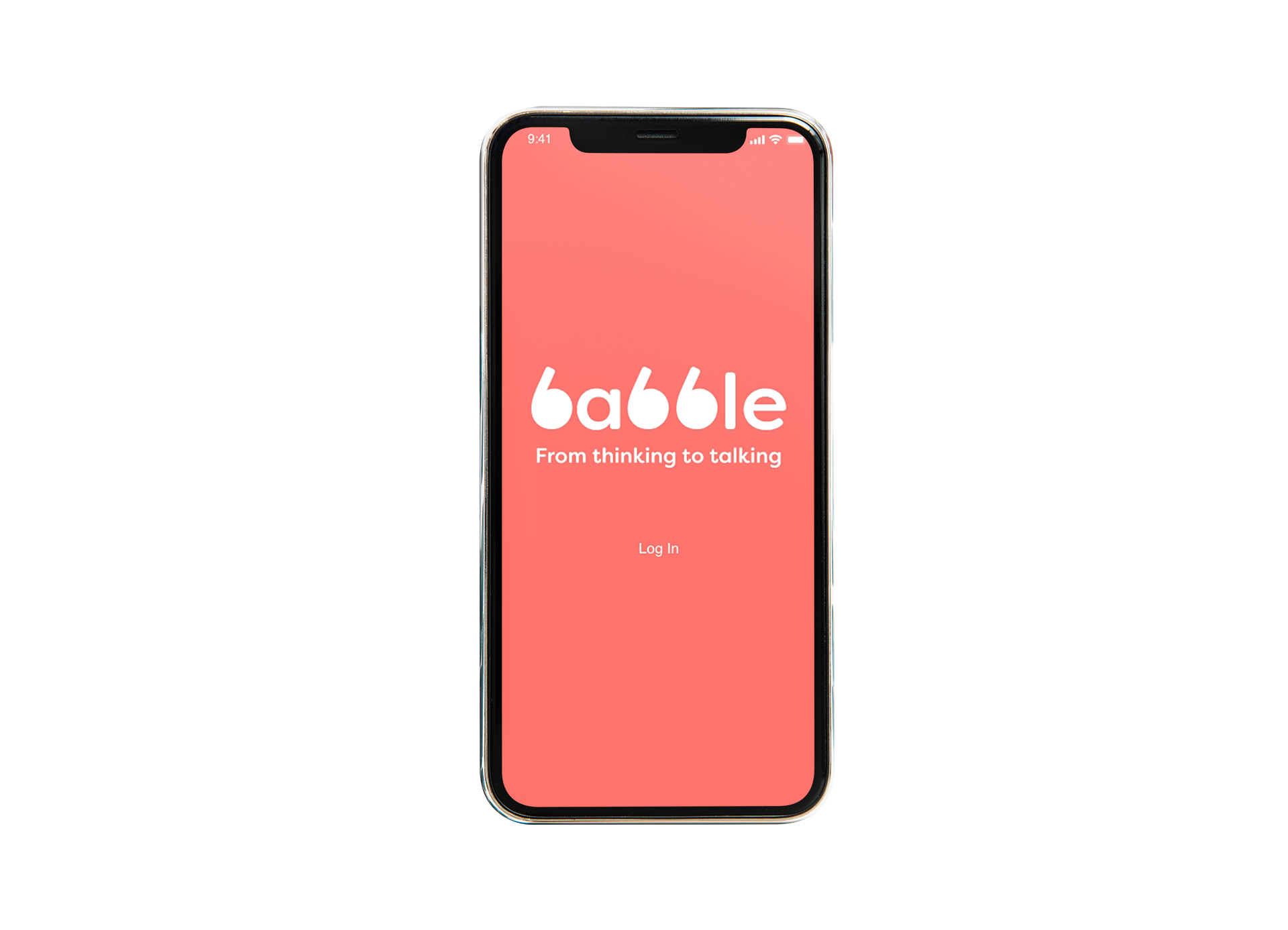
babble
한국어iOS App Design
4 week project
4 week project
Challenge
babble is an app based on small talk and long distance relationships and how thinking about a person can lead to constant small talk.Branding, UI
Illustrator, XD
Illustrator, XD
Solution
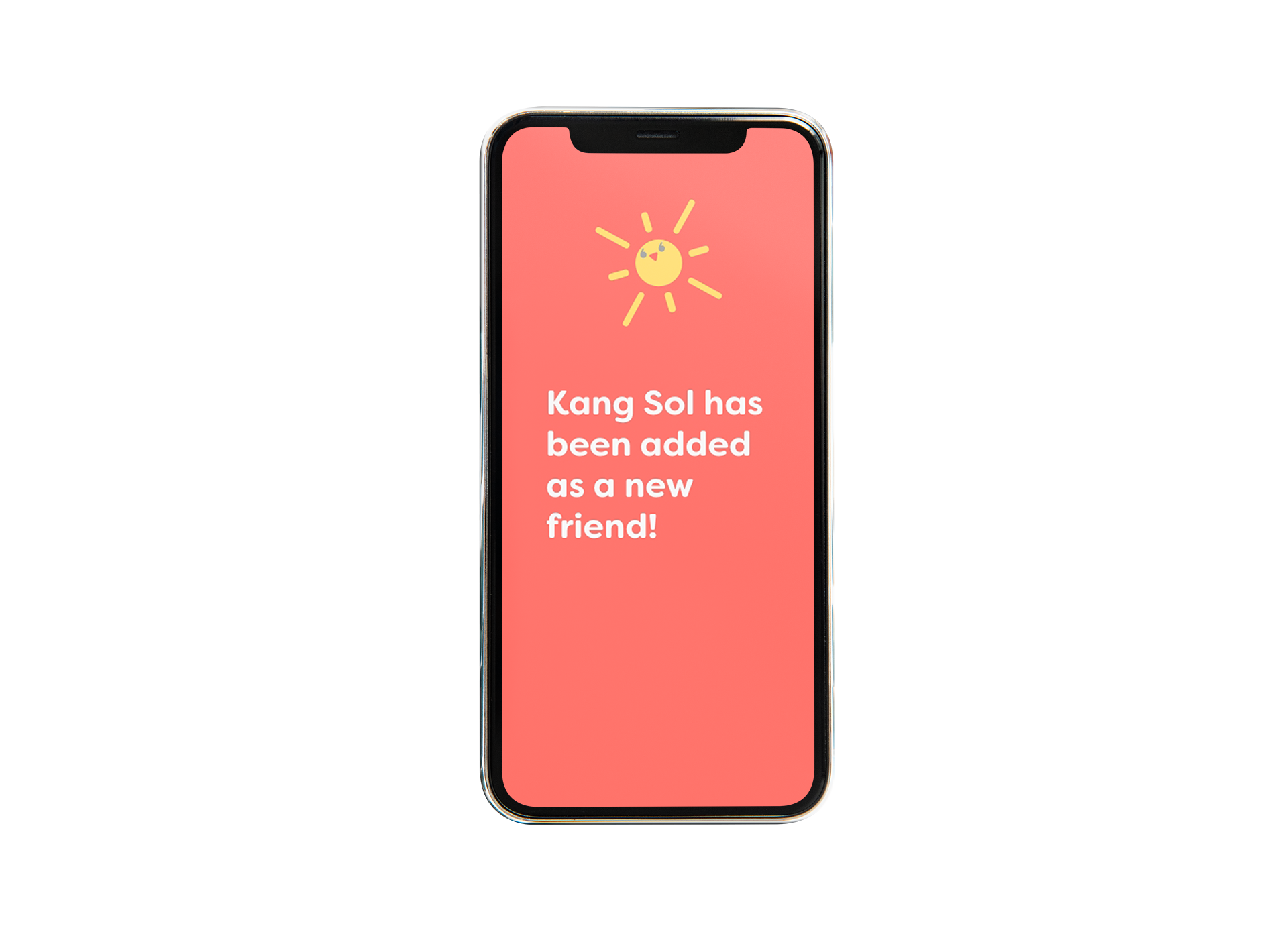
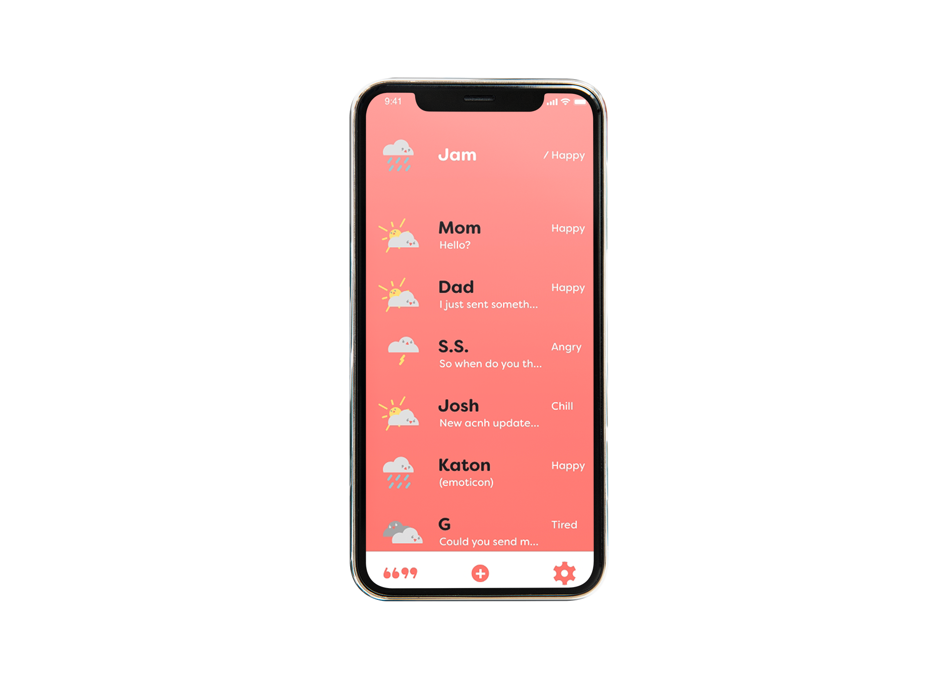
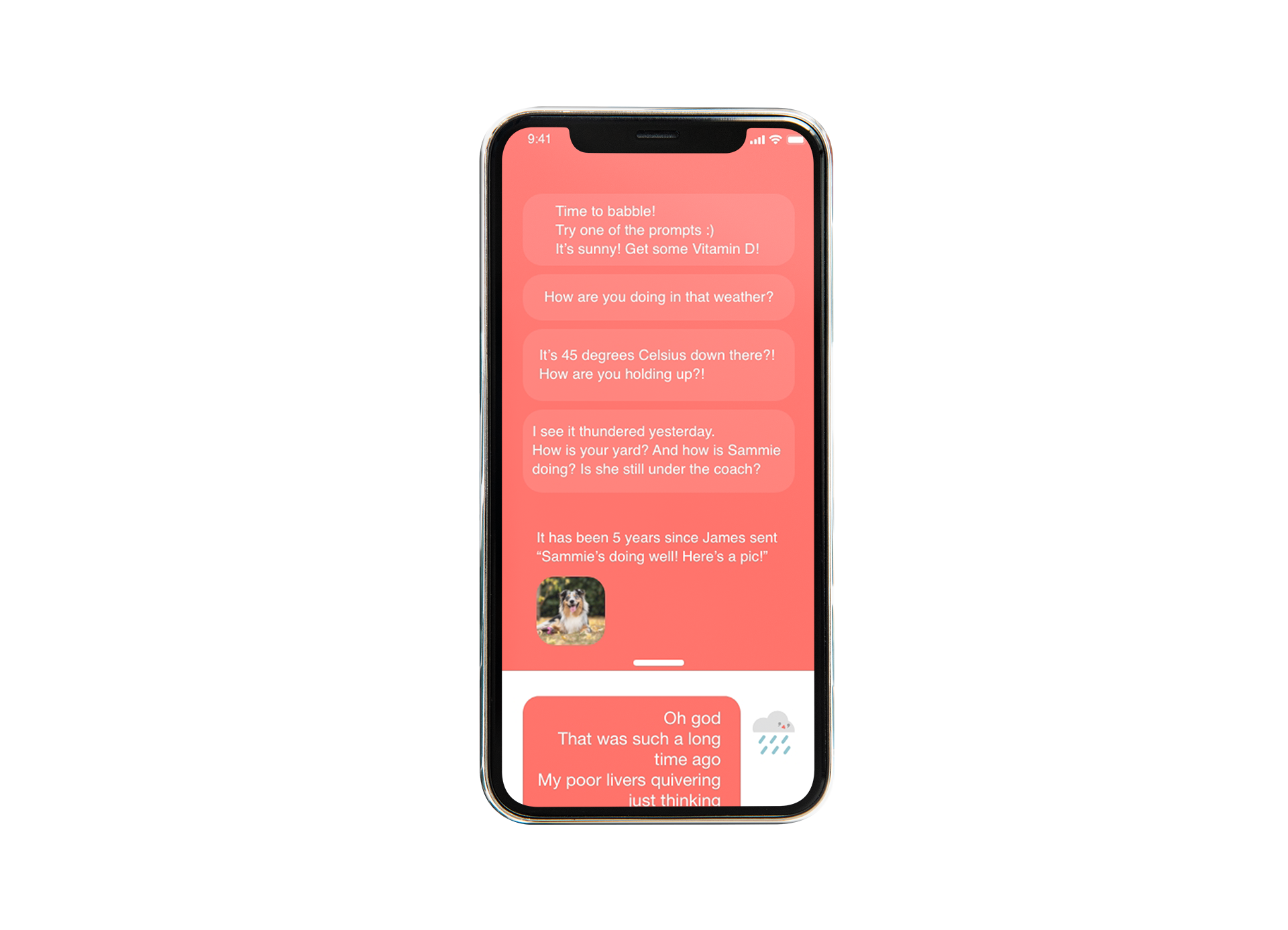
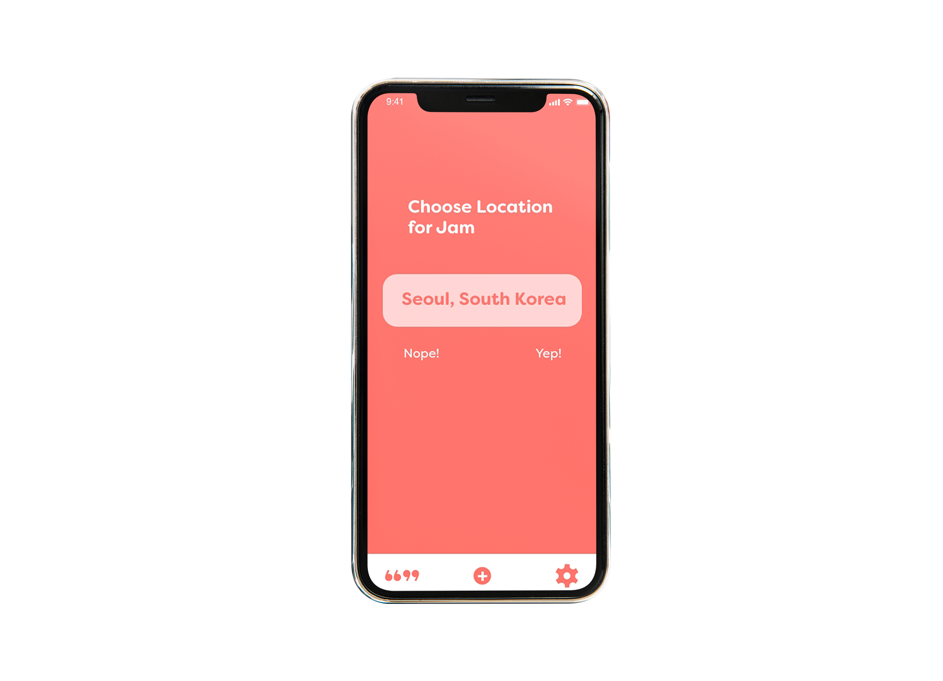
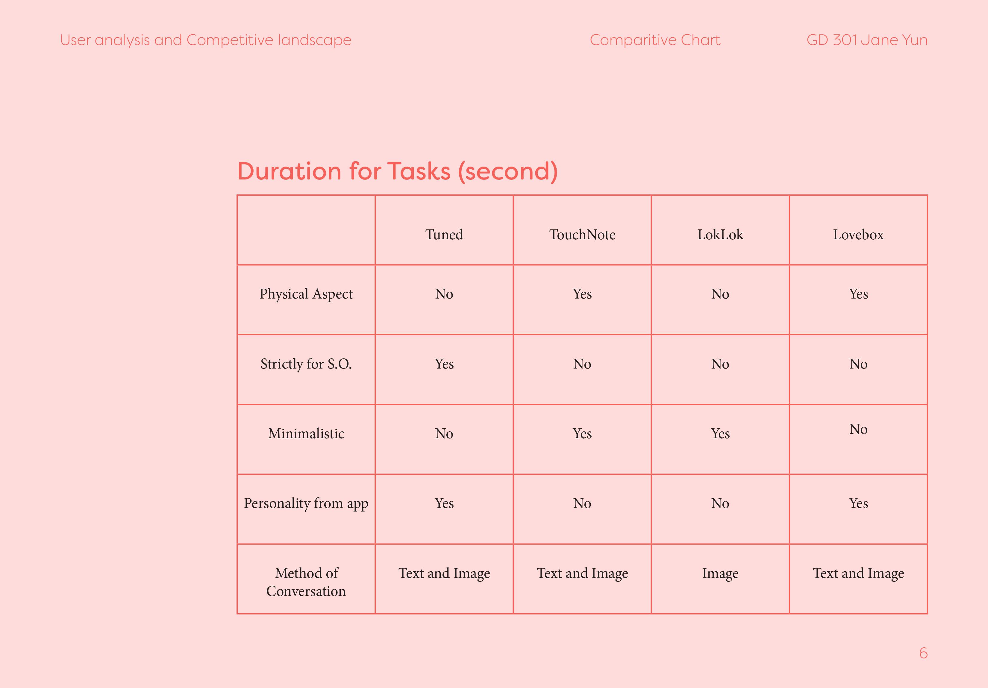
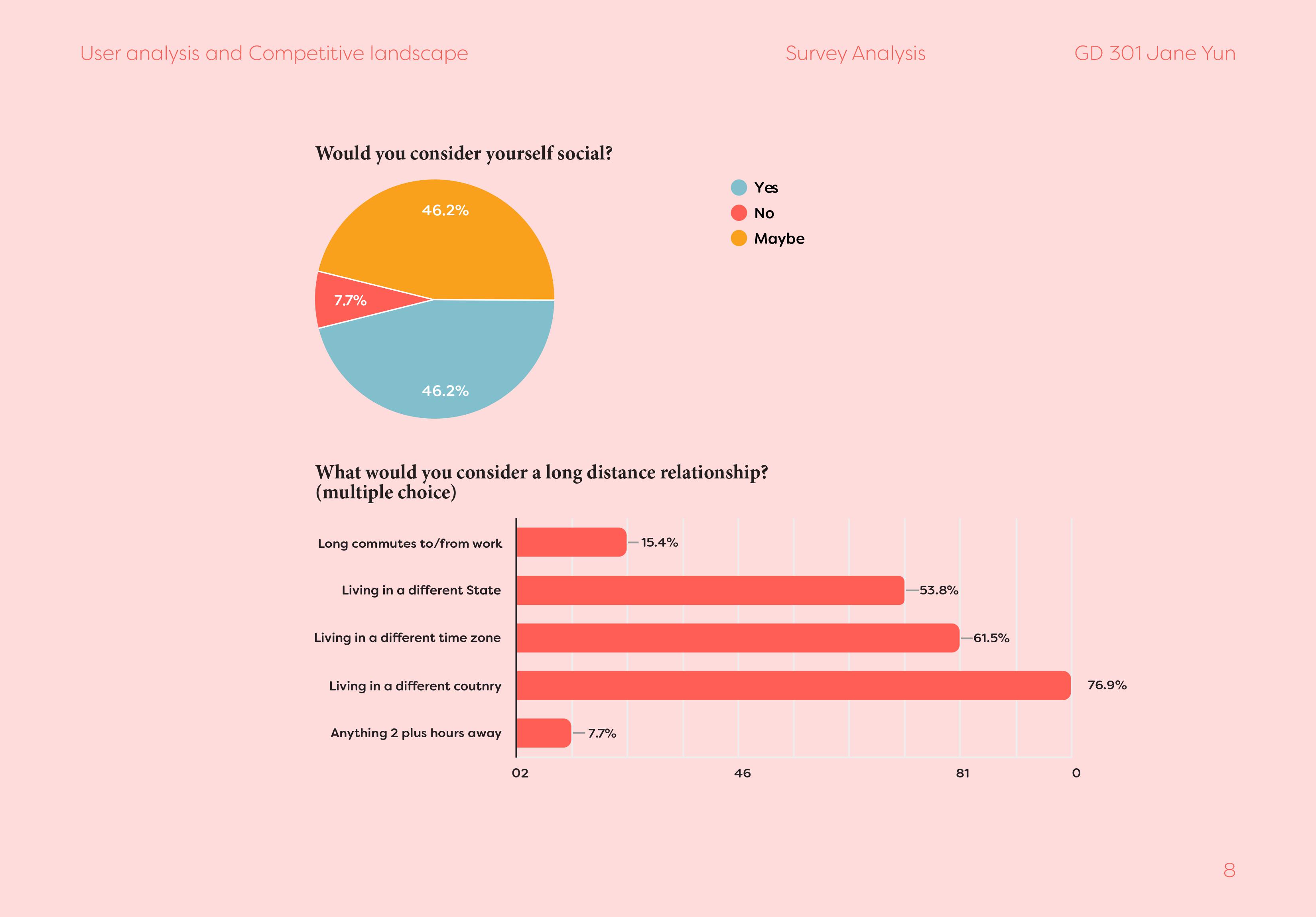
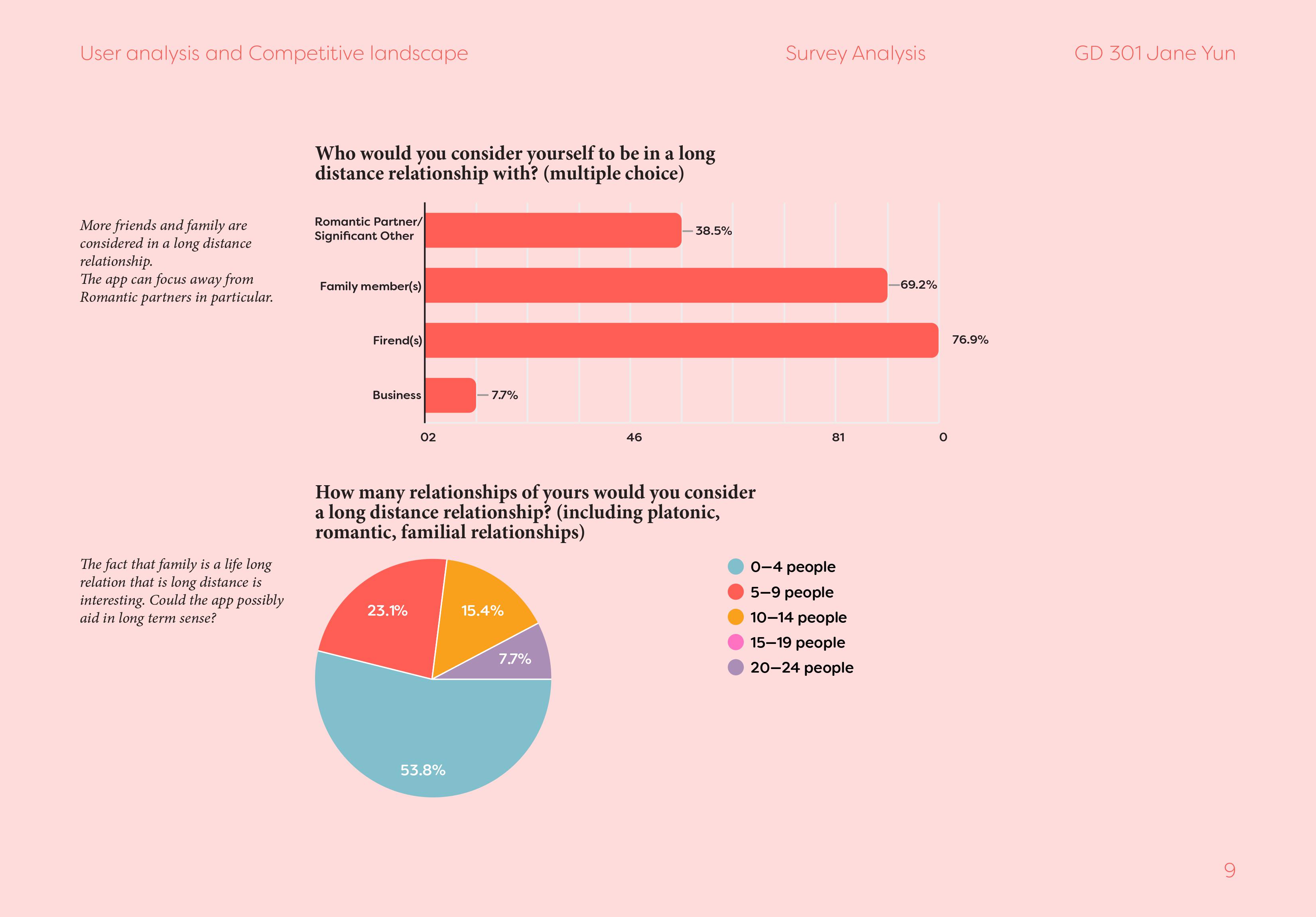
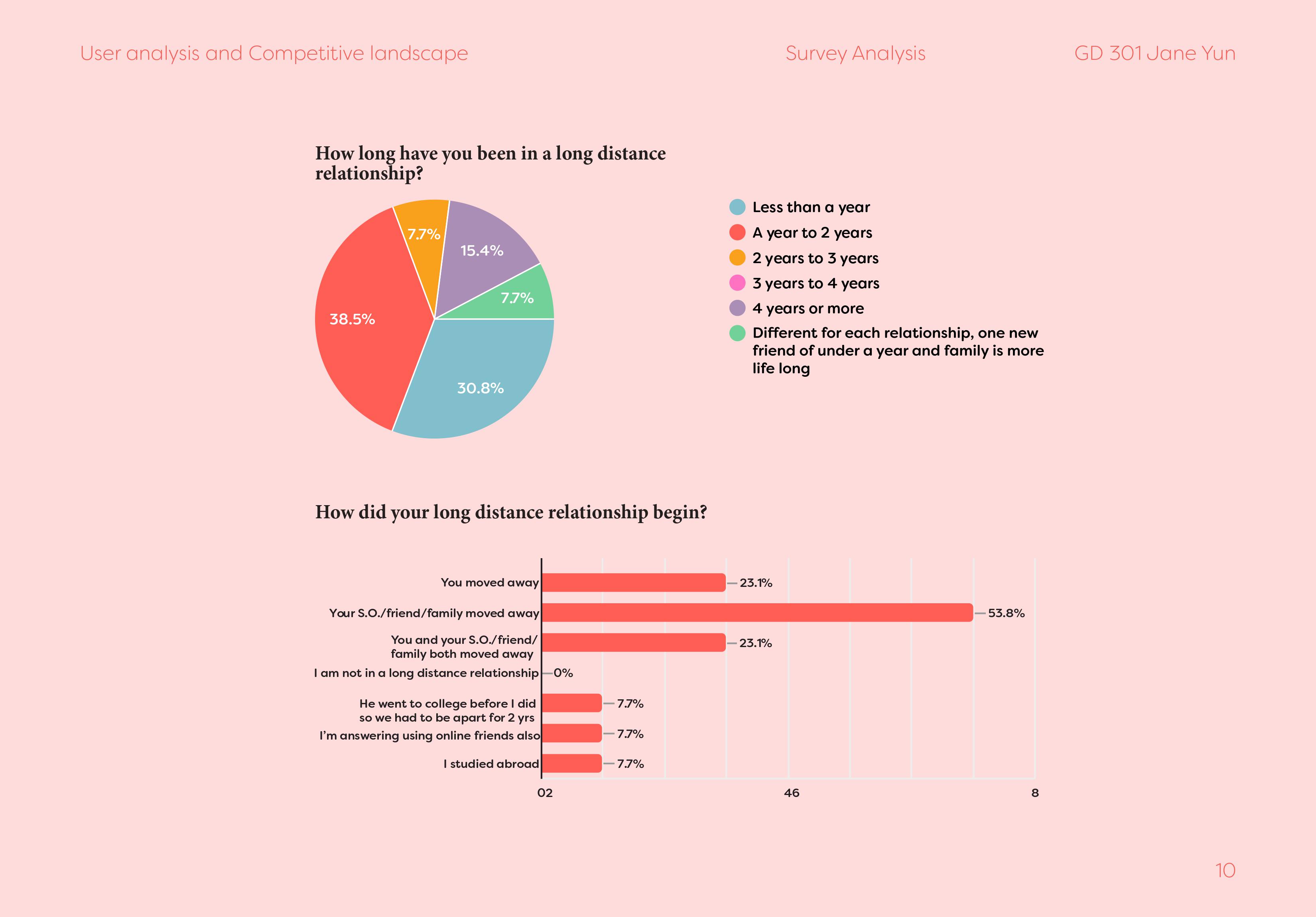
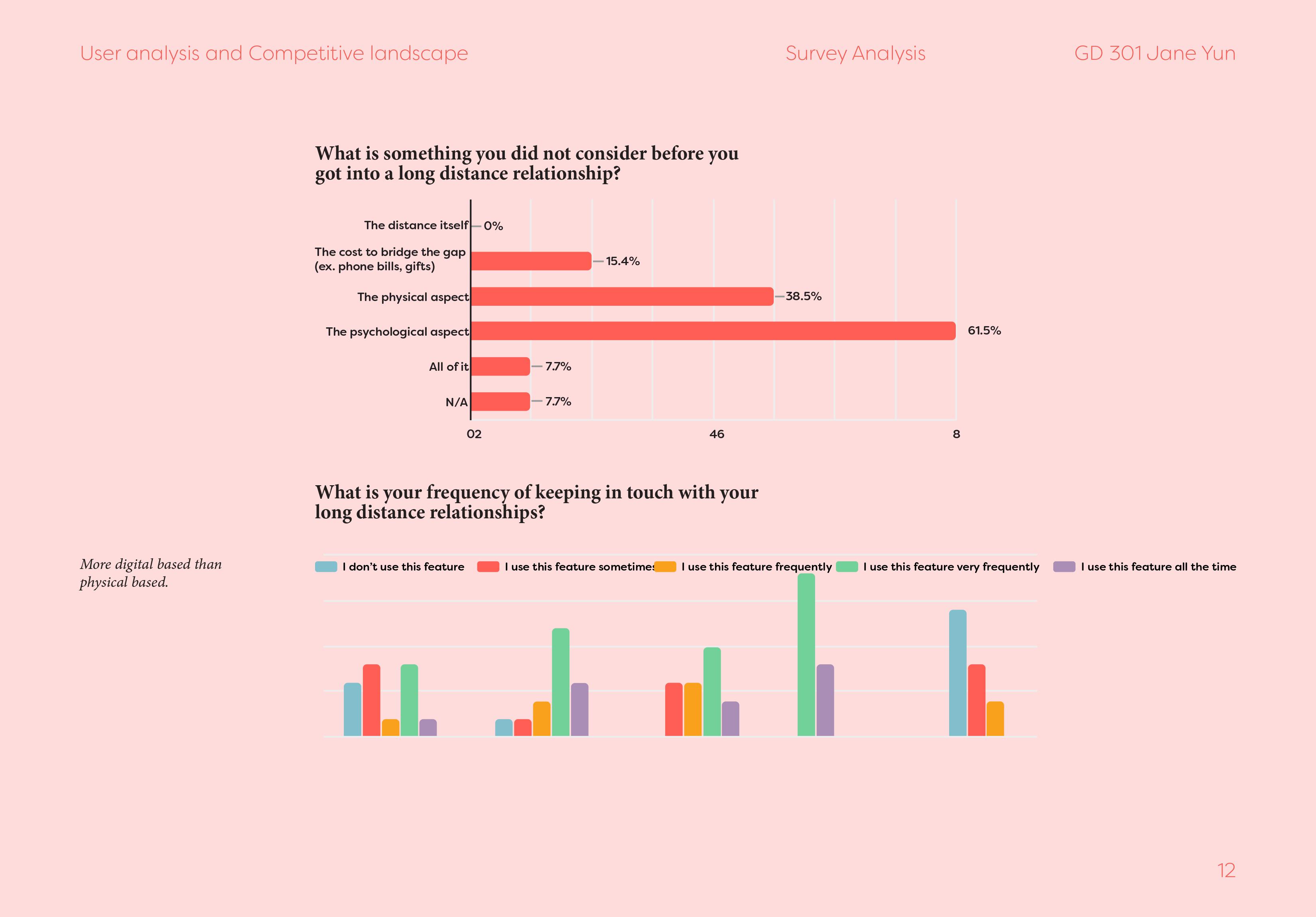
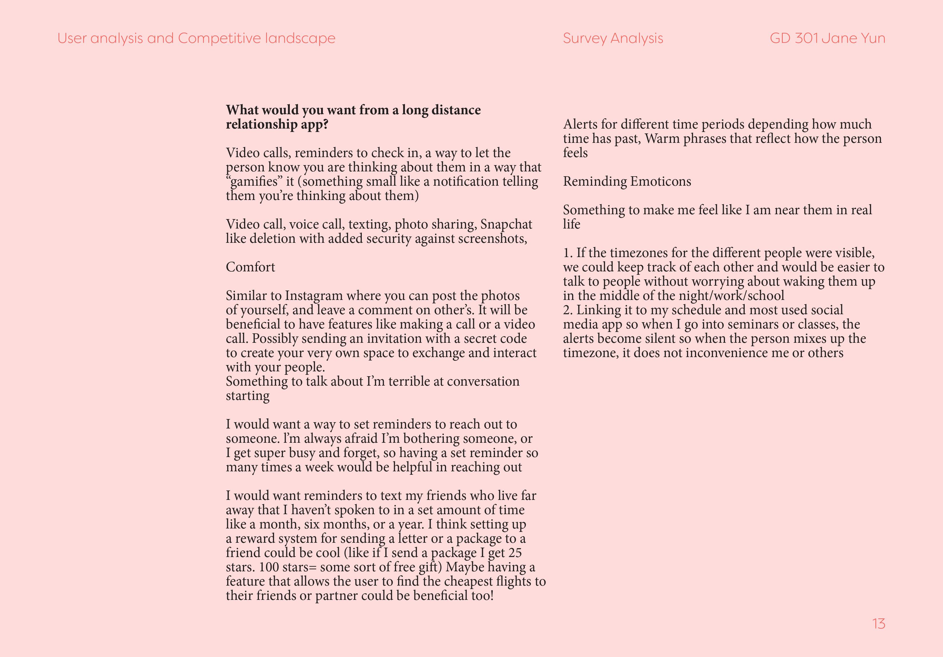
Defining long distance relationships, a majority of people had some form of long-distance relationship happening in their lives.The colors and imagery was kept bright and colorful to keep consistent with the branding of bale. To facilitate better conversation, the weather icons and suggestions were the top priority when designing.
Research
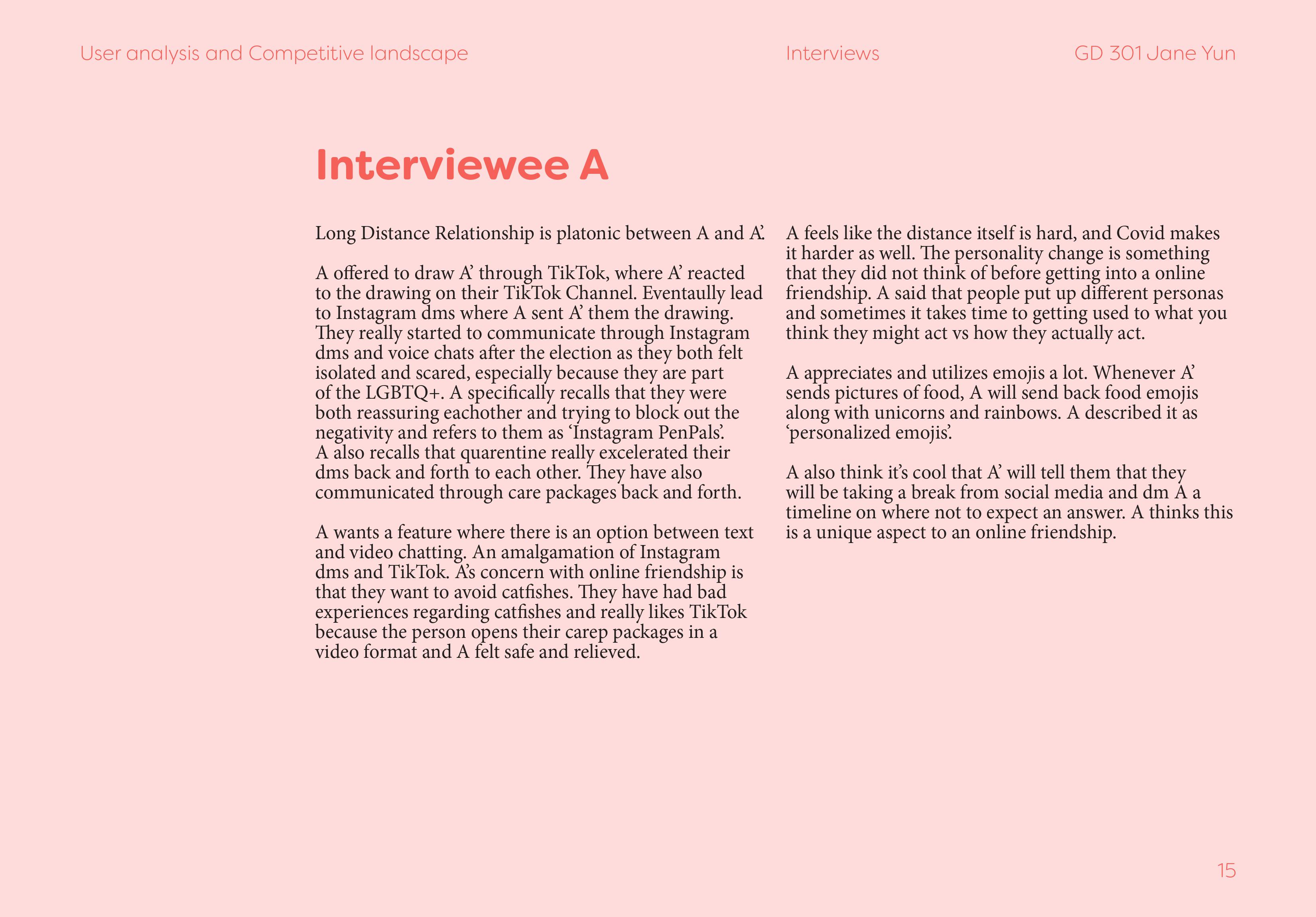
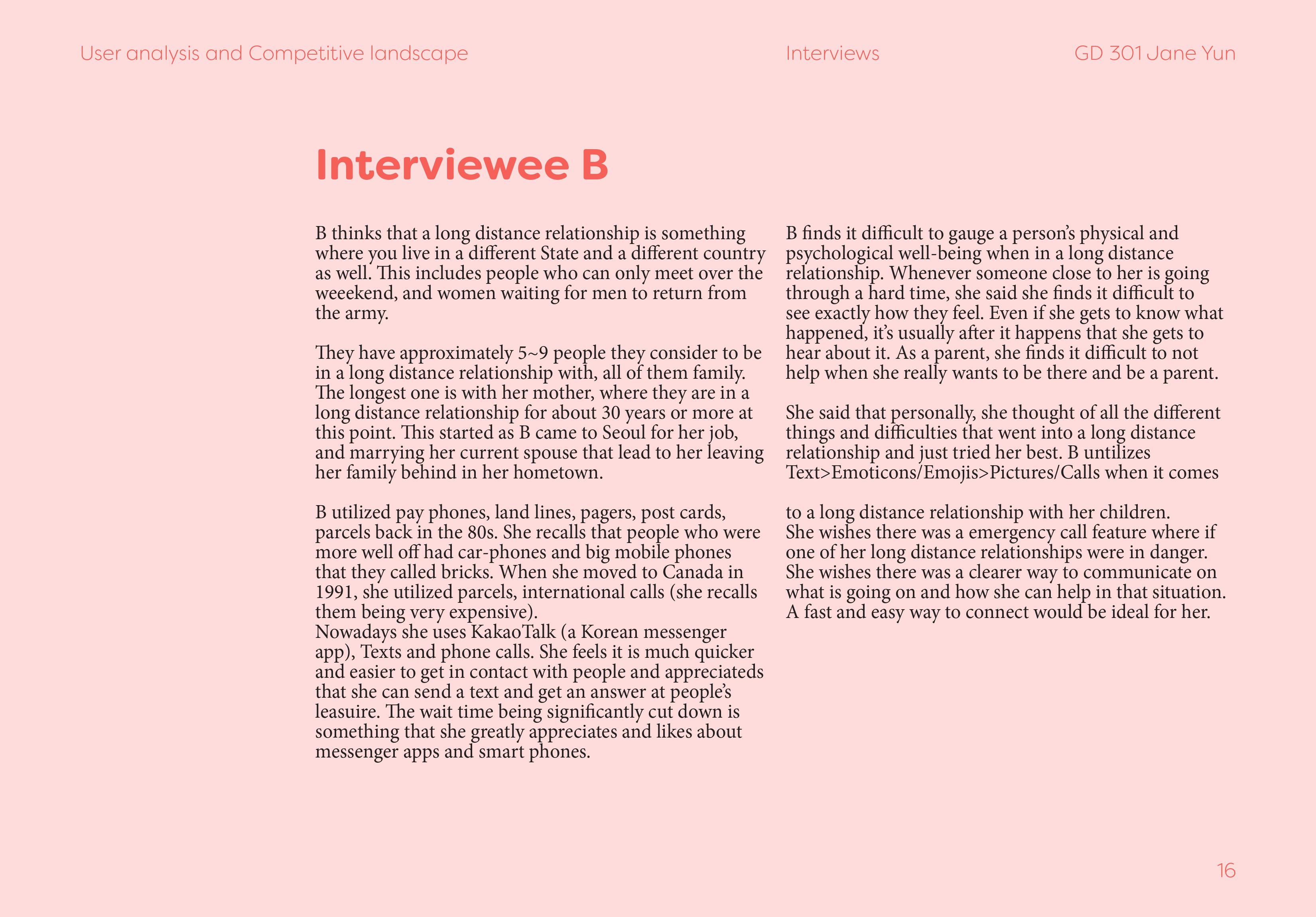
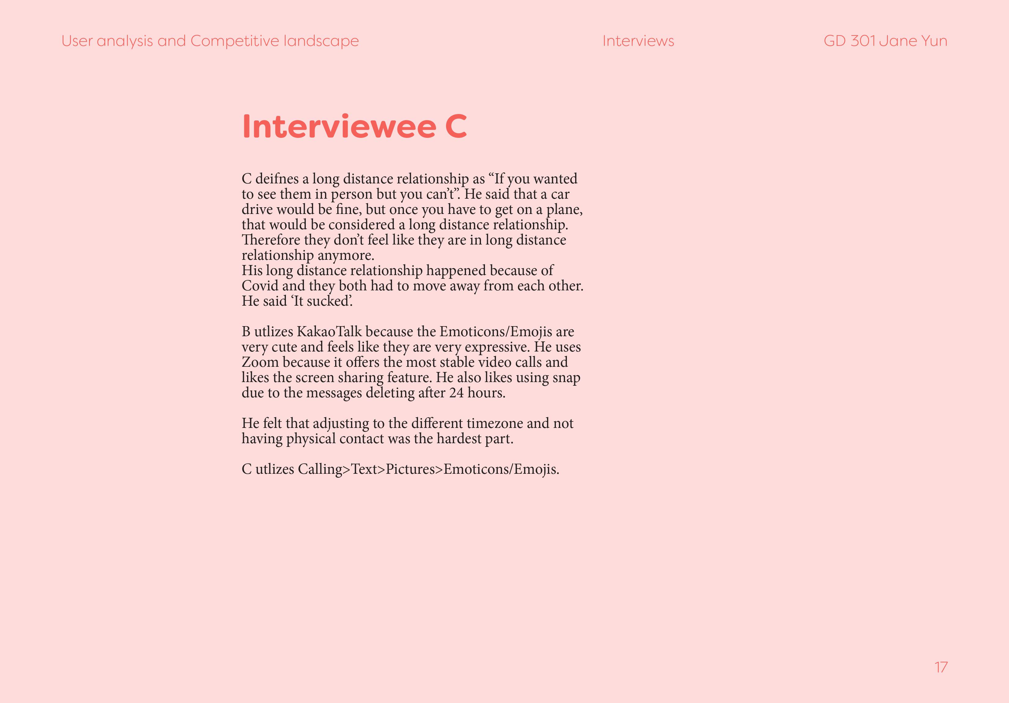
From competitors to user analysis, babble first started to shape up when realizing there was not an app for people to reach out first with the user in mind.A lot of the apps were initiated by a need to express oneself but not to connect with a person with the other in mind.
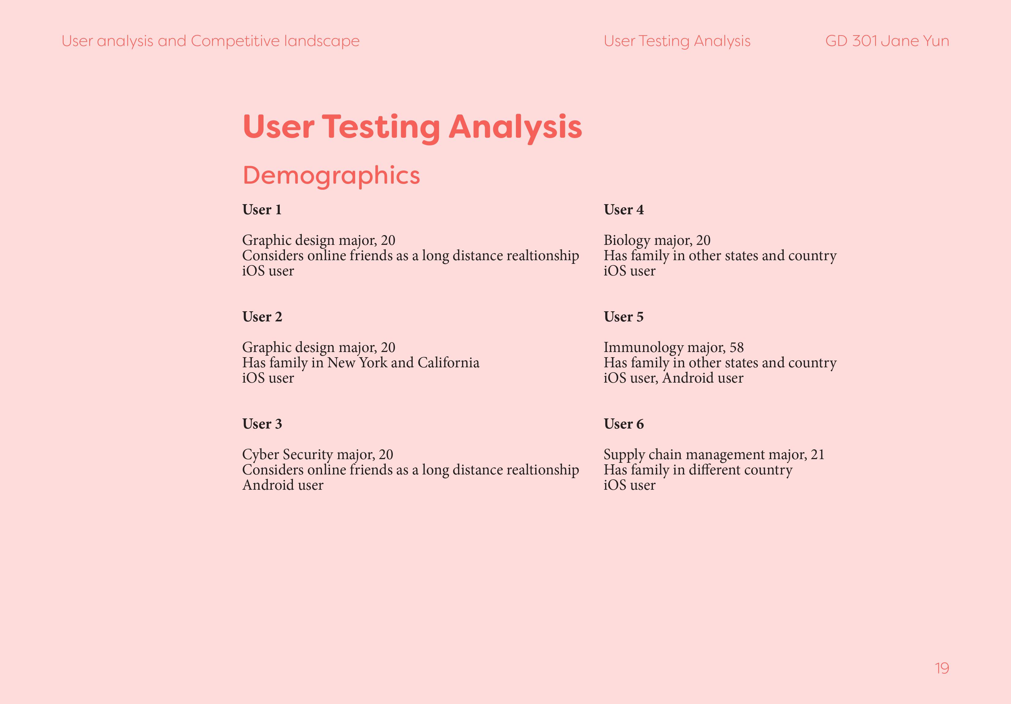
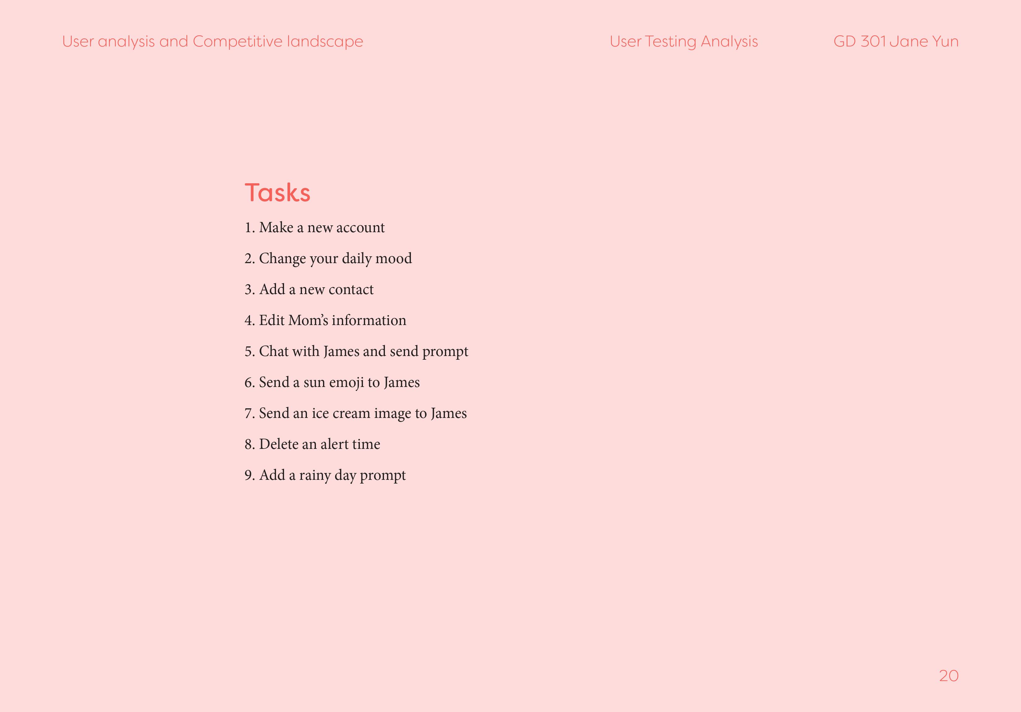
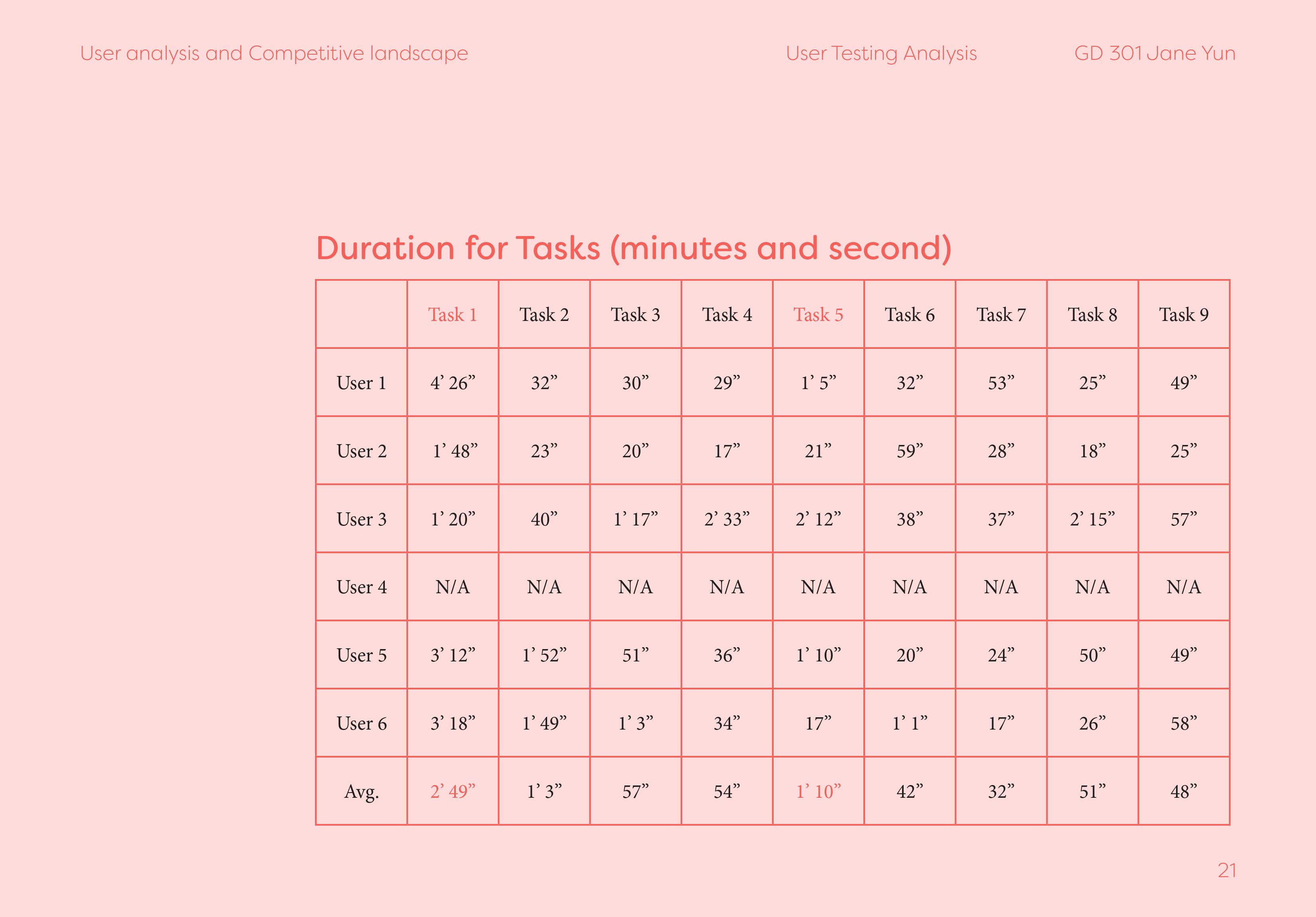
User testing was also utilized in this project at the end to ensure the app’s execution made sense to those who were first using this app.


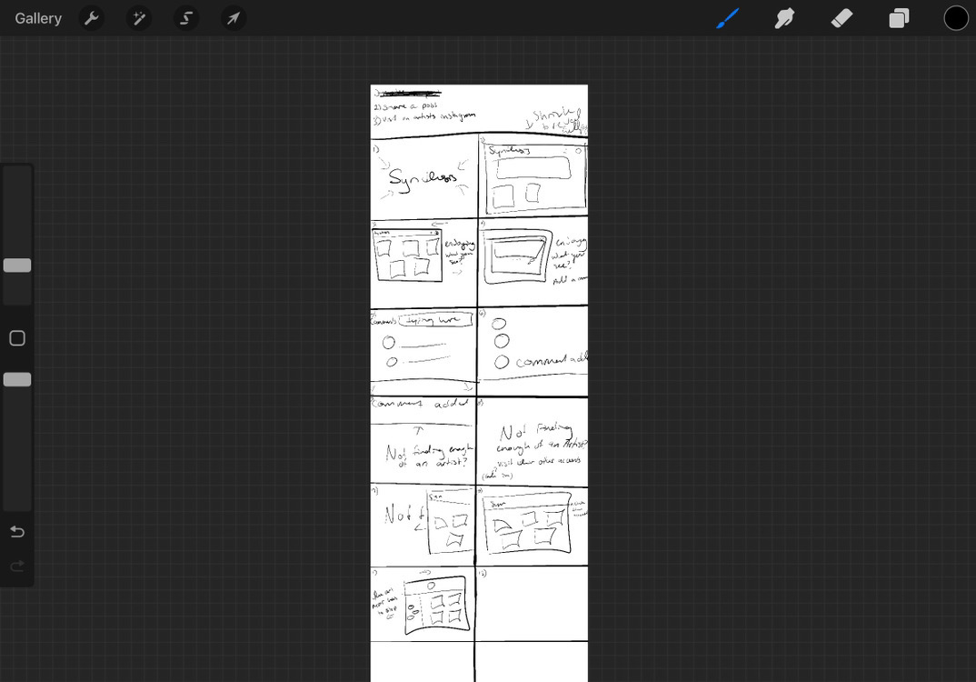
Process
A weather app for people in long distance relationships was inspired by small talk.Normally, due to my awkwardness and wanting to fill the silence I talk about the mundane everyday things.
However, with my family and friends back in South Korea, I found that I genuinely ask the questions rather than filling in a silent situation.
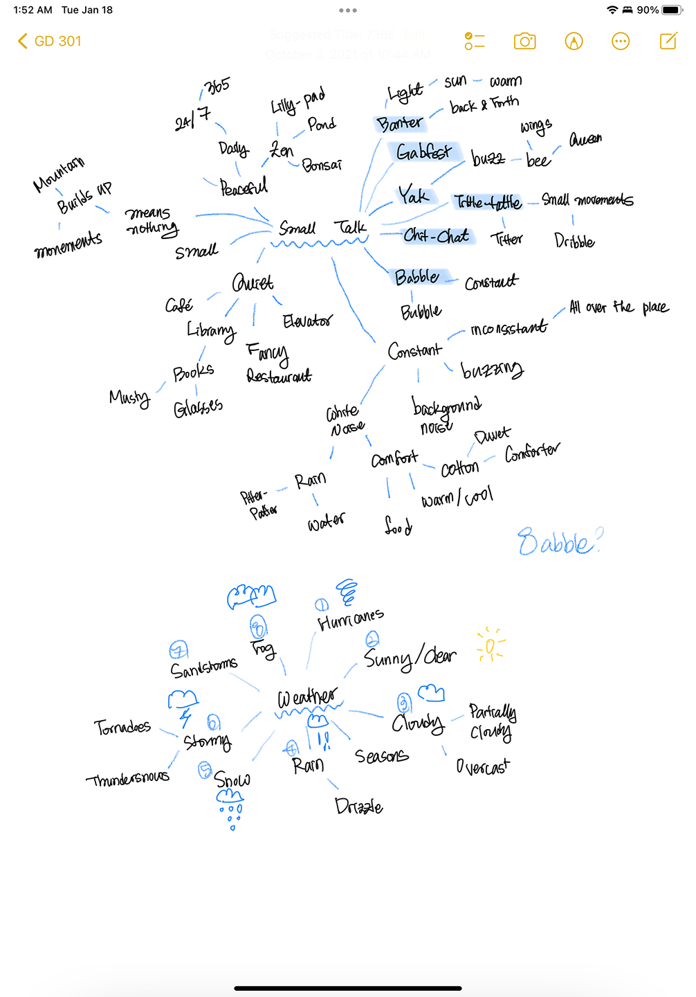
Mind mapping was a big part of coming up with the identity of the app.
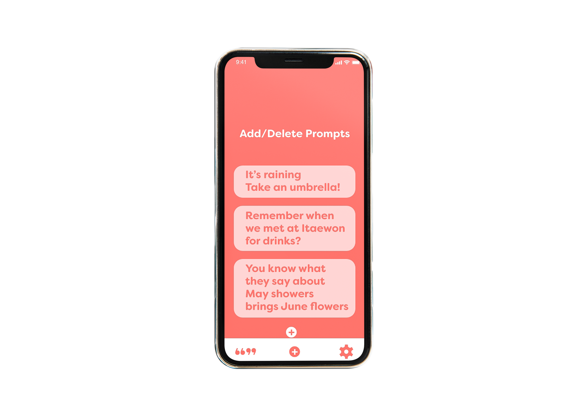
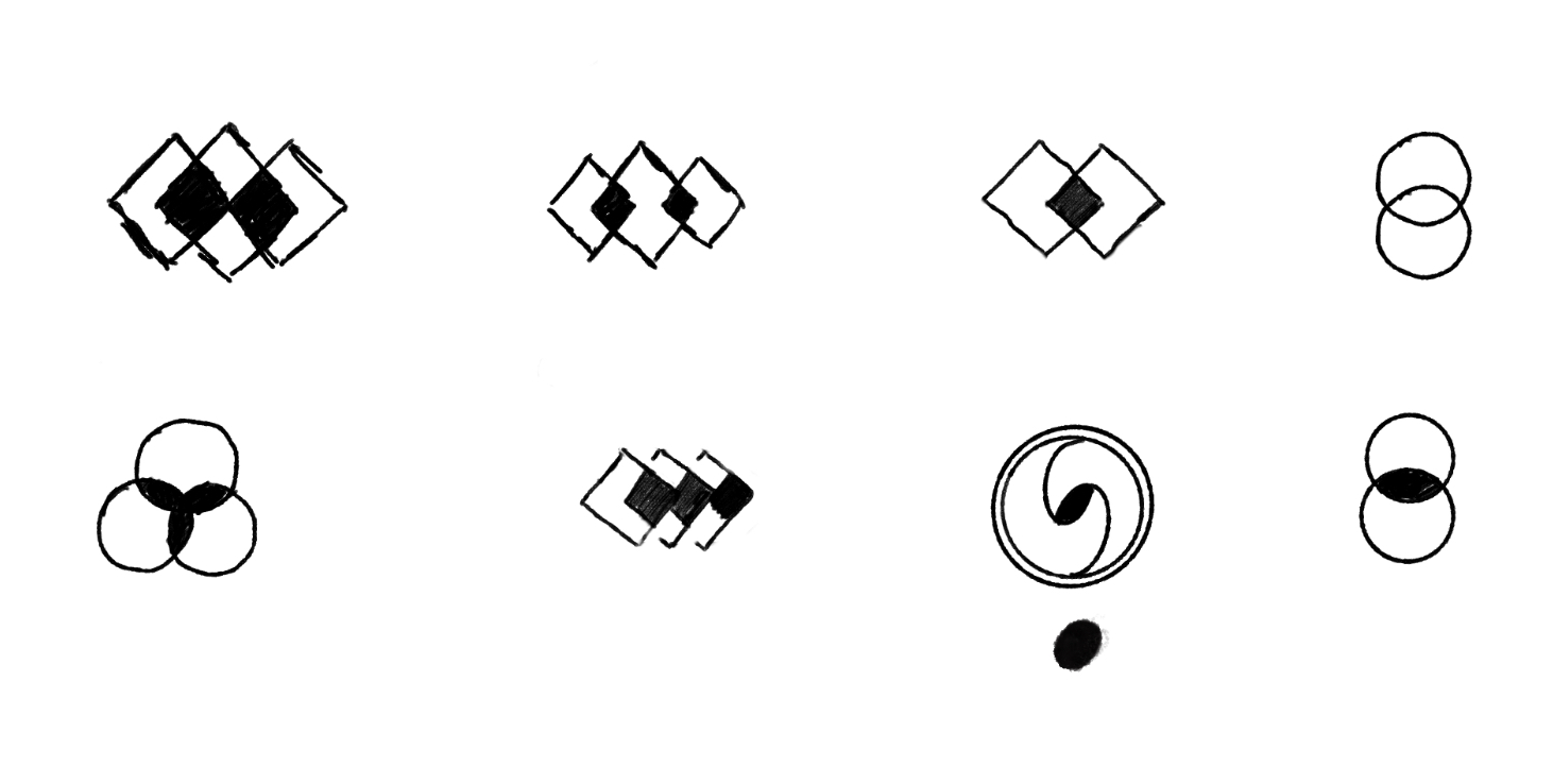
The small and big quotation marks to indicate how thoughts make a way for conversation and these elements being incorporated into the branding was important.
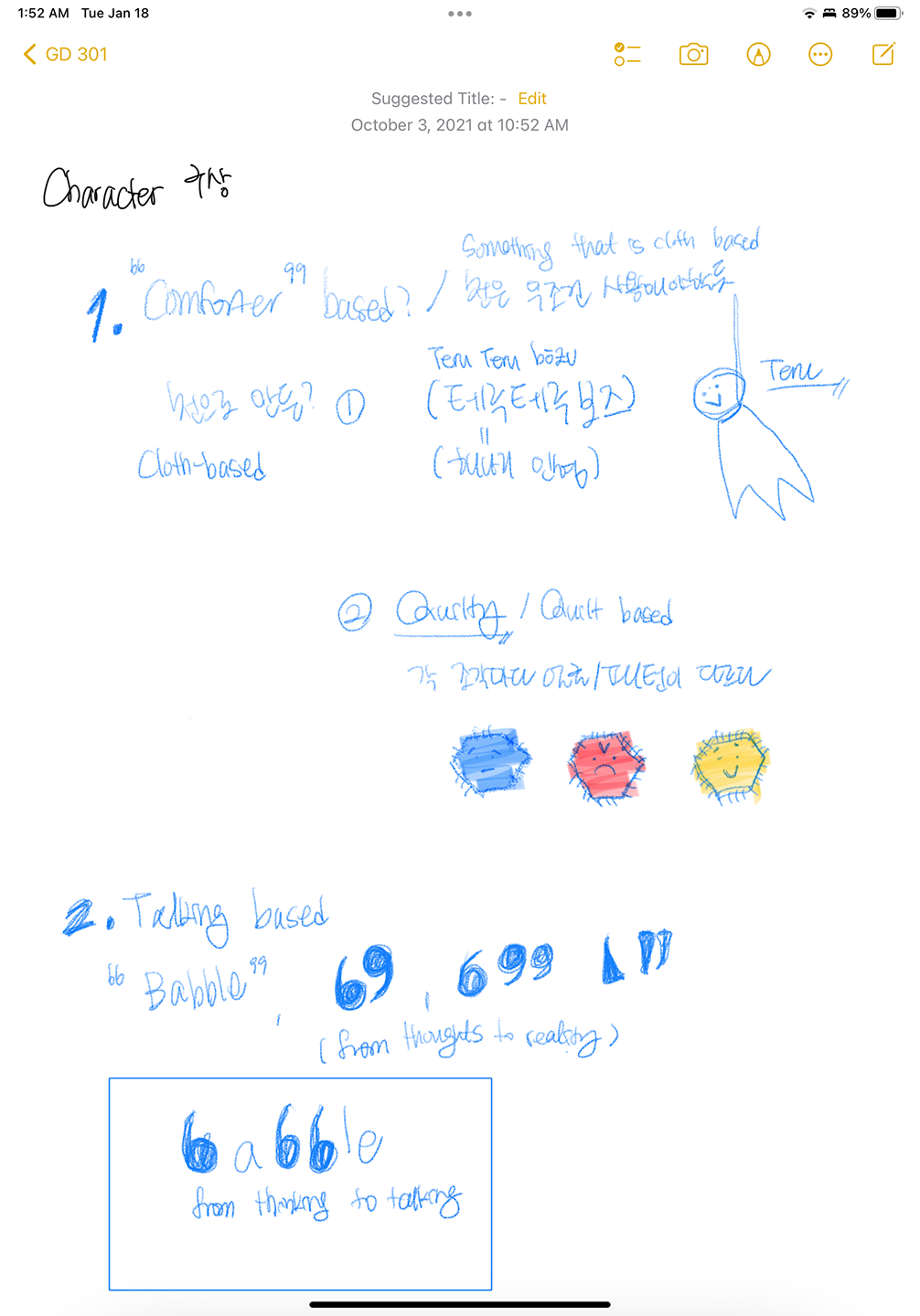
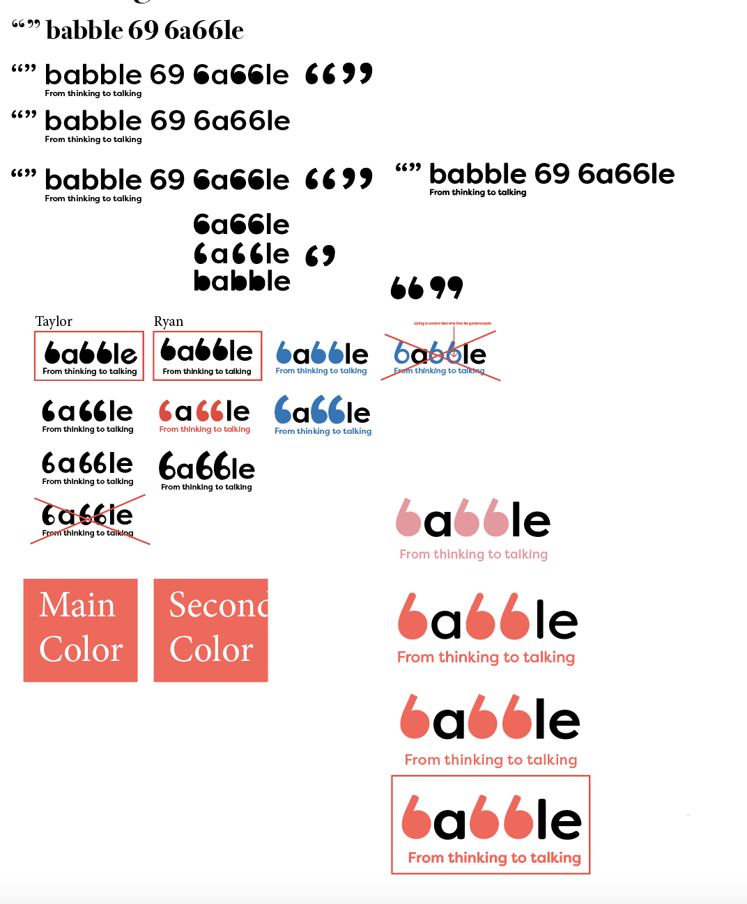

process of conceptualizing babble’s identity
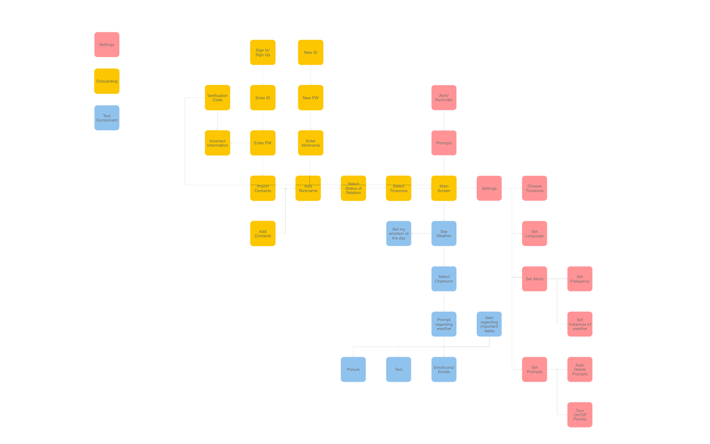
user flow
f10at introduction video
f10at
한국어WatchOS App Design
5 week project
5 week project
Challenge
f10at is a WatchOS app that is designed to assess sadness and a breathing exercise to cope with such emotions on a daily basis.Branding, UI
Illustrator, After Effects, XD
Illustrator, After Effects, XD
Solution
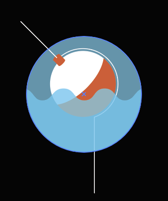
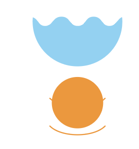
The water element came in as a strong brand identity in the start of the project and influenced the copy as well.“Are you sinking or are you floating?” 5 levels of sadness and 5 levels of happiness for 10 levels of emotional range to provide diversity of the person’s daily emotional state.
To address the sinking, a bobber bobbing along in the water to help the breathing when you are sinking.
An app animatic was also created to further promote the app with a story boarding progress.
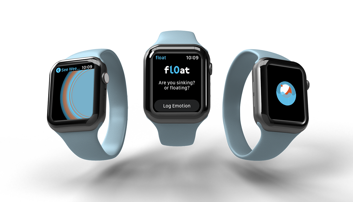
final result
Research
When thinking of a mood tracker for an Apple Watch, it was easy to think of my own emotions.“Not all people are in the peak of their happiness the all day... (add in more research based and more about the demographic of people and how it relates to the general public)”
There was a focus on addressing the daily monotony of sadness and the little bursts of happiness, words relating to water to reflect the branding as well.
emotion tracking for 3 weeks
Process


branding elements of f10at
user flow


story boarding

SYNTHESIS
한국어iOS app/website design, Event design
15 week project
15 week project
Challenge
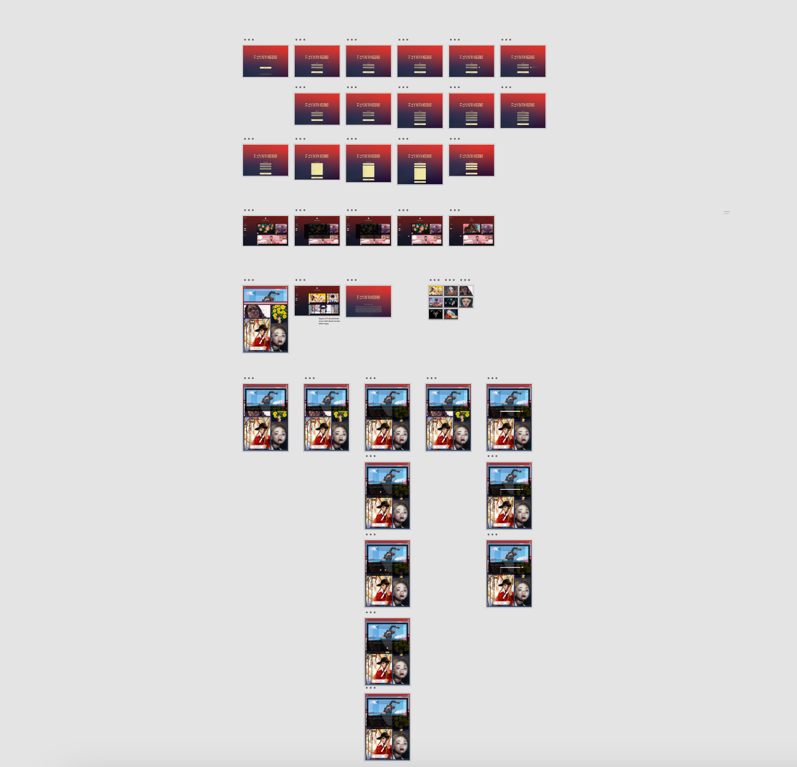
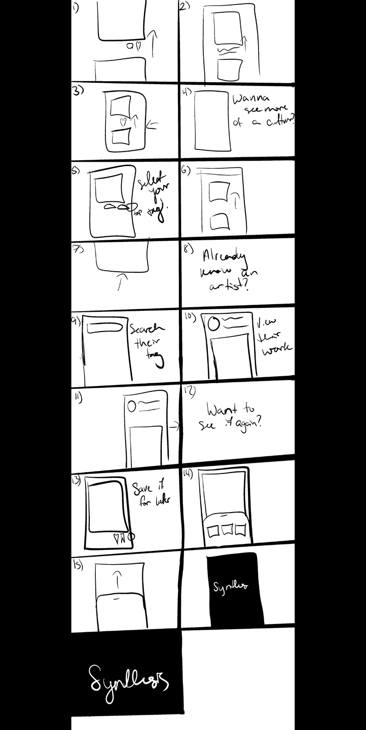
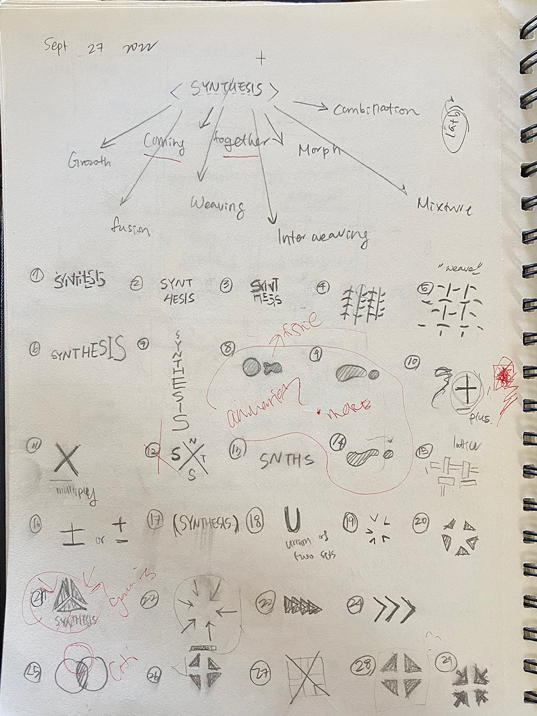
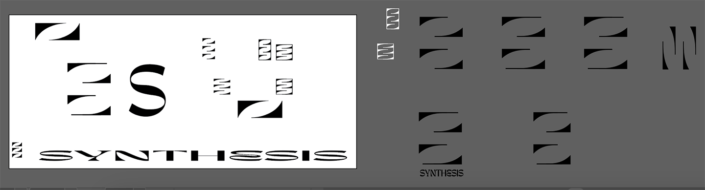
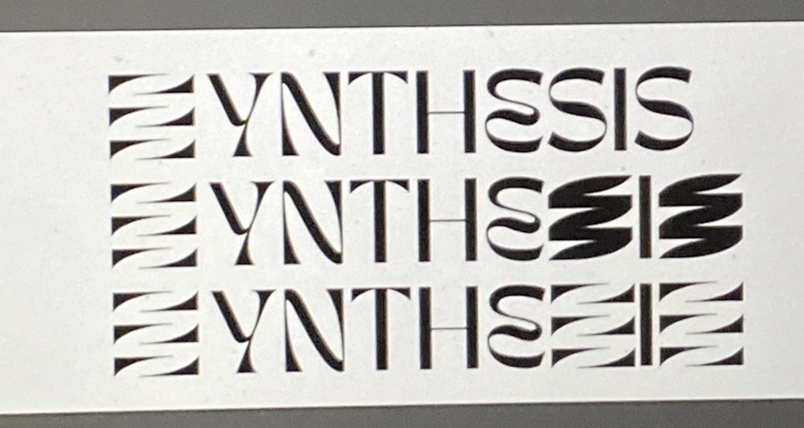
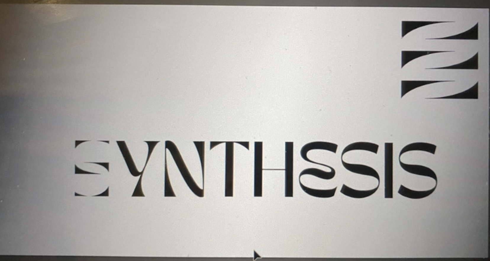
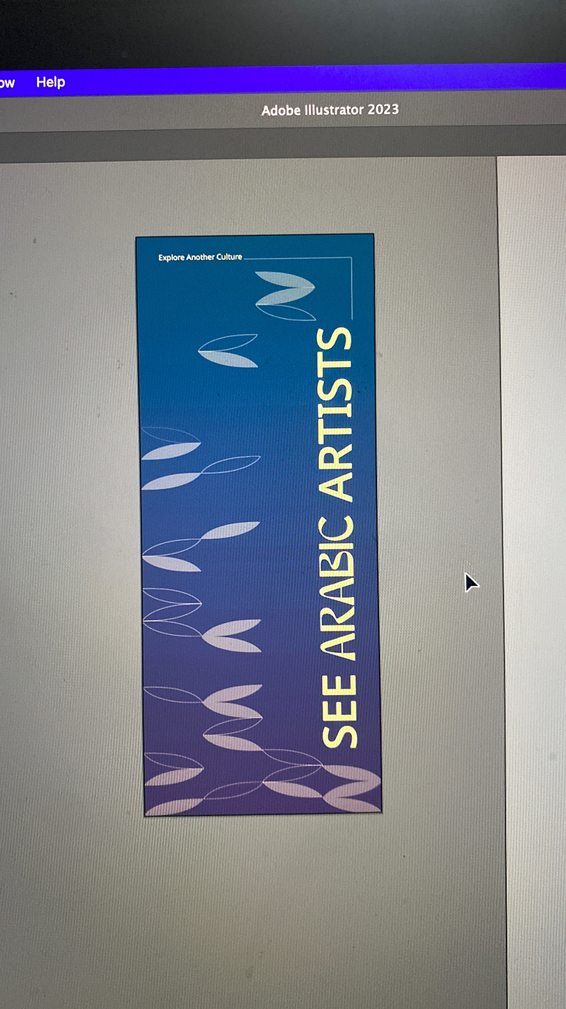
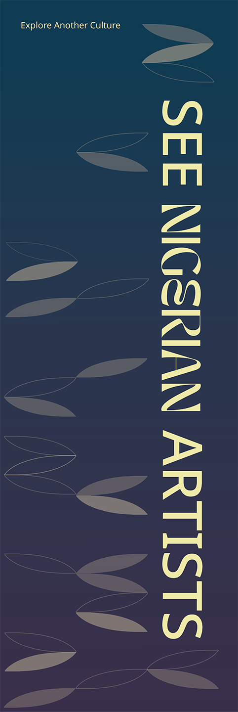
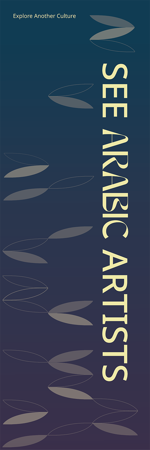
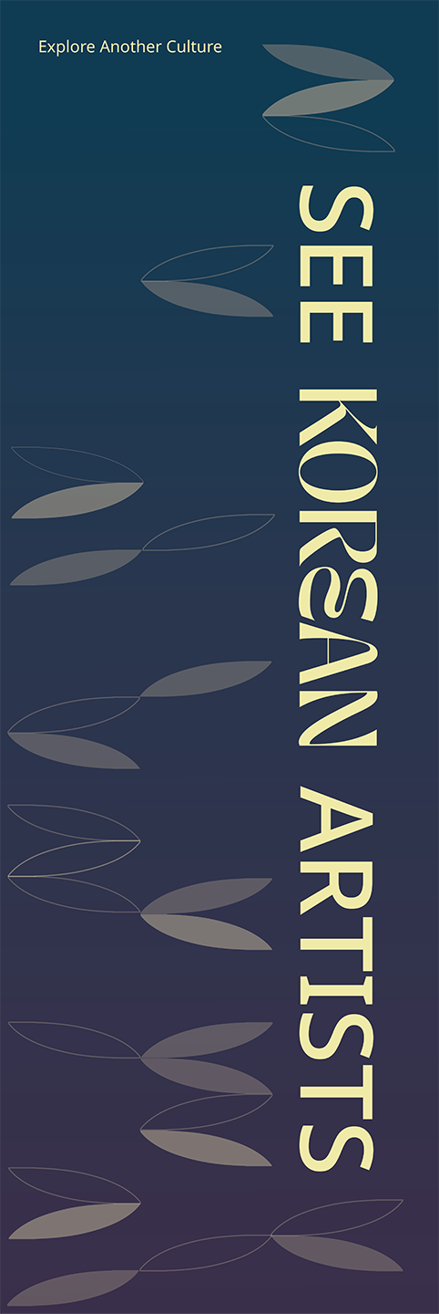
Synthesis means “the combination of ideas to form a theory or system.”SYNTHESIS is an app & website dedicated to bringing artists to the forefront of the conversation of Cultural Appreciation vs. Appropriation.
UX, UI, Branding
XD, After Effects, Illustrator, Photoshop
XD, After Effects, Illustrator, Photoshop
Solution
SYNTHESIS is a project that spanned across the full semester, with multiple collaborators from different fields.we wanted SYNTHESIS to be a safe place for artists to come together to learn, share and embrace each other’s culture through art of different mediums. It is a judgment free zone where people feel open and free to show off different aspects, and potentially unknown elements of their culture.
Collaboration with Aeva Roth & Zhongwei Ren & Rachel Smith
Design responsiblites included Branding, Website design, Ideation of launch event, Launch event static posters, Case study
Design responsiblites included Branding, Website design, Ideation of launch event, Launch event static posters, Case study
Project Componenets
This was a multifaceted project with multiple deliverablesBranding
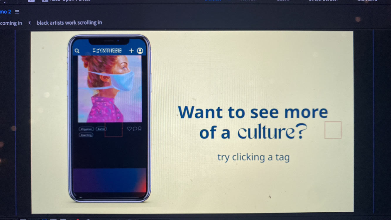
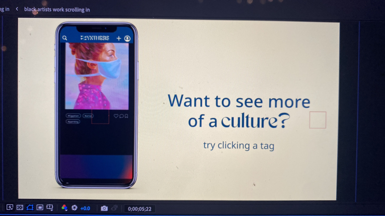
App & Website
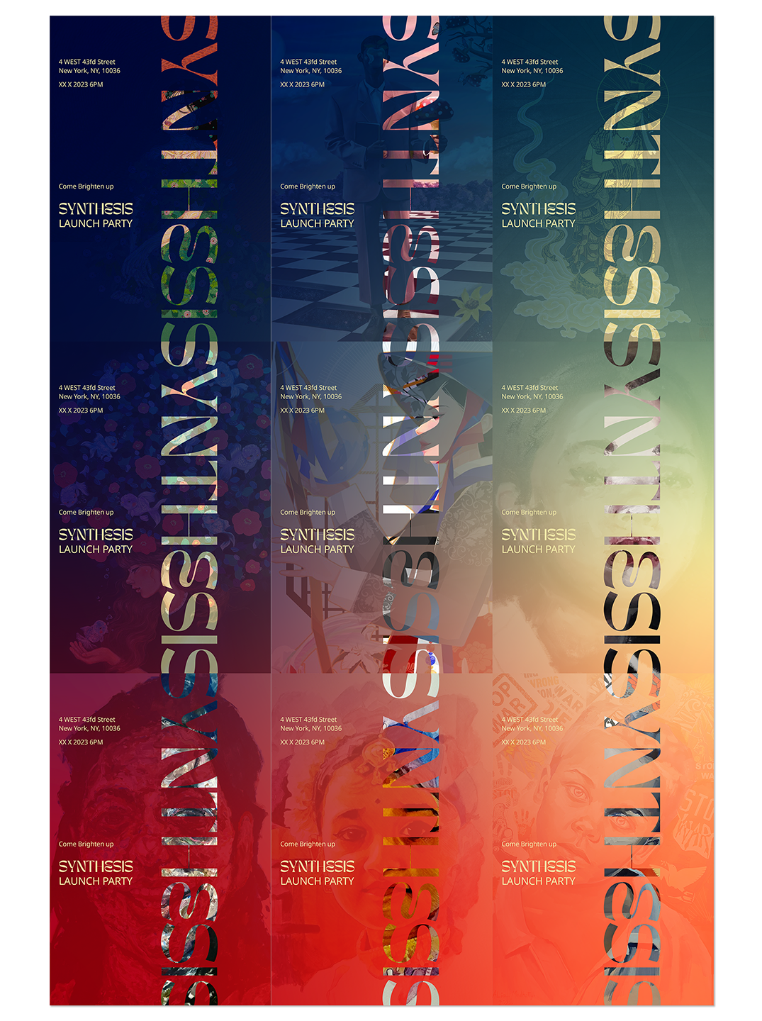
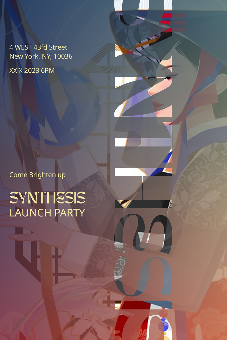
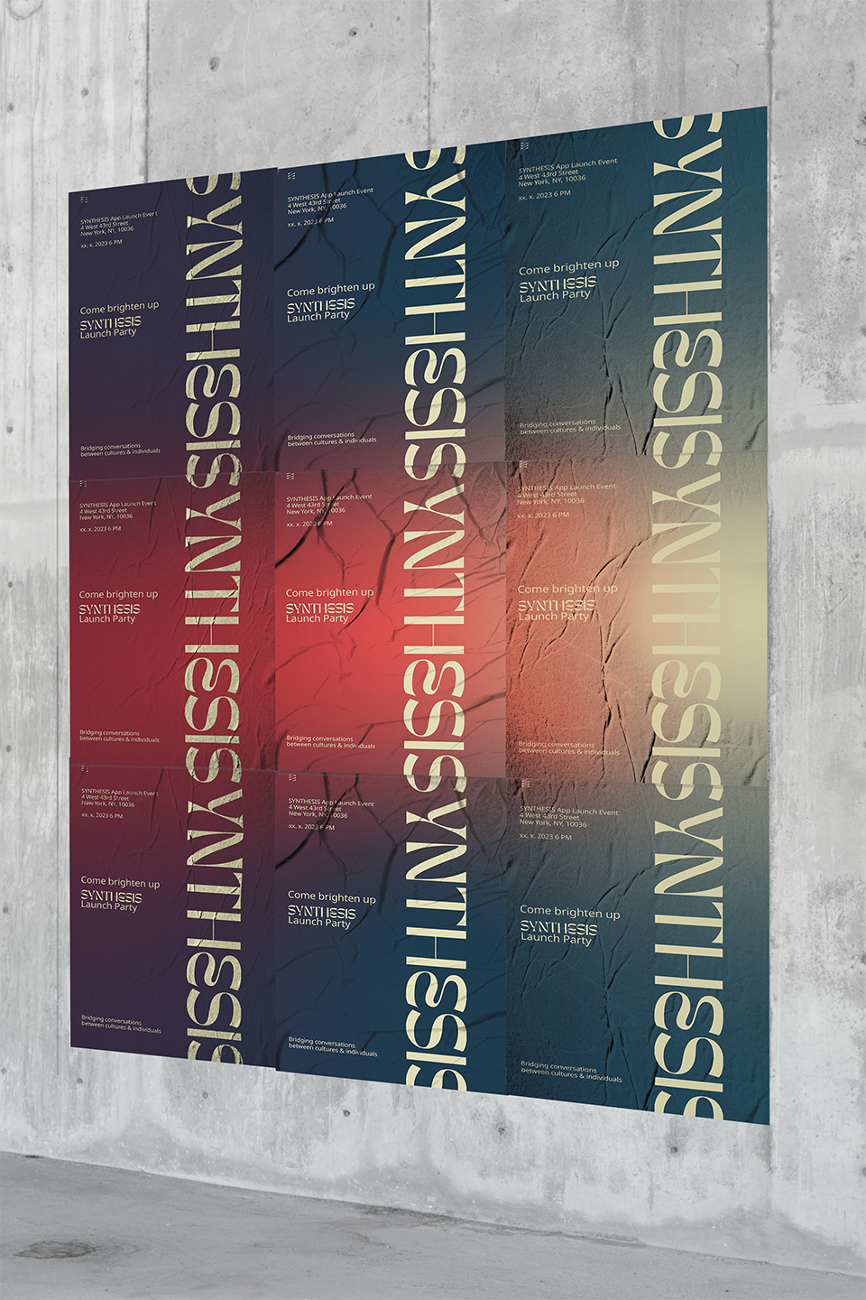
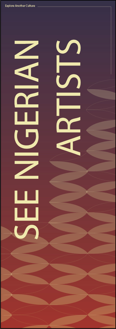
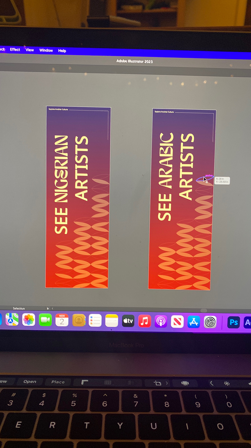
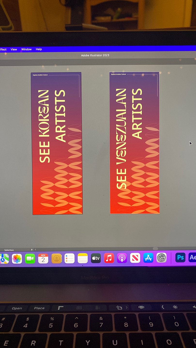
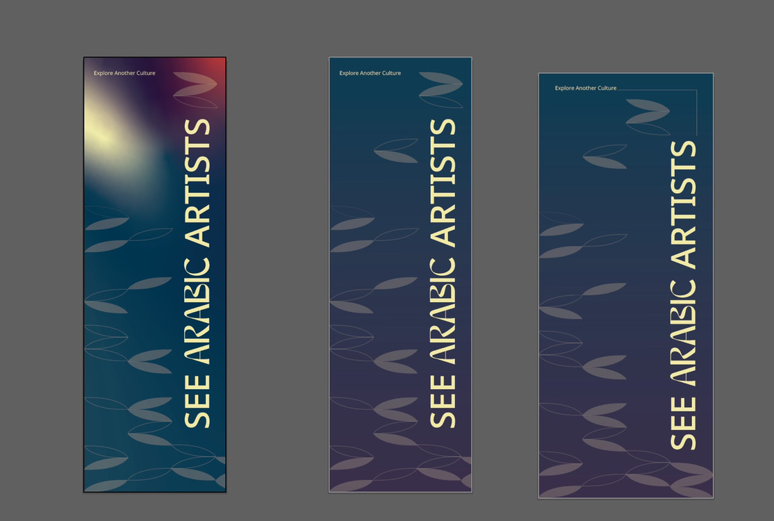
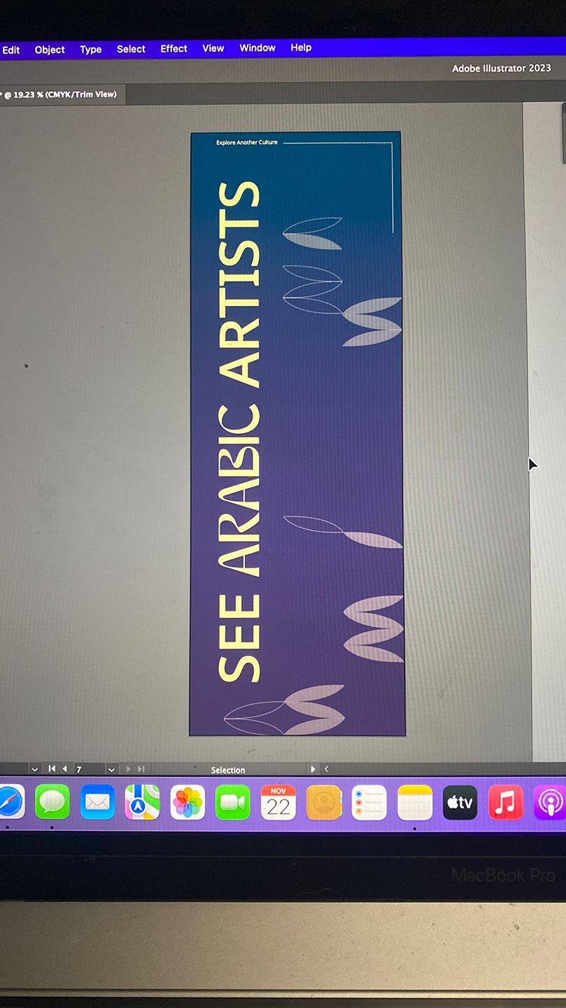
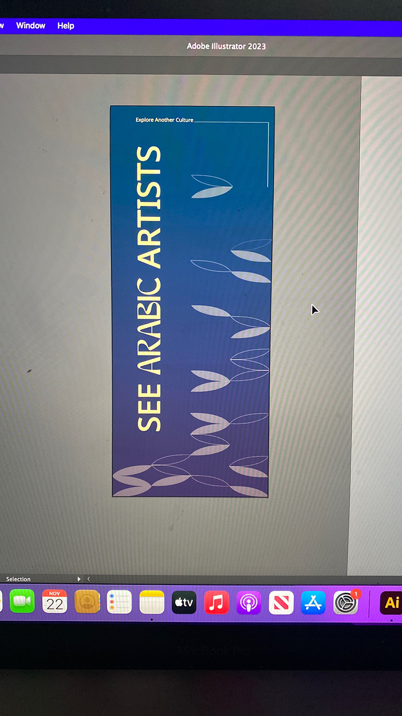
Launch Event Promotional Materials
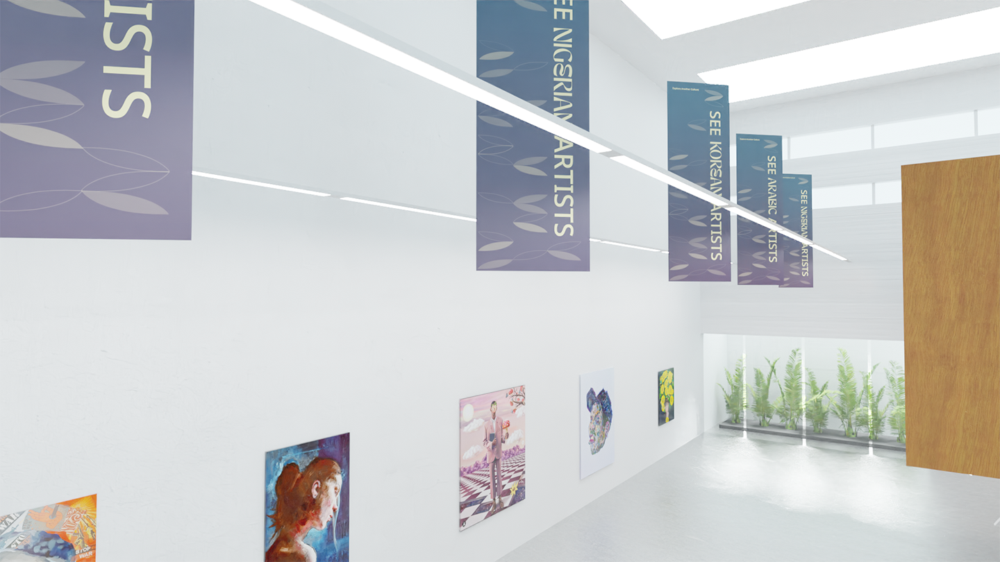
Gallery Spaces & Launch Event Banners
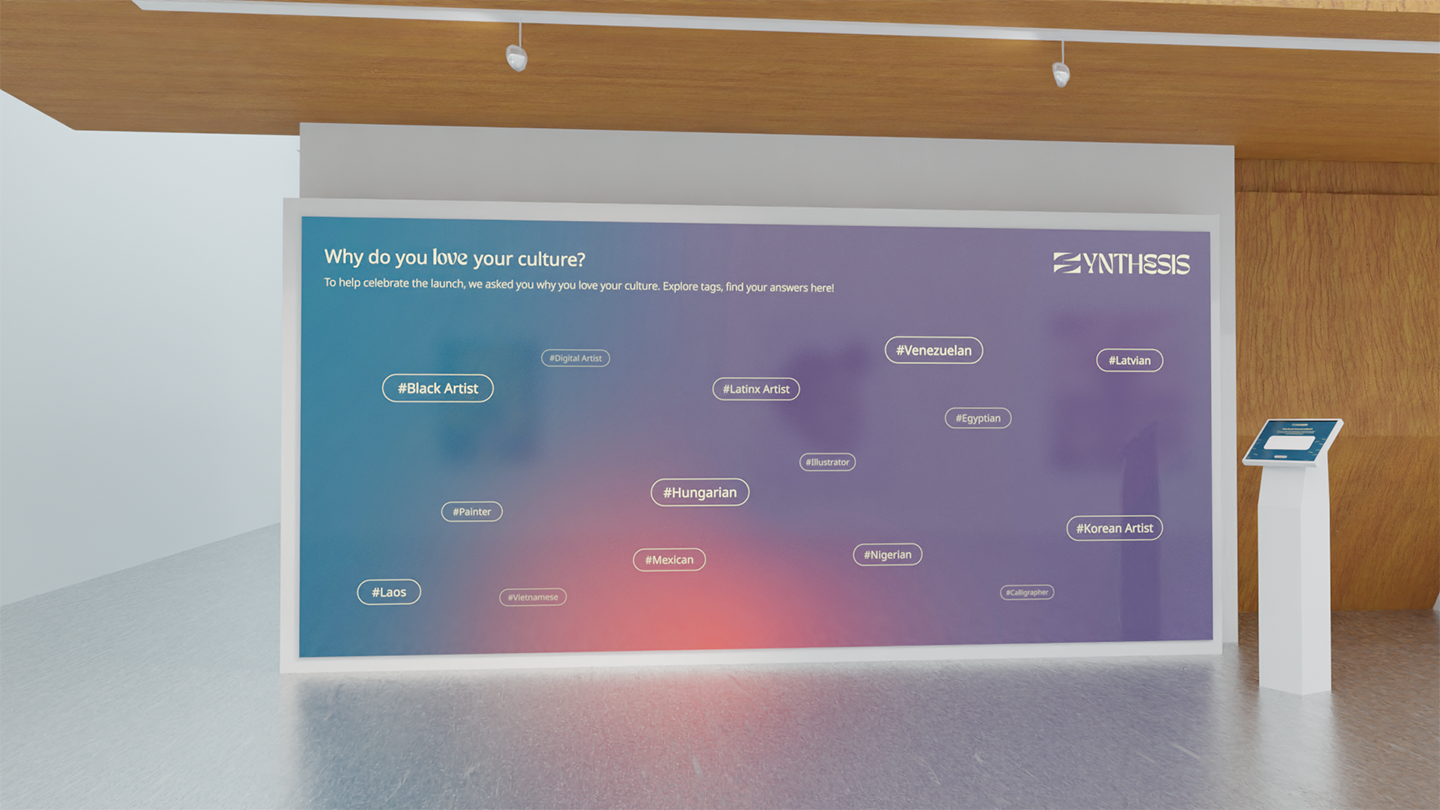
Interactive Wall & Kiosk
Case Study
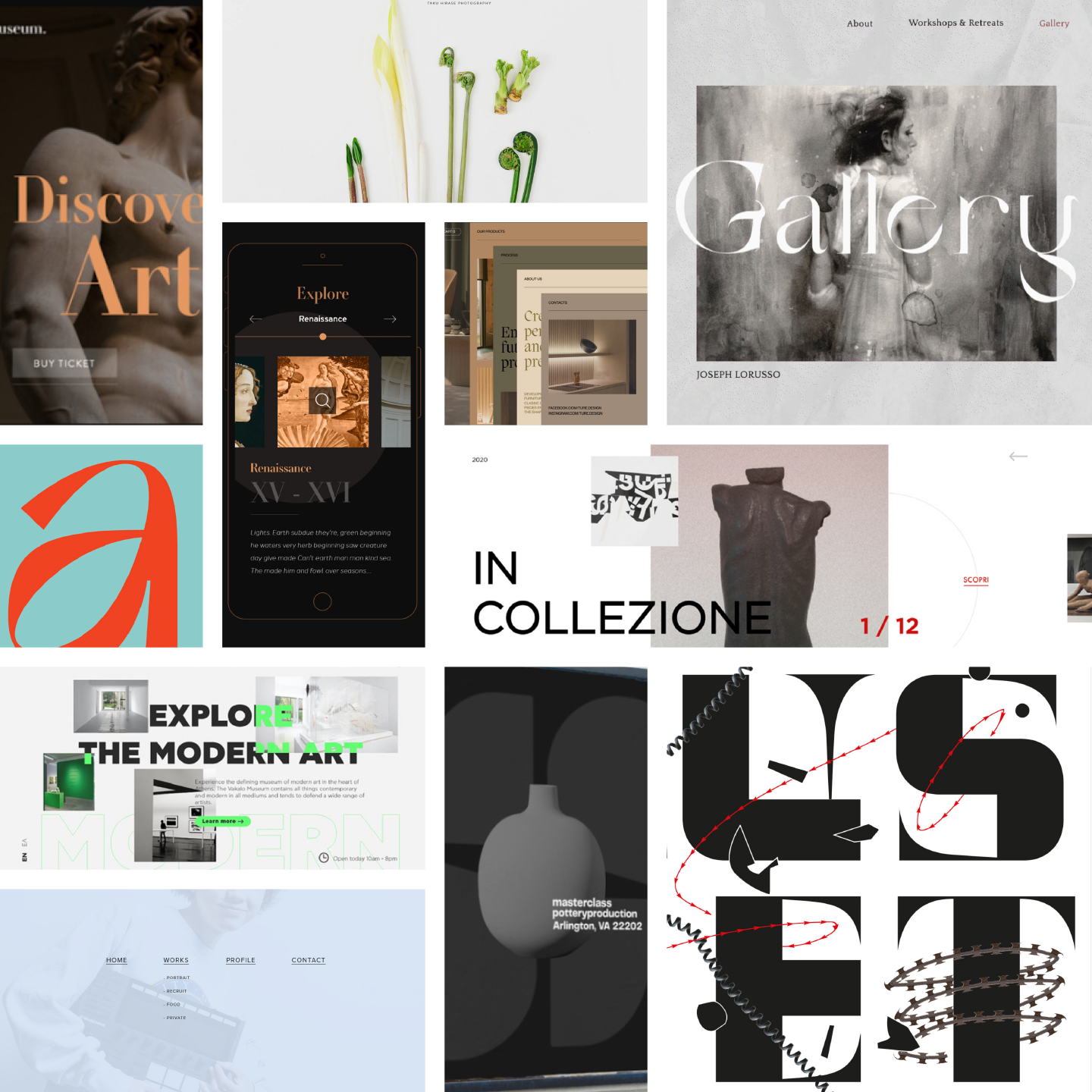
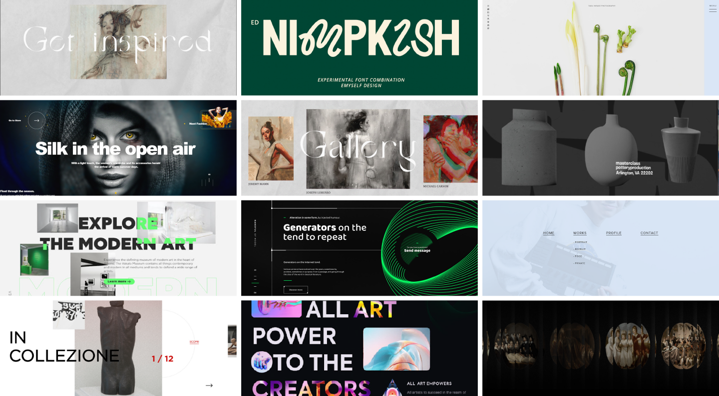
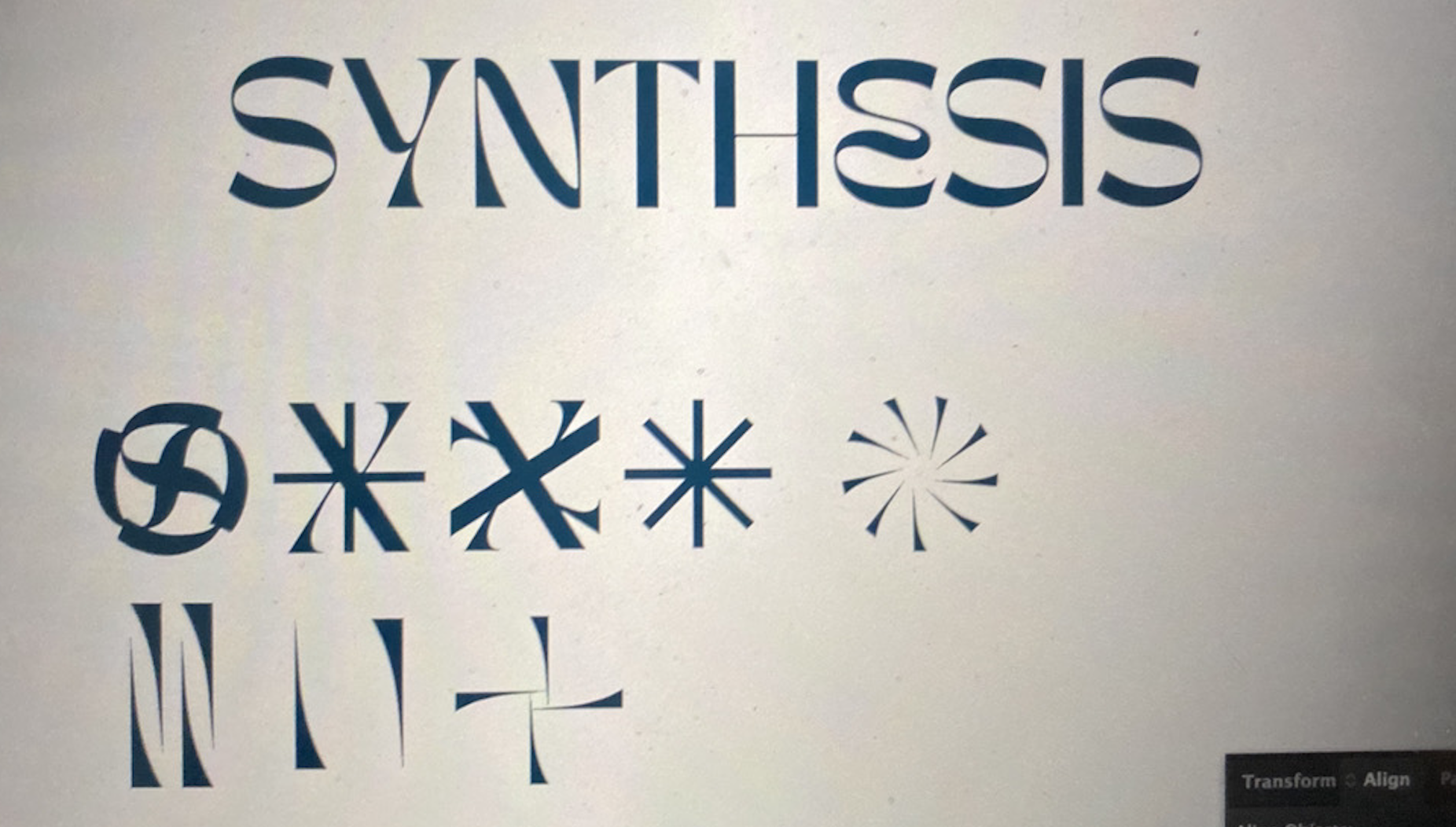
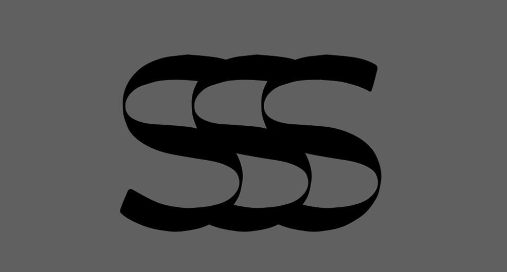
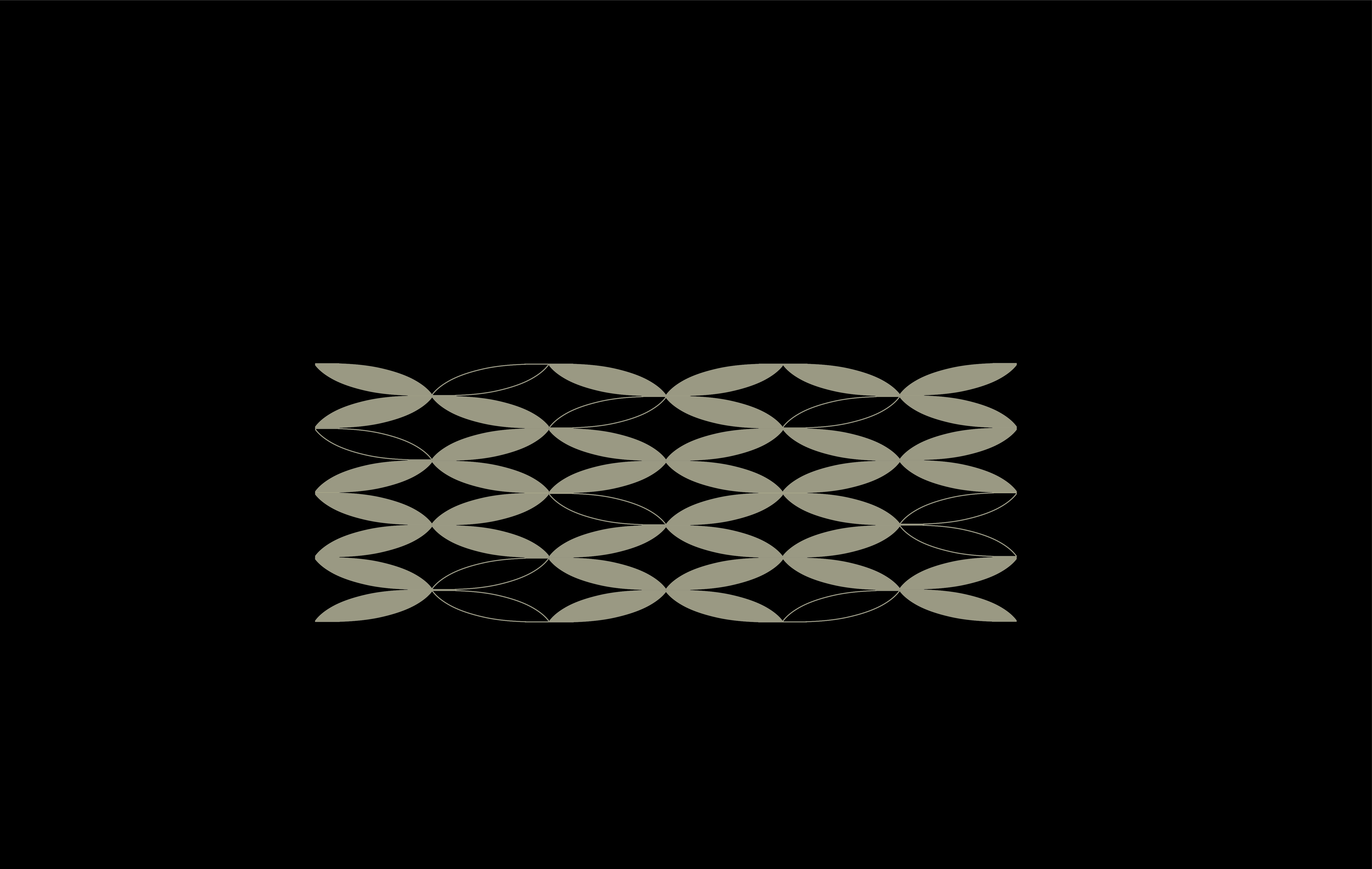
responsive wordmark
launch event promotional video
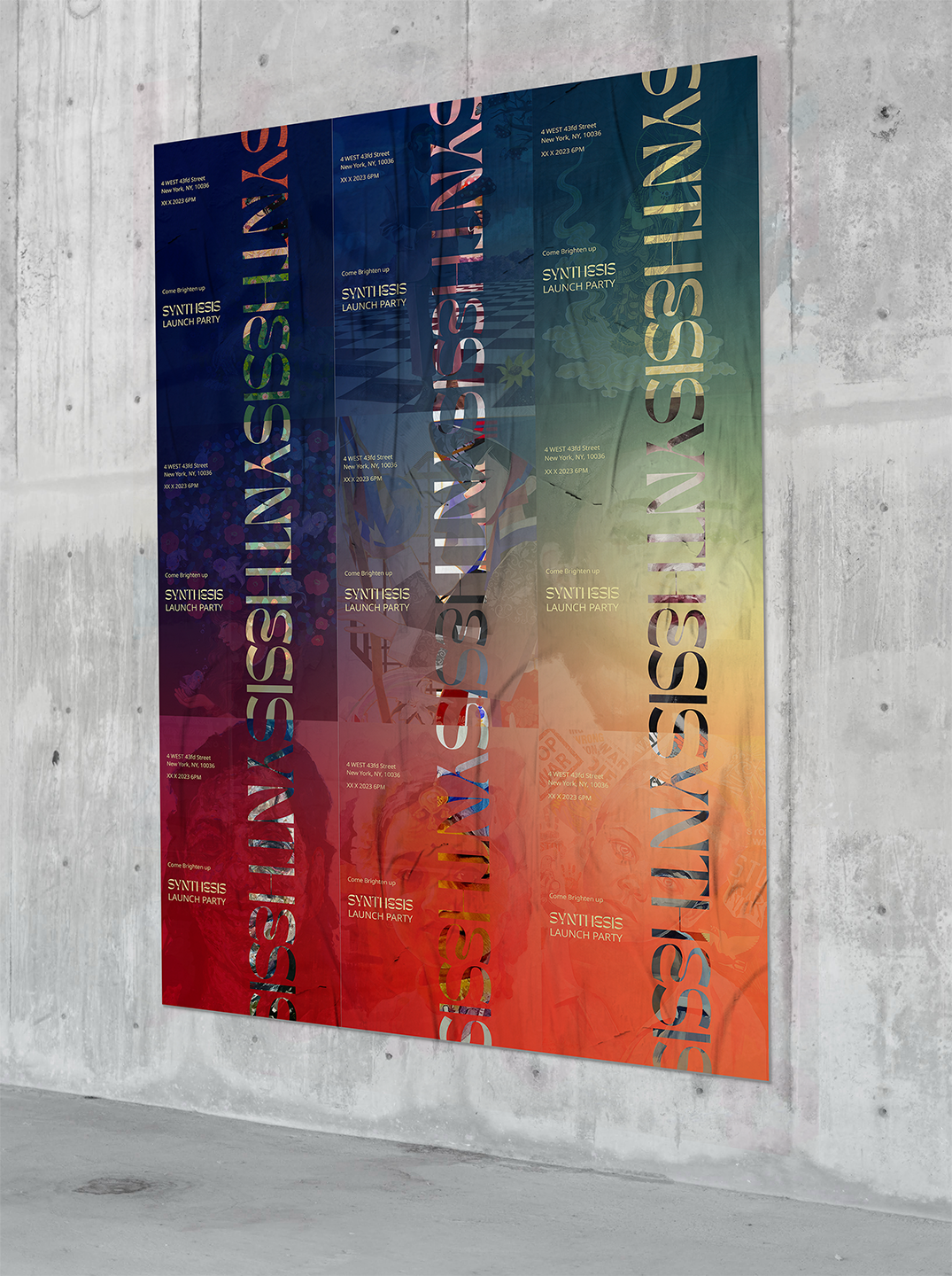
launch event animated poster


launch event interactive wall
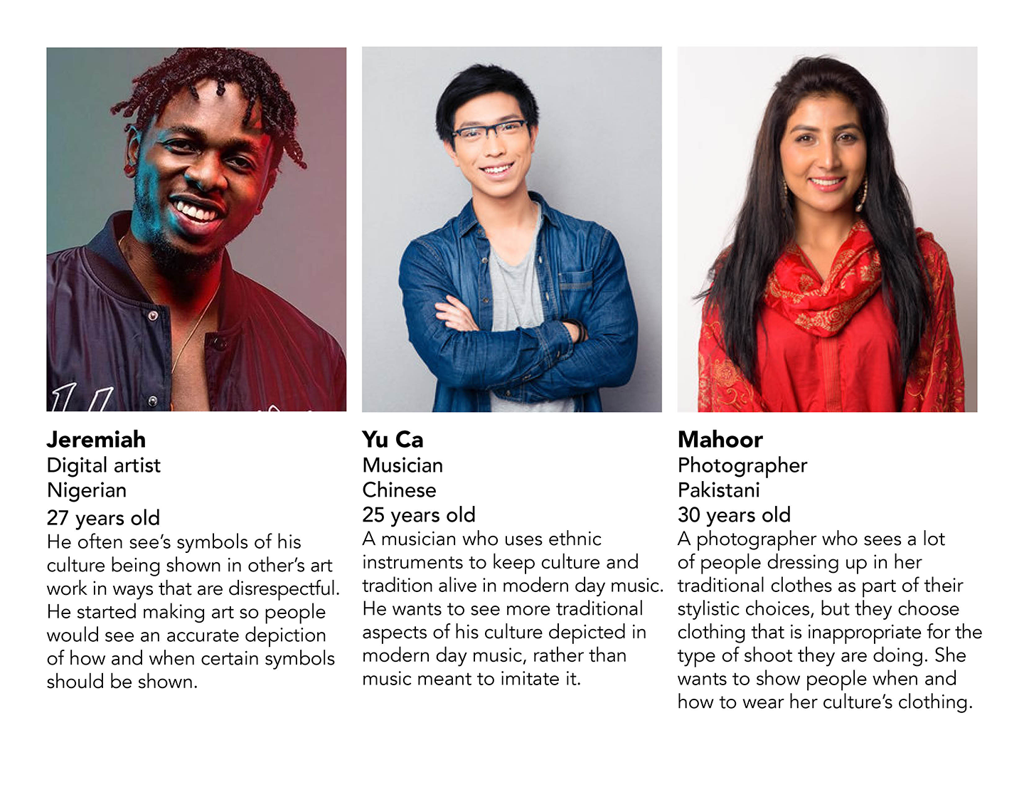
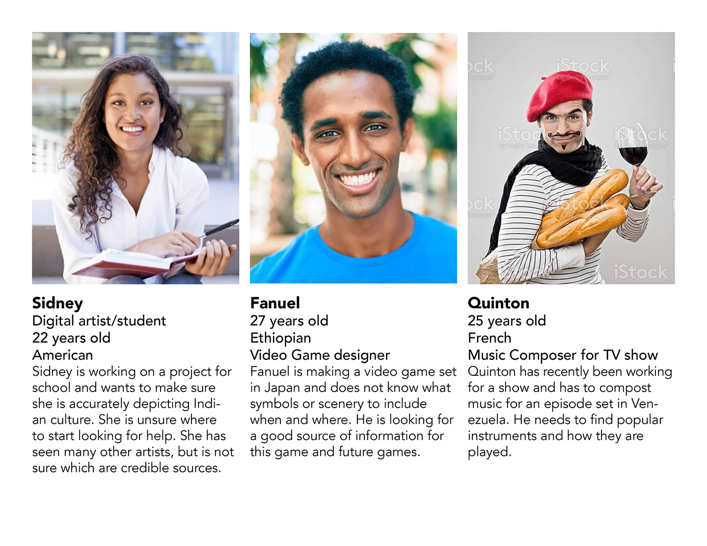
Research
Our research was composed of competitor analysis, appreciation vs. appropriation, and various focus groups testing various functionality issues of the app and website.


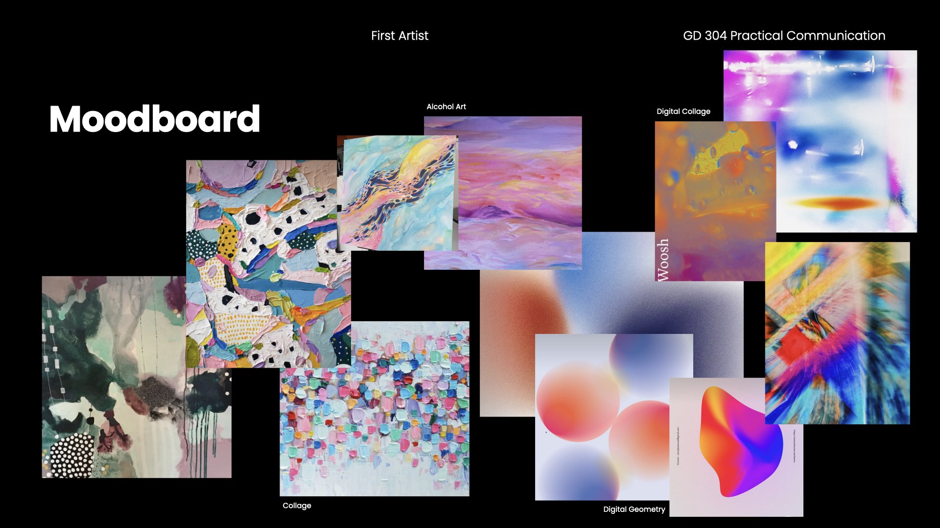
moodboard
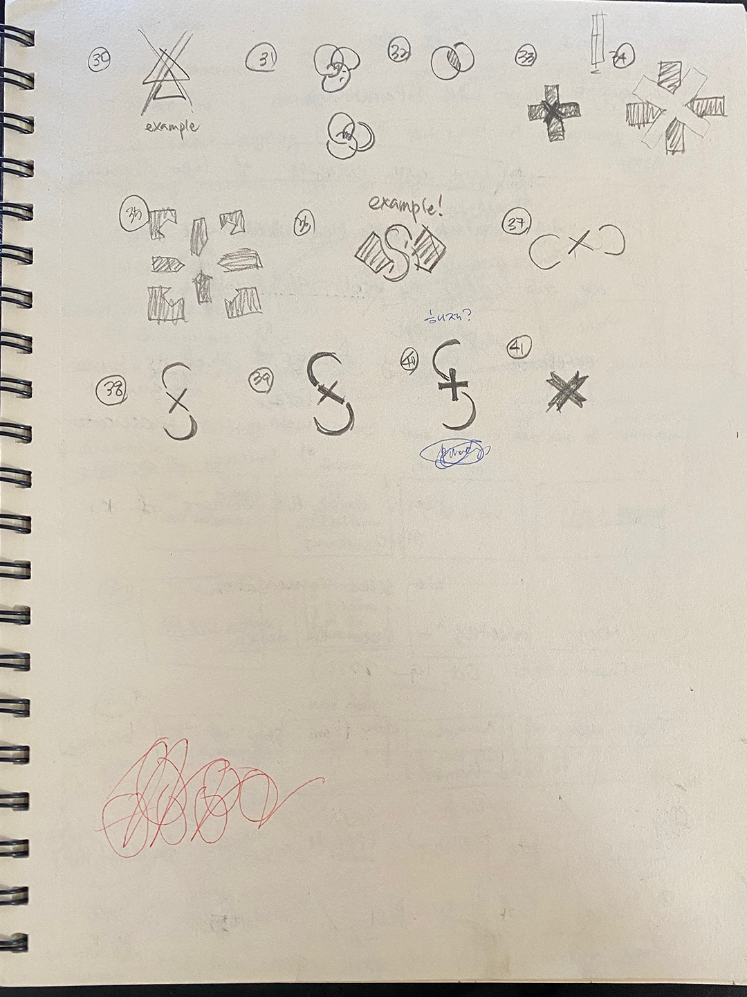
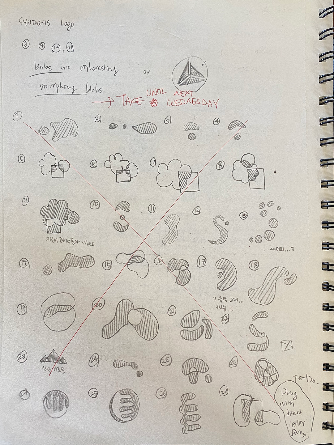
Process
We had to approach this project with a careful hand and an open mind to make sure that we could include everyone’s opinions and also get our message across.We had to be patient with our collaborators while asking for their help, and we had to understand if people refused to participate in our project.
moodboards
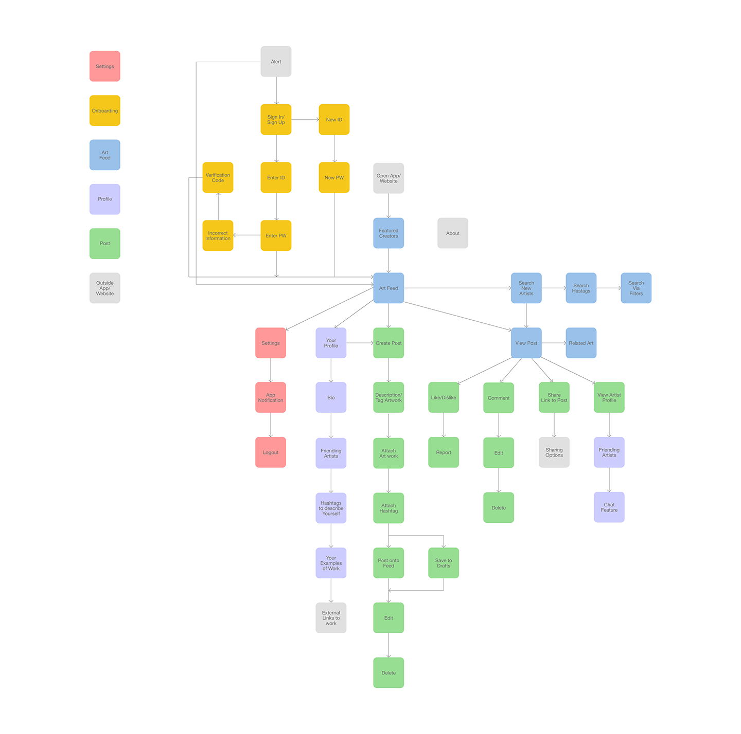

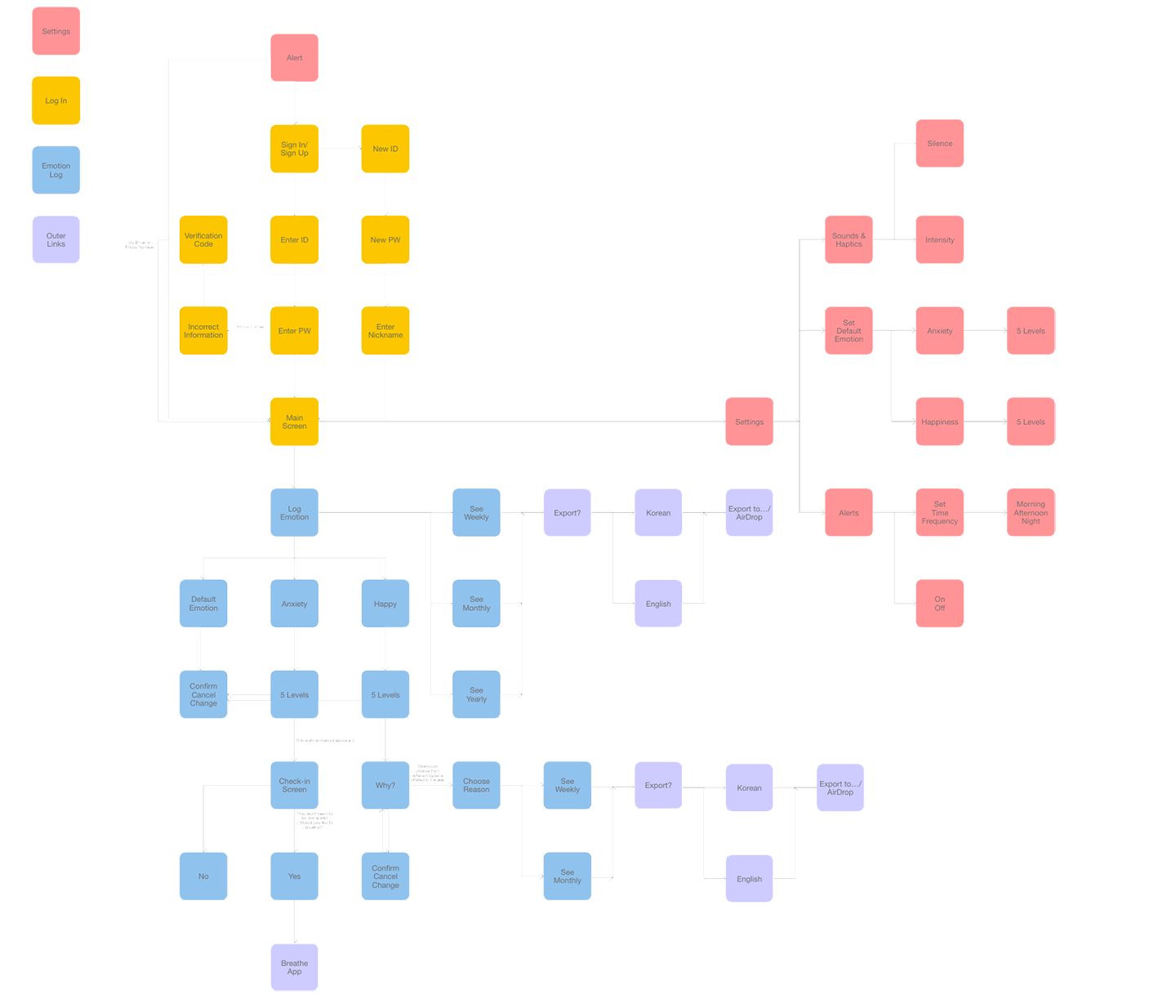
user flow of app & user journey

Branding


Launch Event
We decided the best way to promote the launch of the app and website was to hold multiple events at art galleries across the world showing off our featured artists.
Promtional Materials
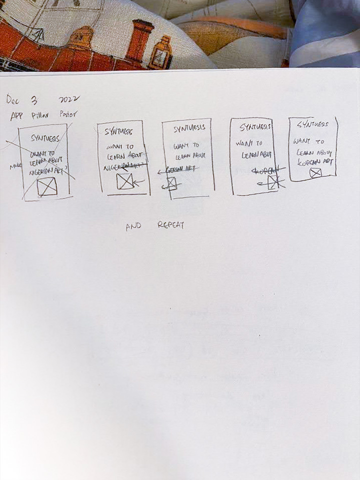
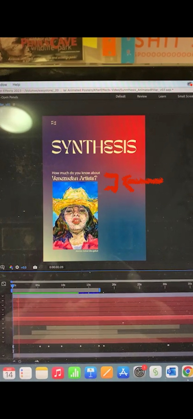
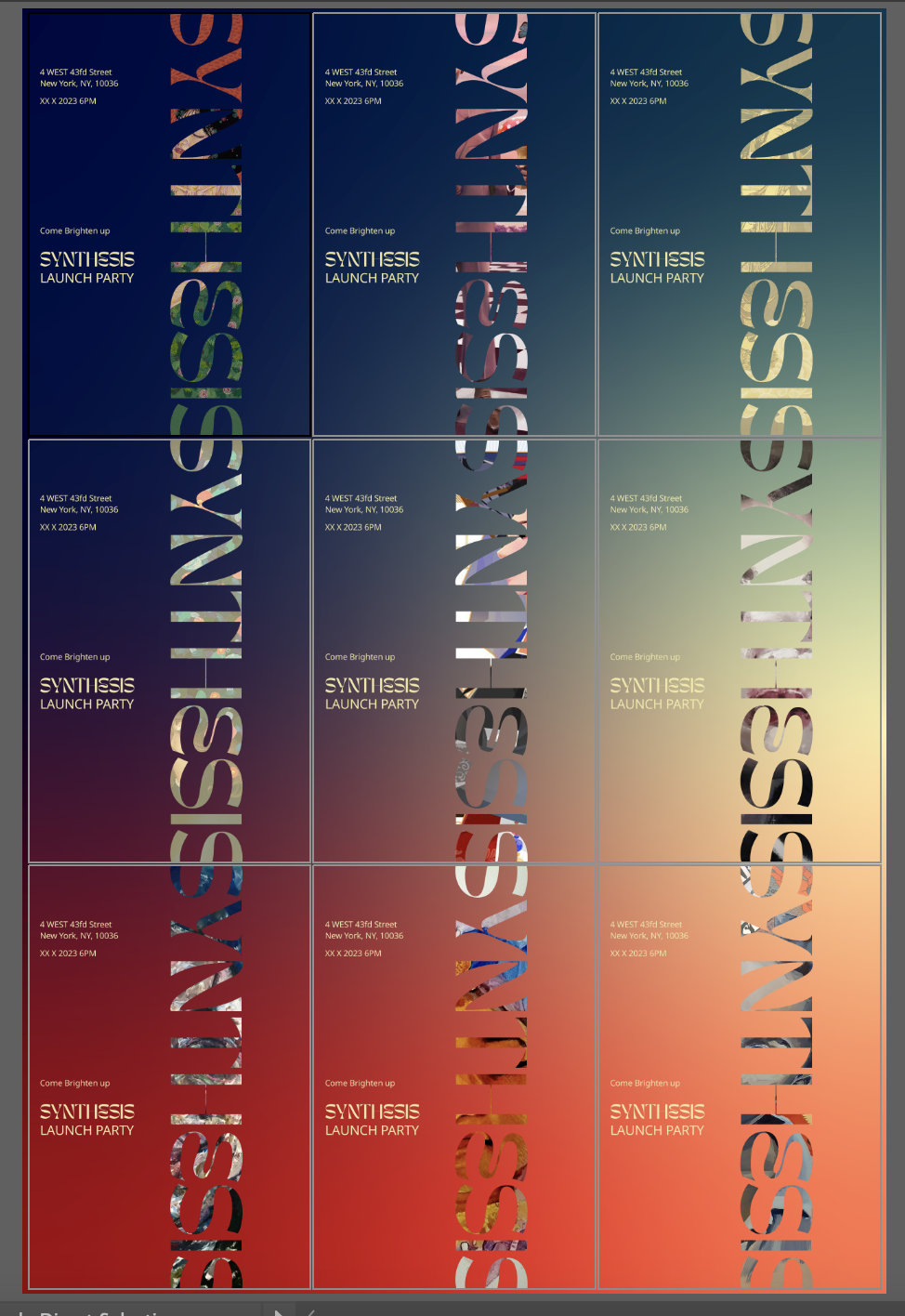
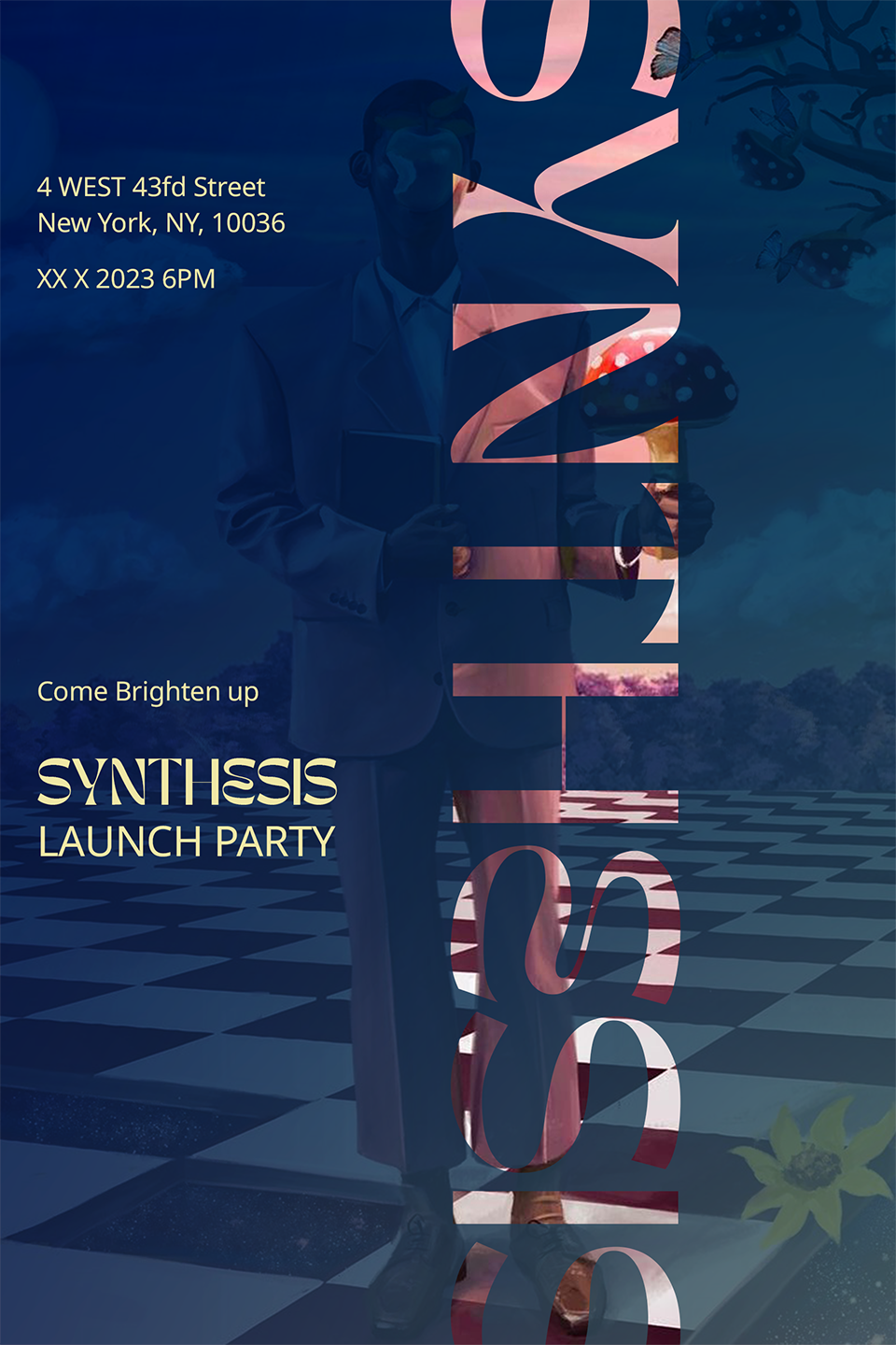
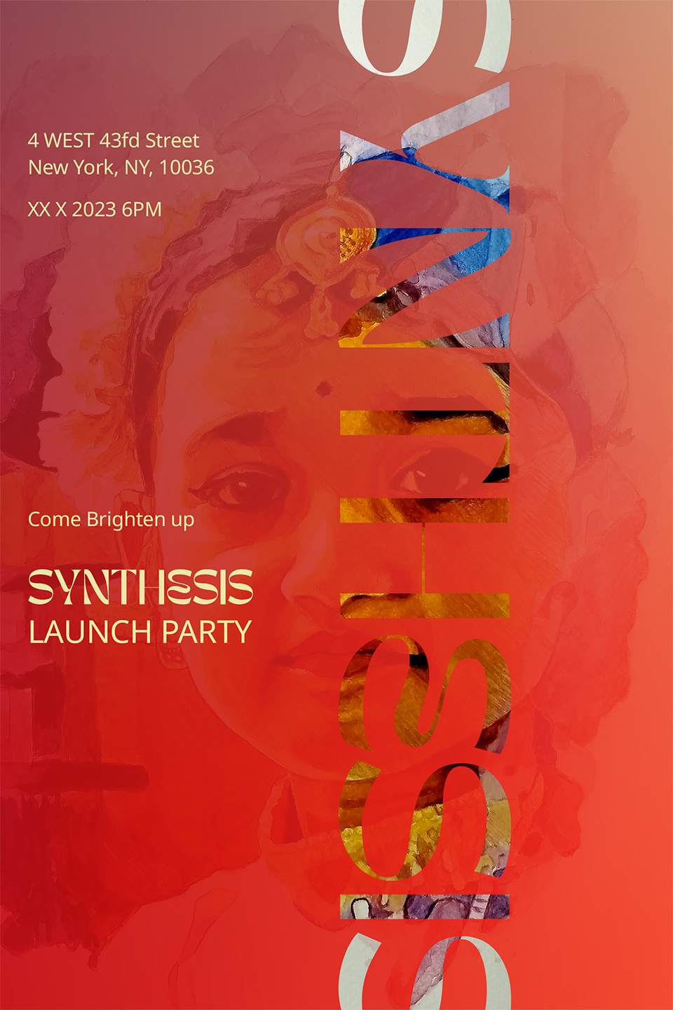
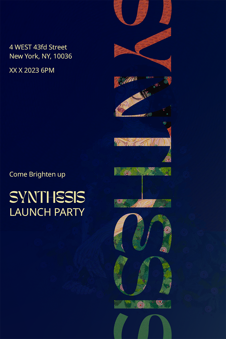
process of animated poster
![]()
![]()
![]()
![]() process of static grid poster
process of static grid poster
![]()
![]()
![]()
![]() individual posters of the grid
individual posters of the grid

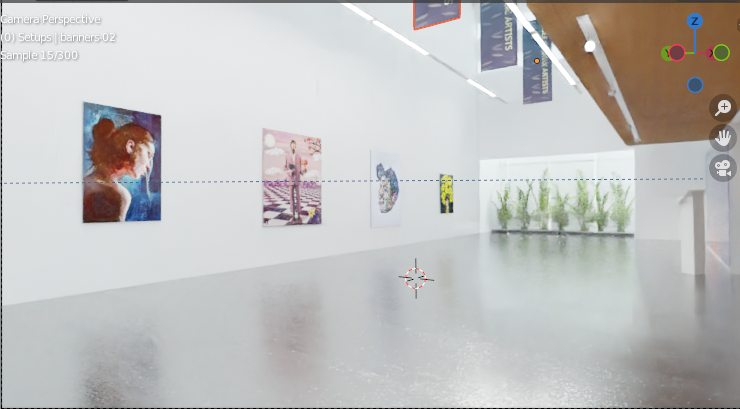
Gallery Spaces & Banners
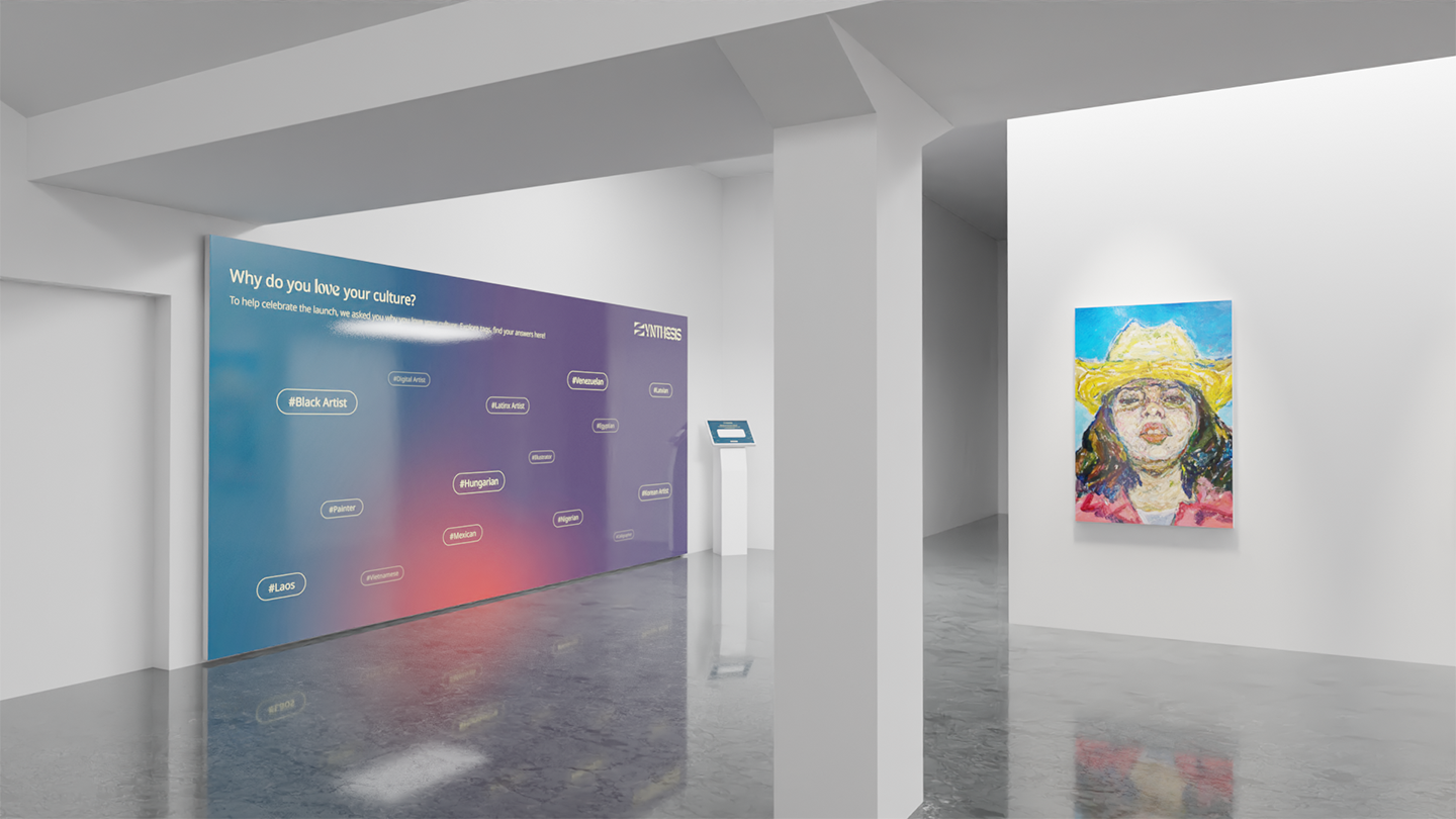
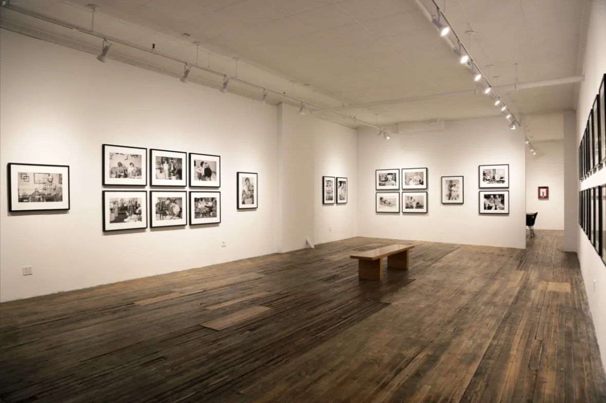
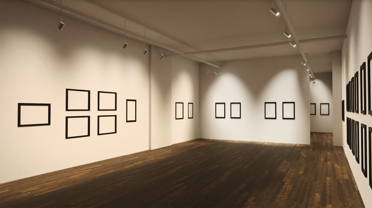
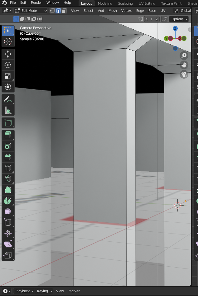
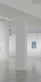
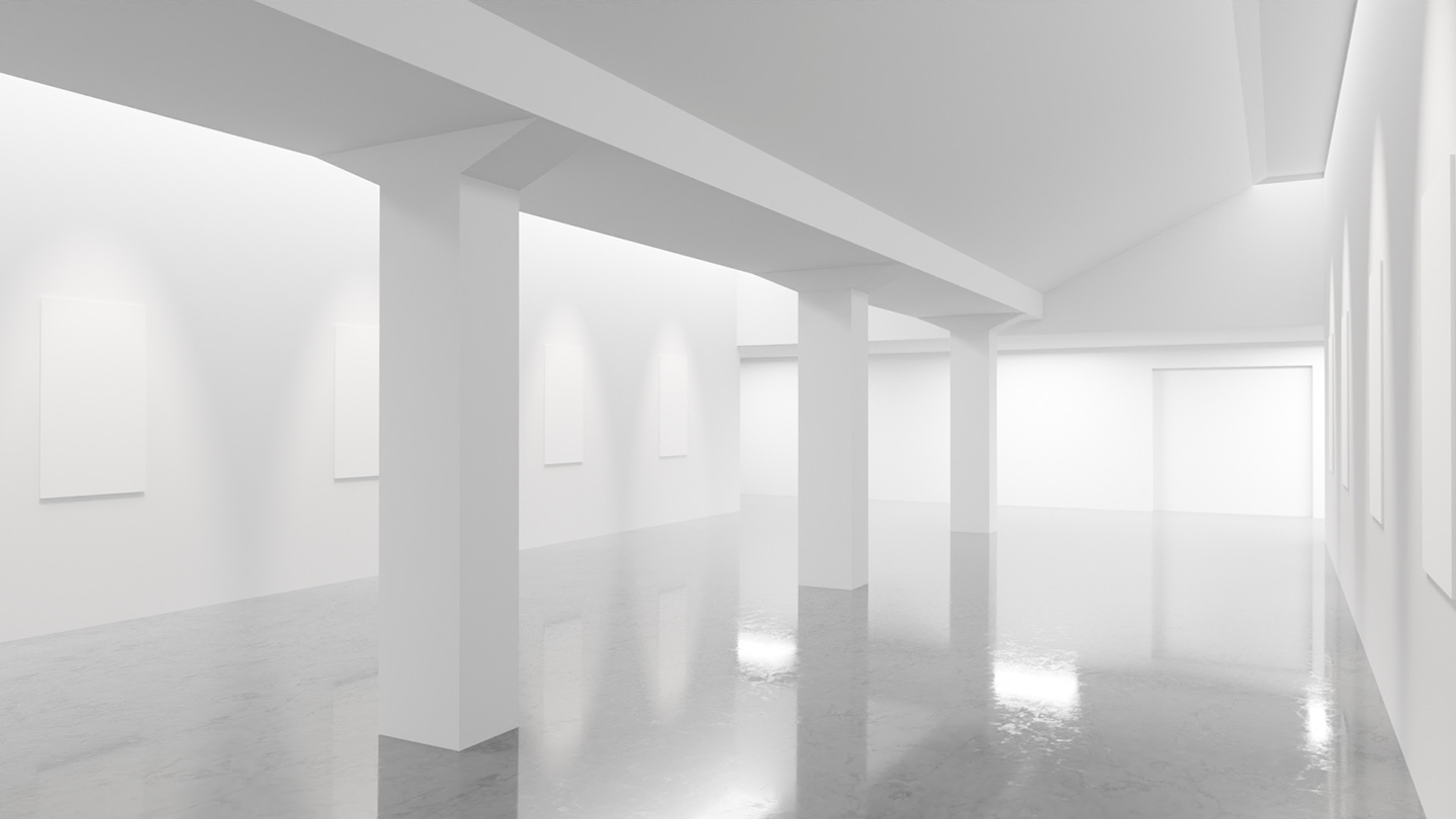
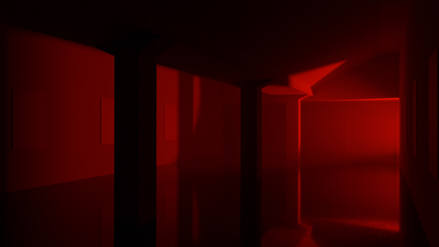
Since SYNTHESIS is about sharing art from different cultures, we thought an art gallery would be the best way to show what our app and website do in real life. These galleries would be located in Singapore, New York City, and São Paulo.These locations were chosen since they are all very populated cities known for their art and the variety of people who live there and come from different backgrounds. (All buildings in the photos are real galleries in each of the cities, created in Blender based off blueprints.)
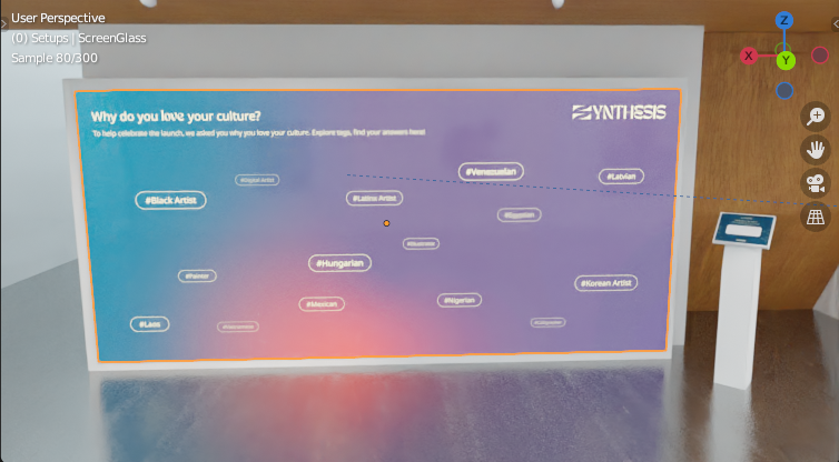


Interactive Wall
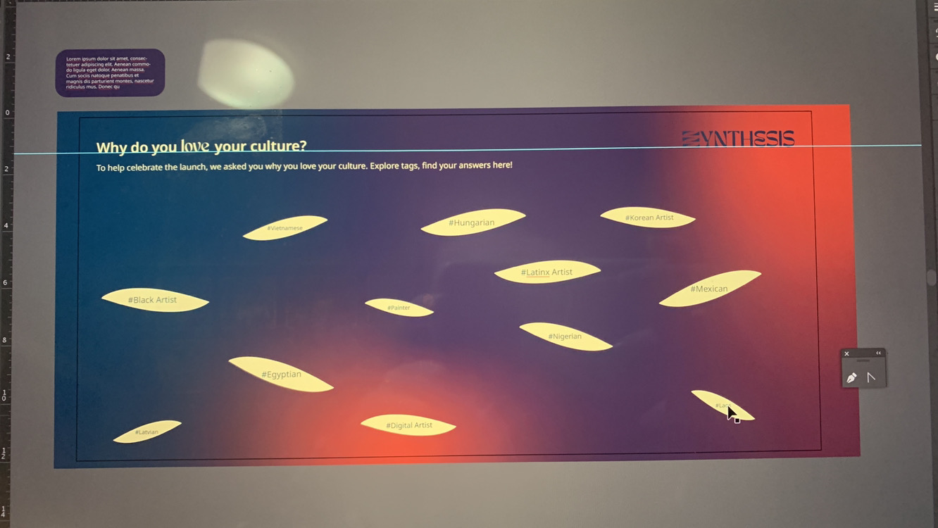
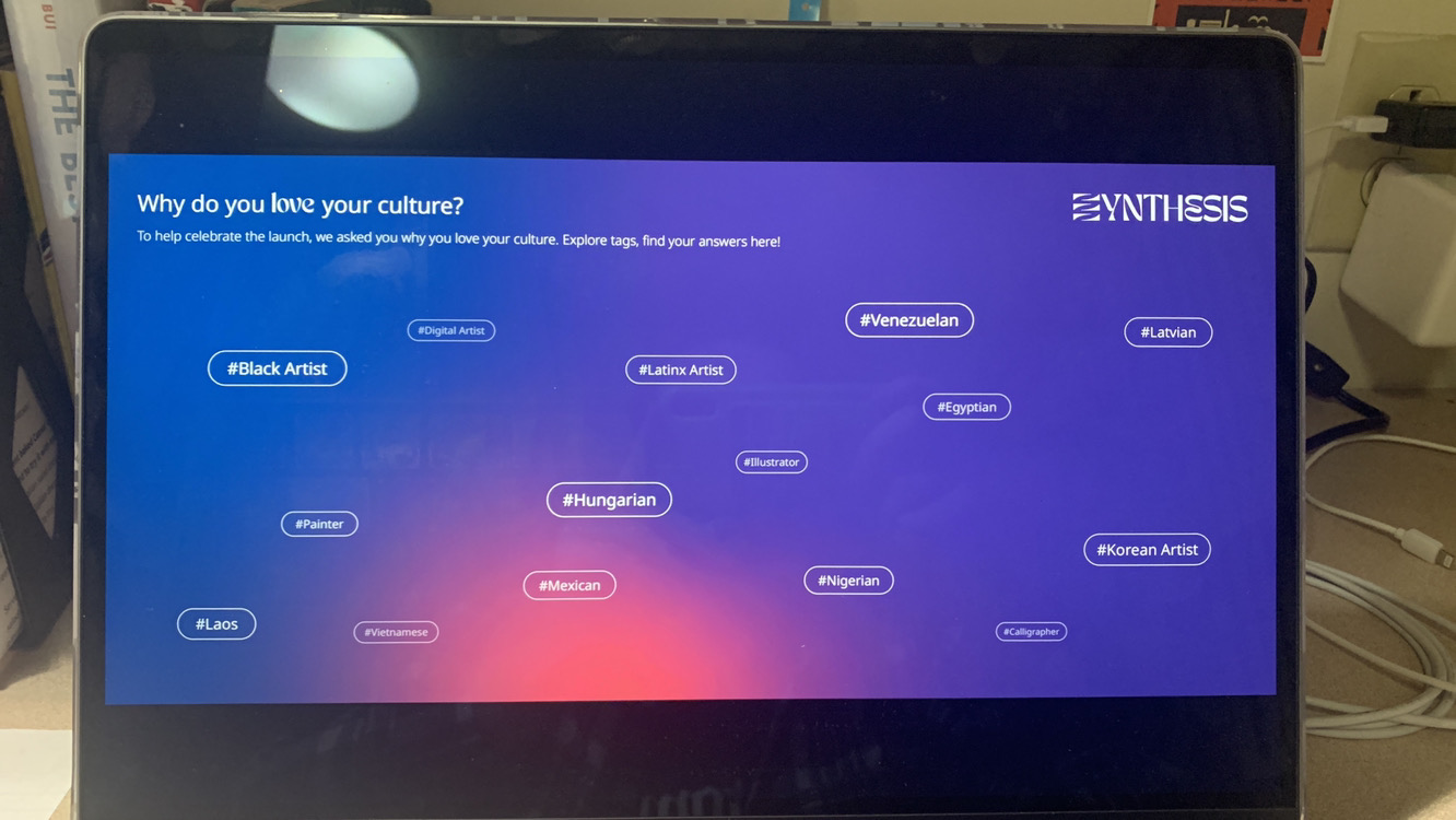
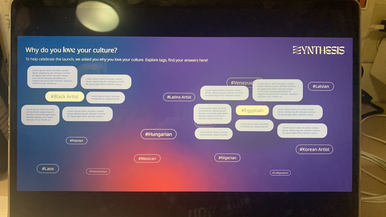
The interactive wall is another link from the Synthesis platform reflected into real life.
A kiosk allows visitors to submit a statement about what they love about their culture and tag it. It then gets reflected on the wall, where other visitors can interact, think about their culture, and take the opportunity to read about what other visitors love from theirs.
starting ideation of interactive wall
interactive wall kiosk walkthrough
interactive wall kiosk walkthrough

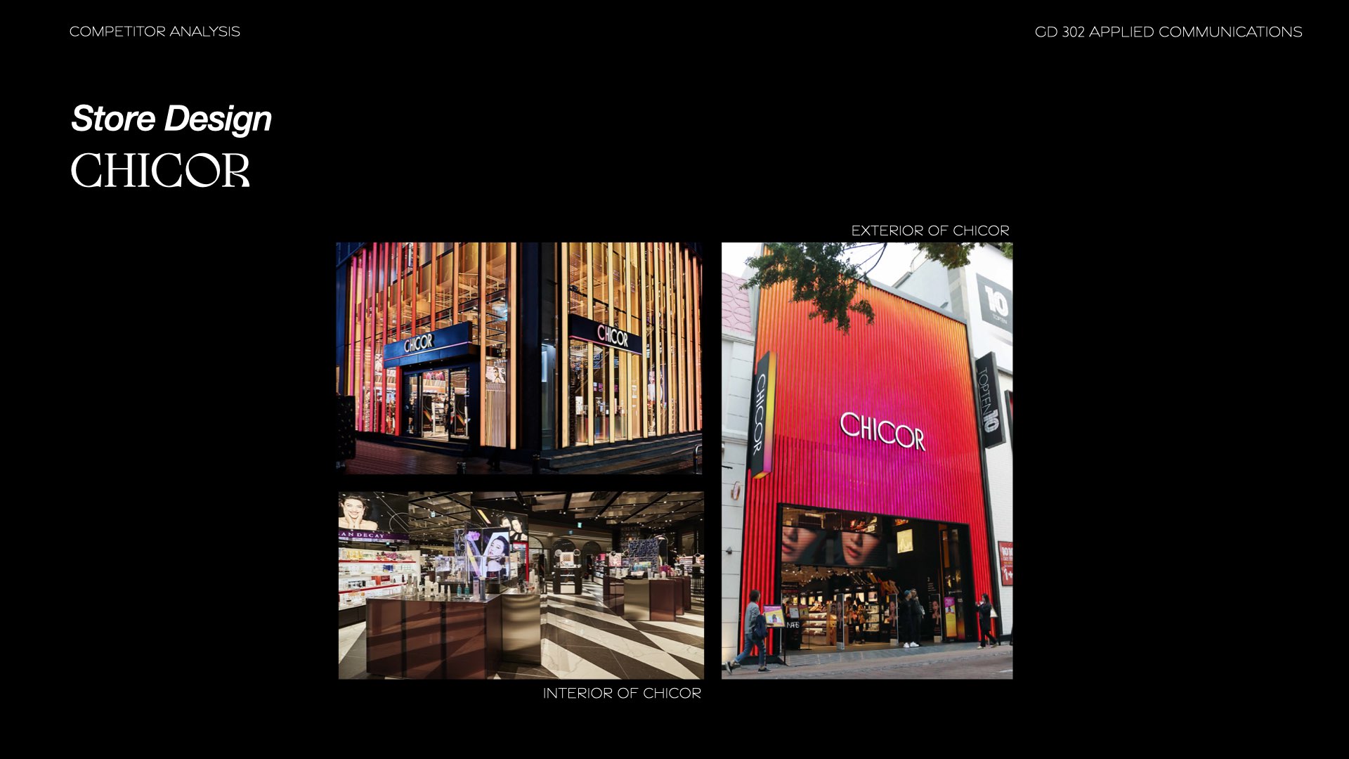
Store front design
15 week project
15 week project
Challenge
This was a project that was accomplished alongside other projects in other classes.The two key words were Immigration & Transportation, which were our only prompts for this project
Branding, UI, UX, Product design
Photoshop, Lightroom, Illustrator, Indesign, After Effects, XD
Photoshop, Lightroom, Illustrator, Indesign, After Effects, XD
Solution
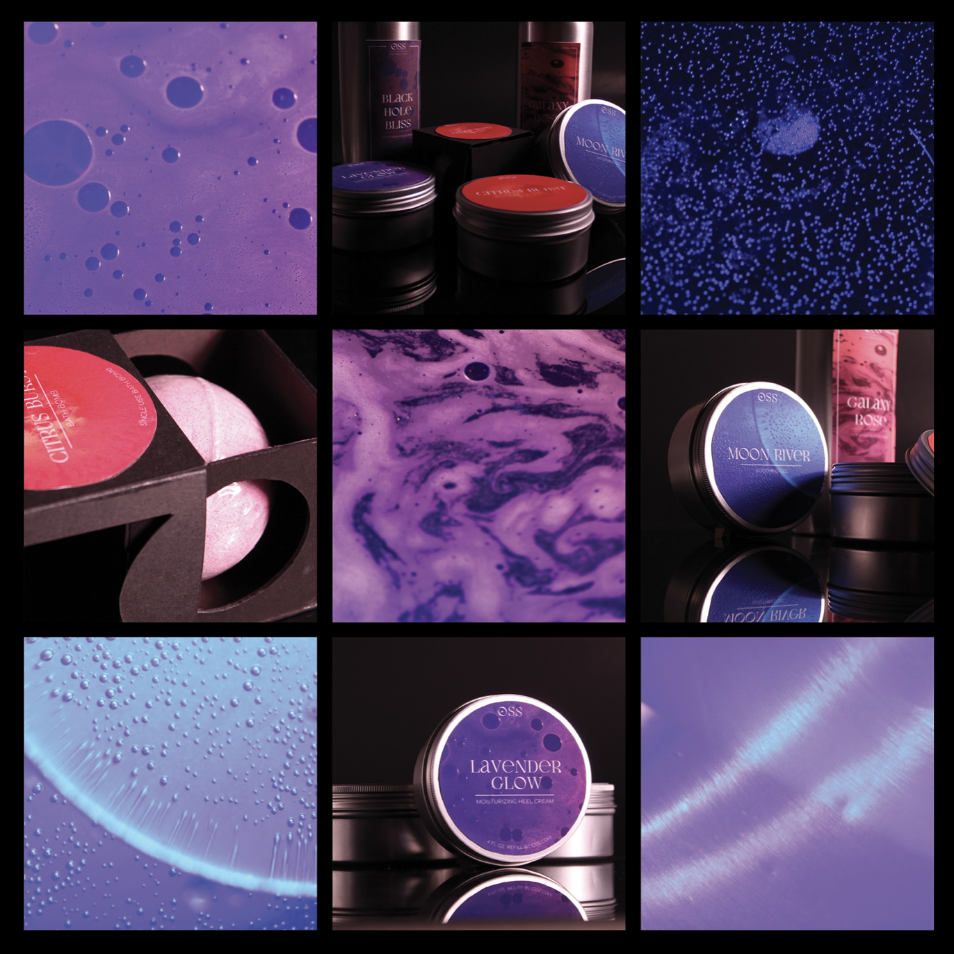
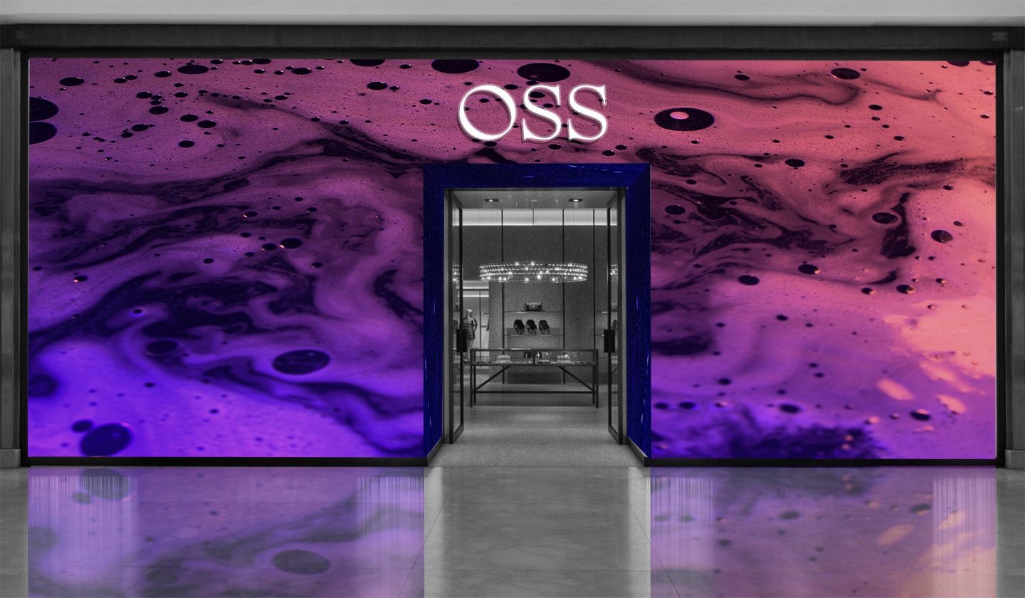
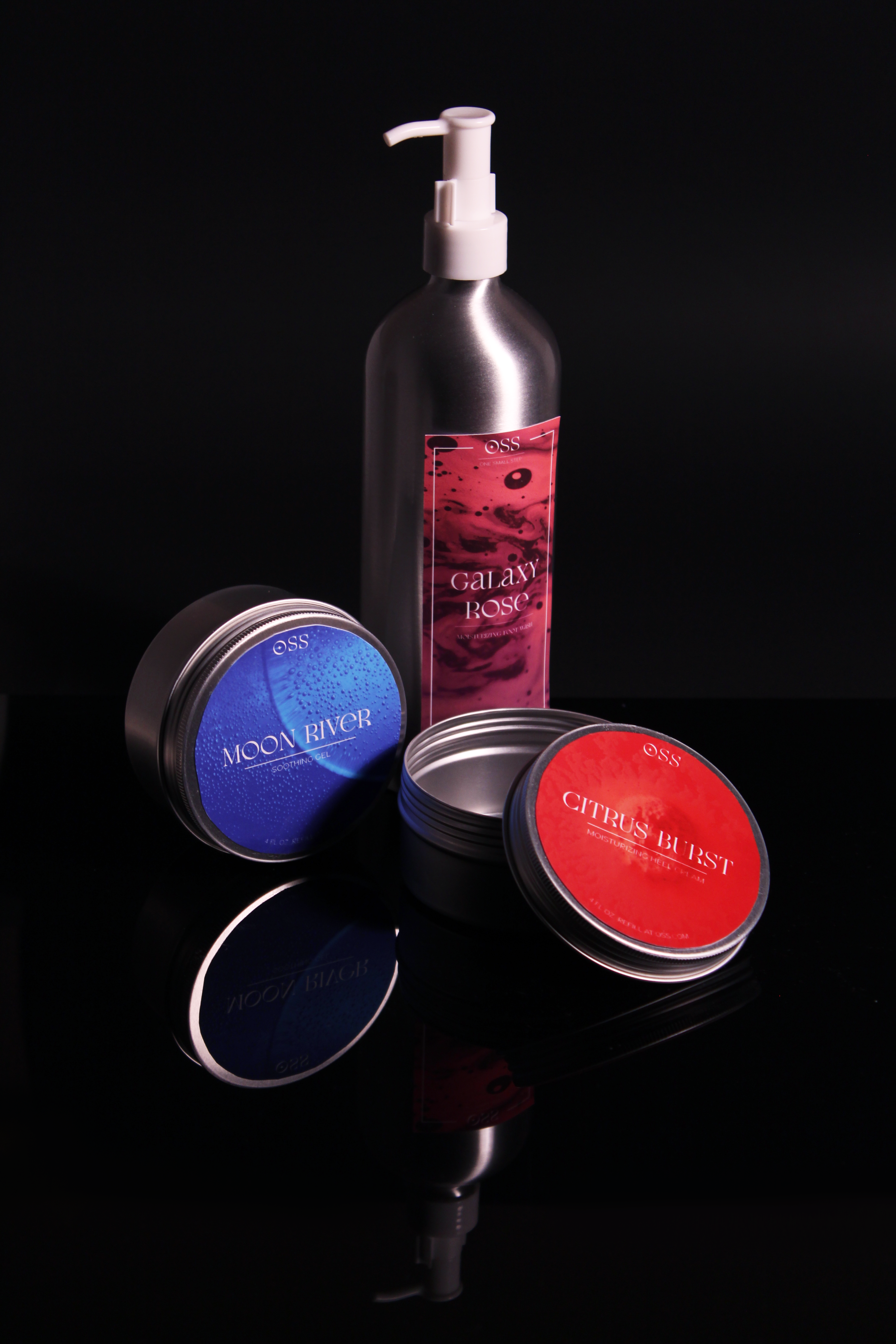
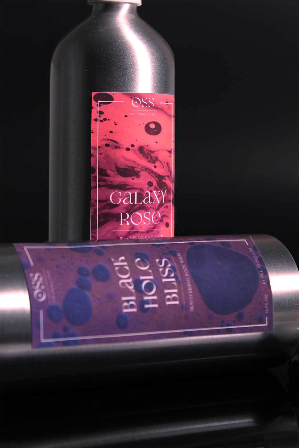
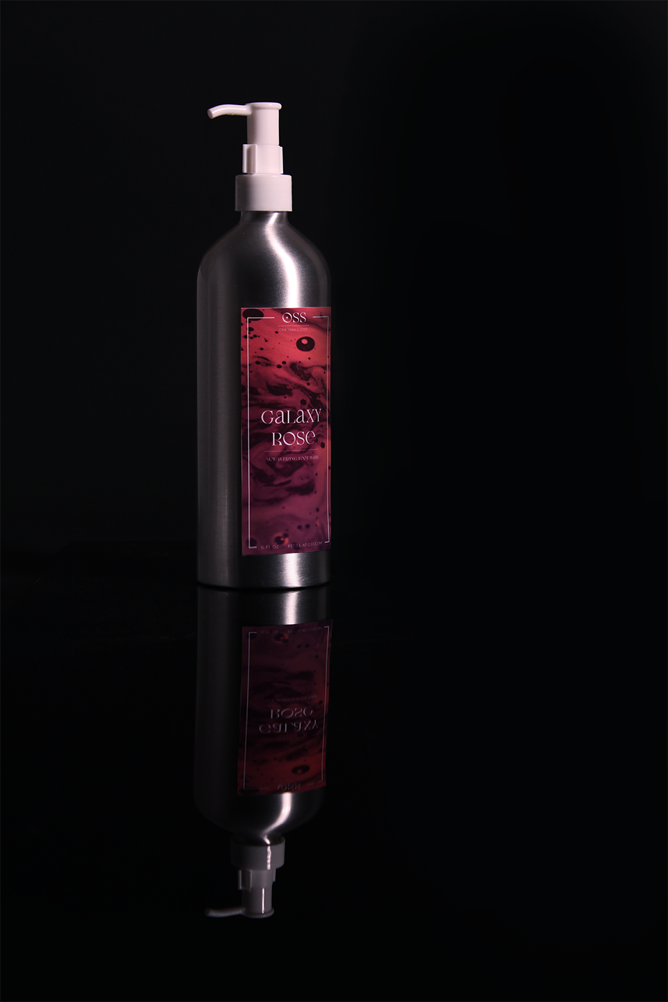
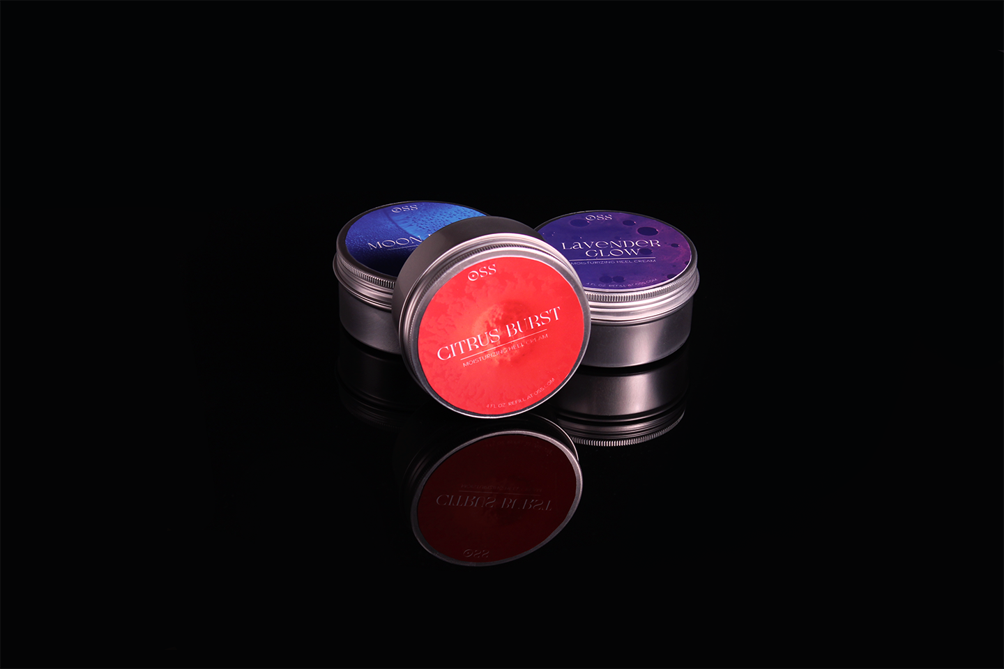
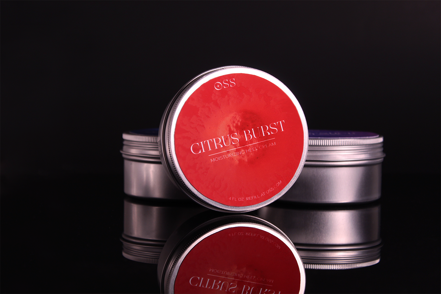
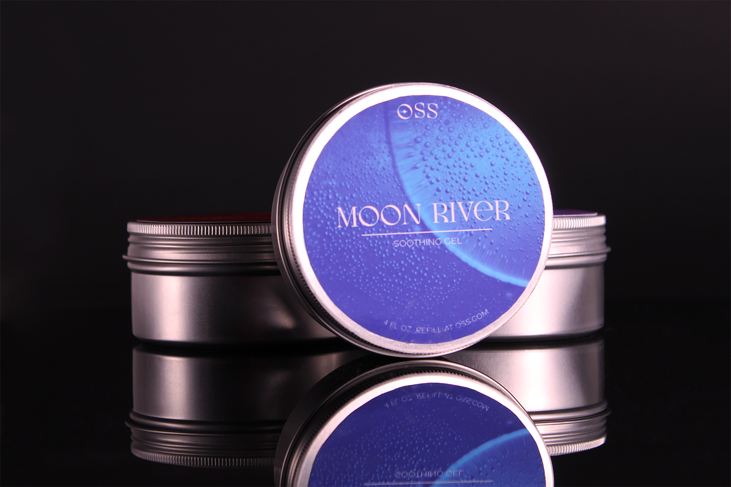
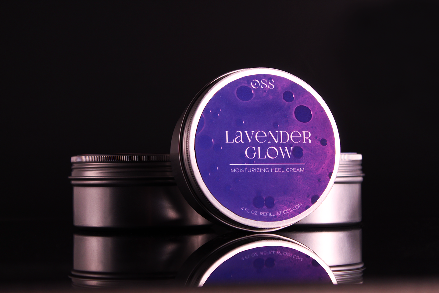
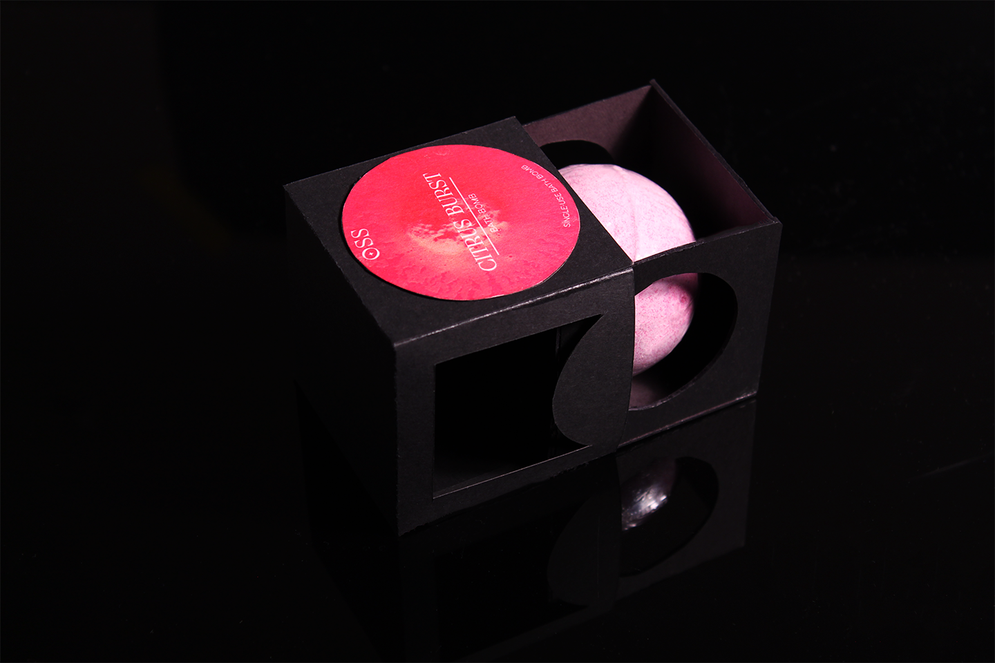
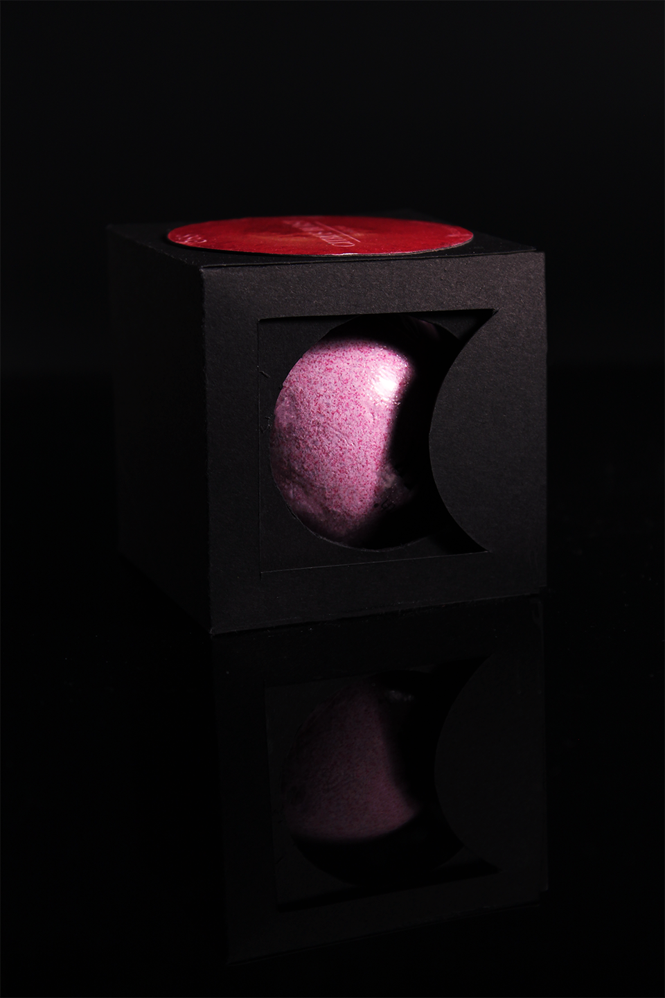
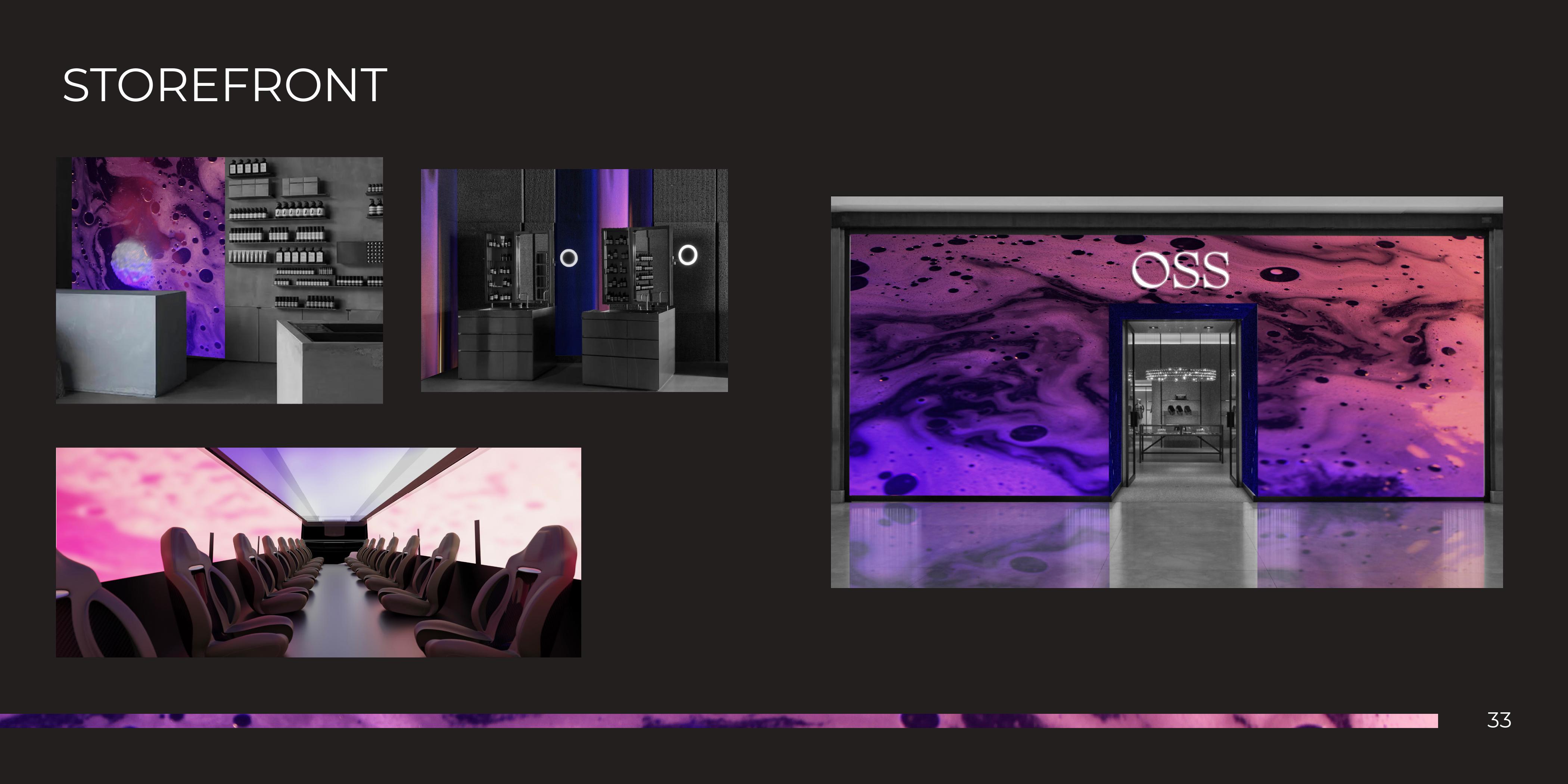
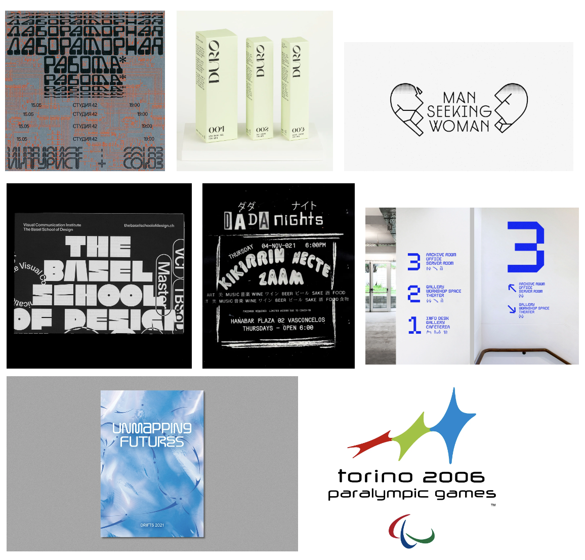
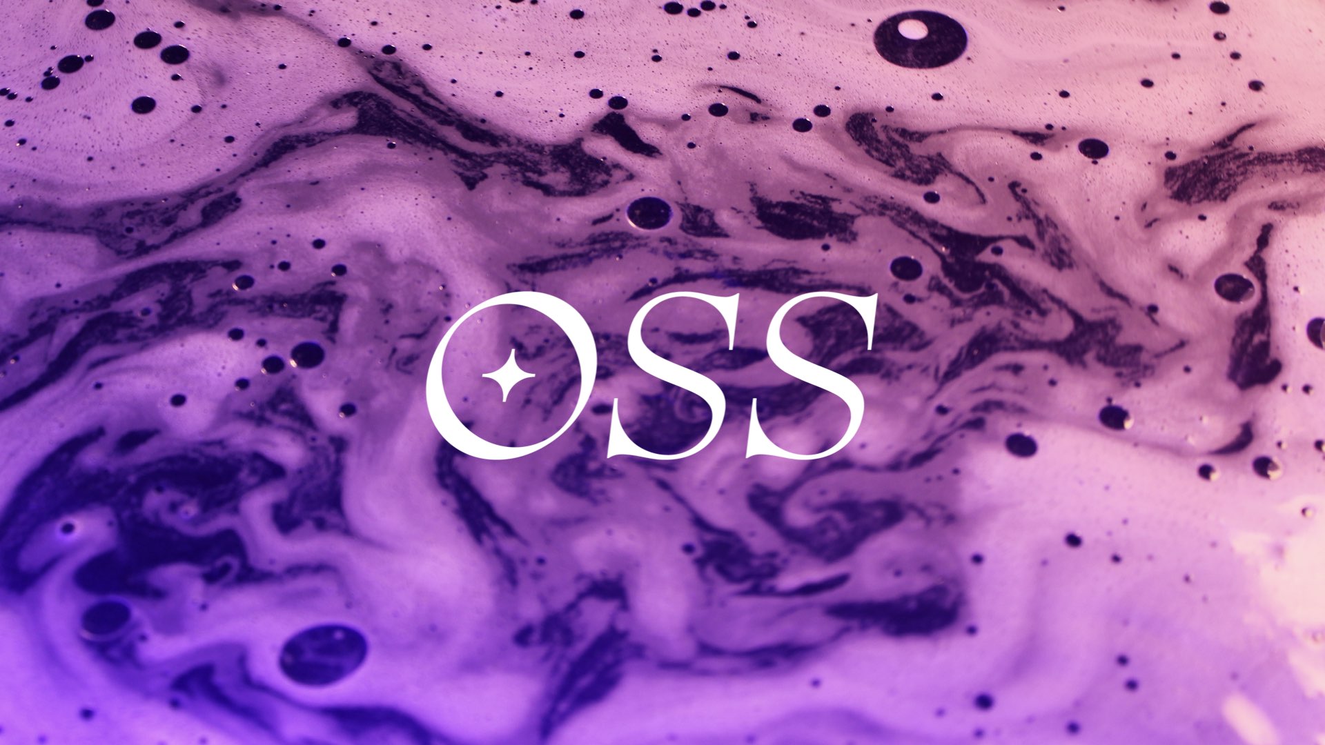
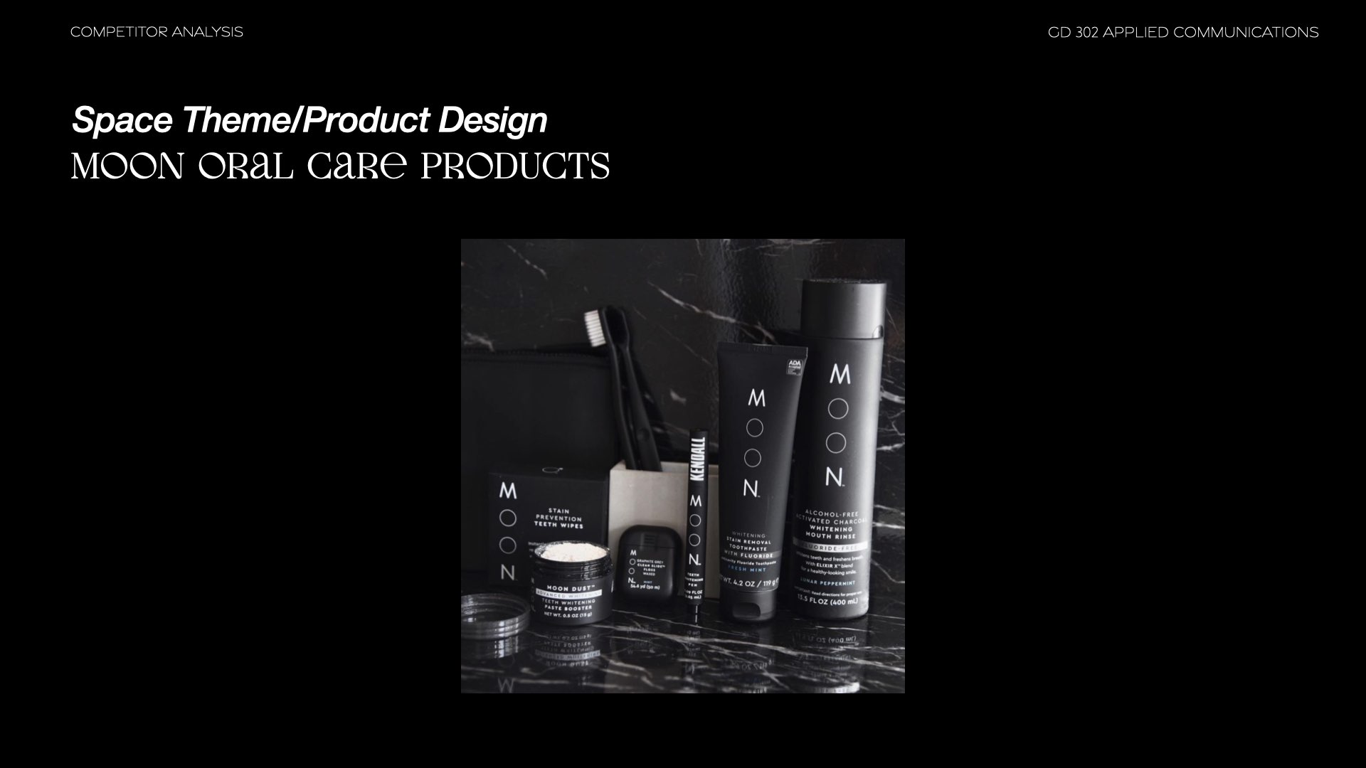
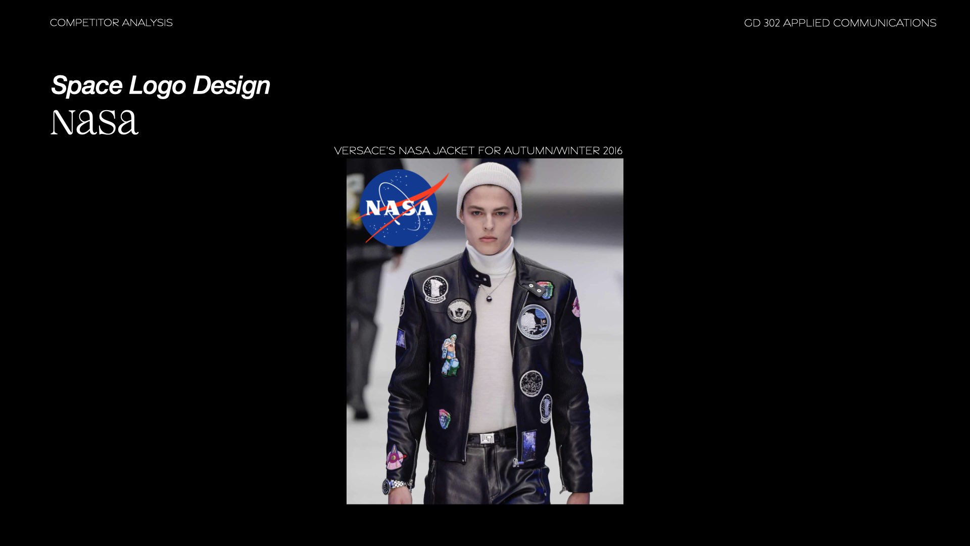
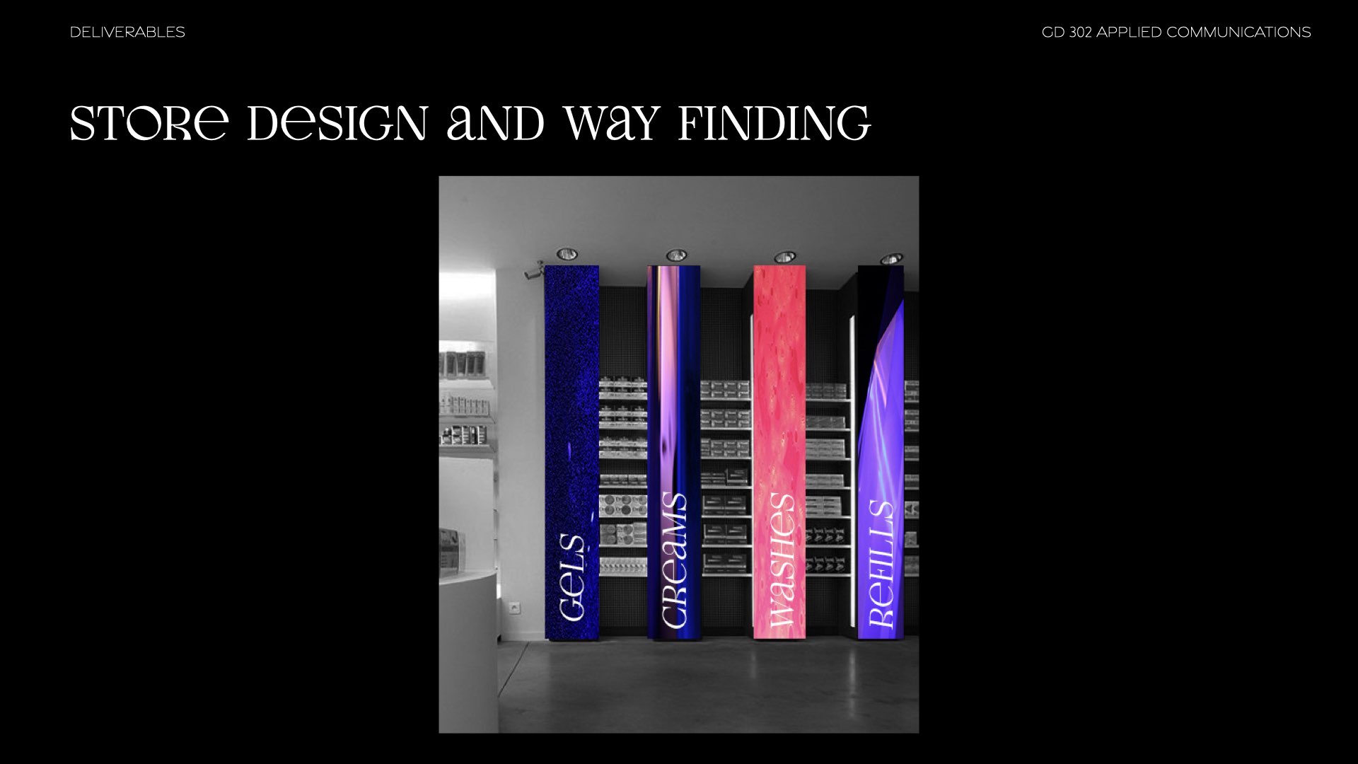
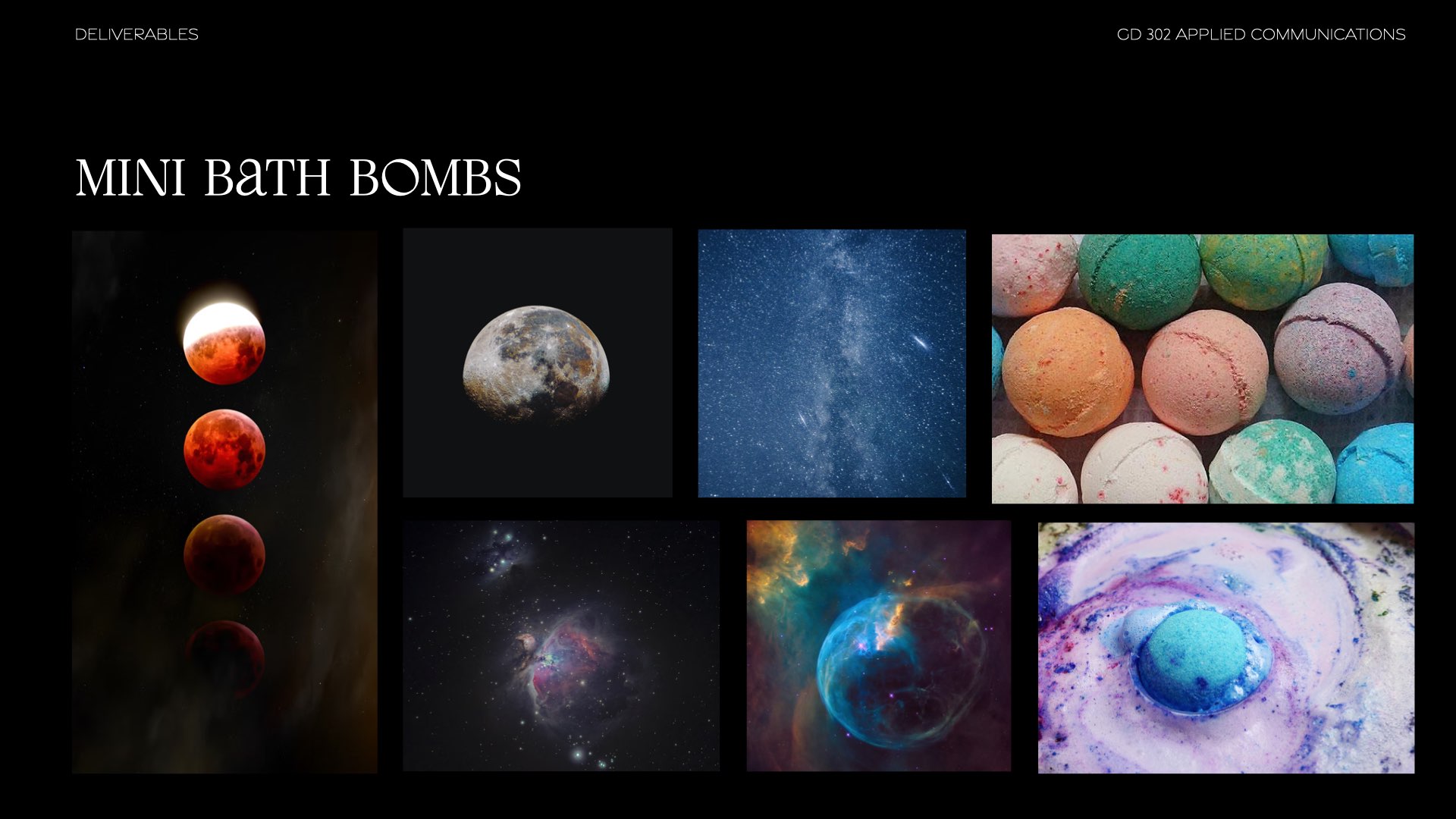
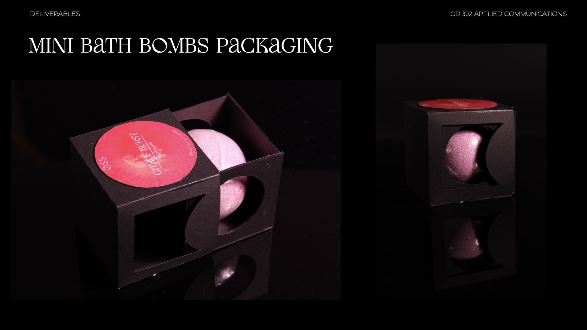
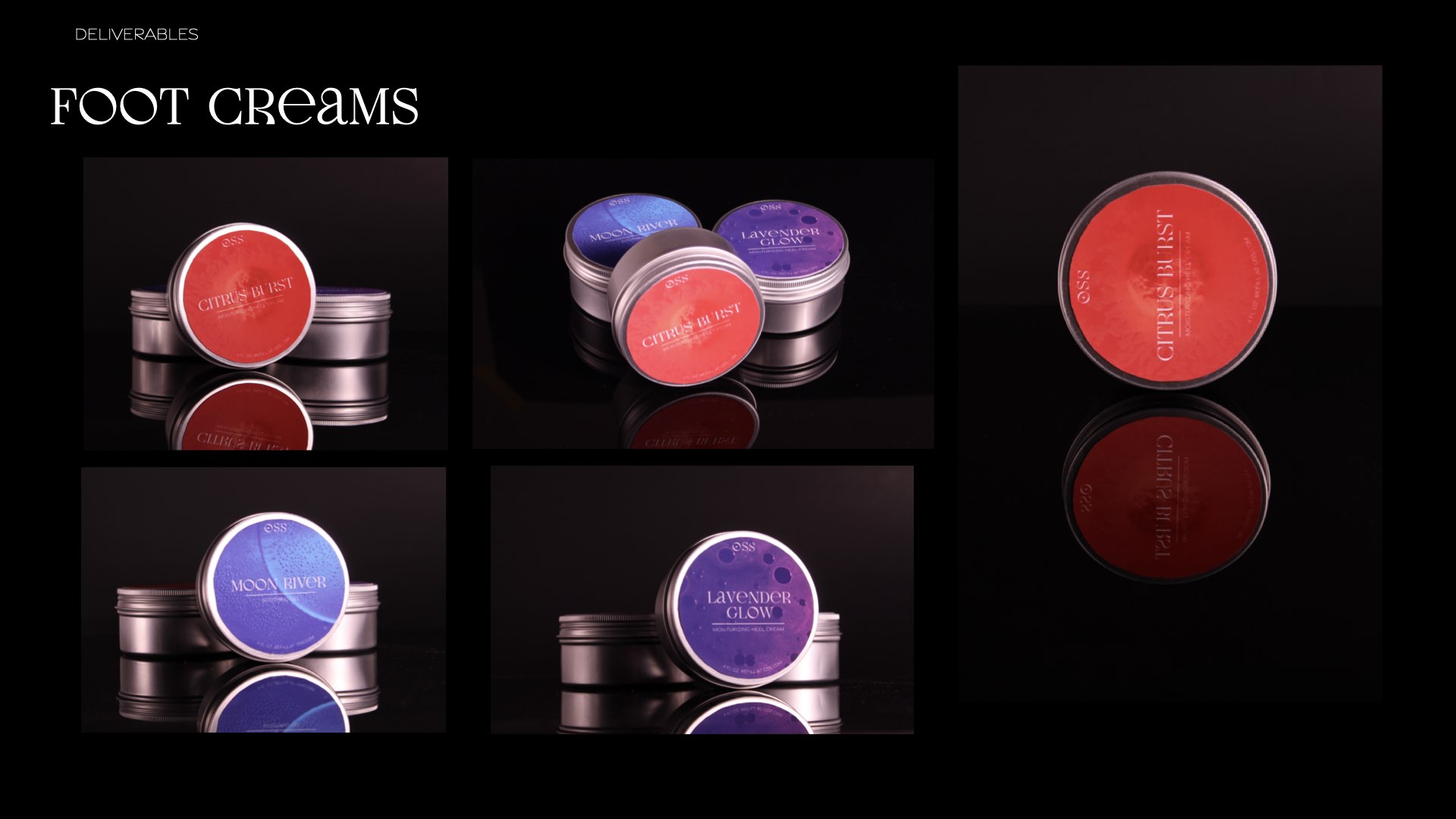
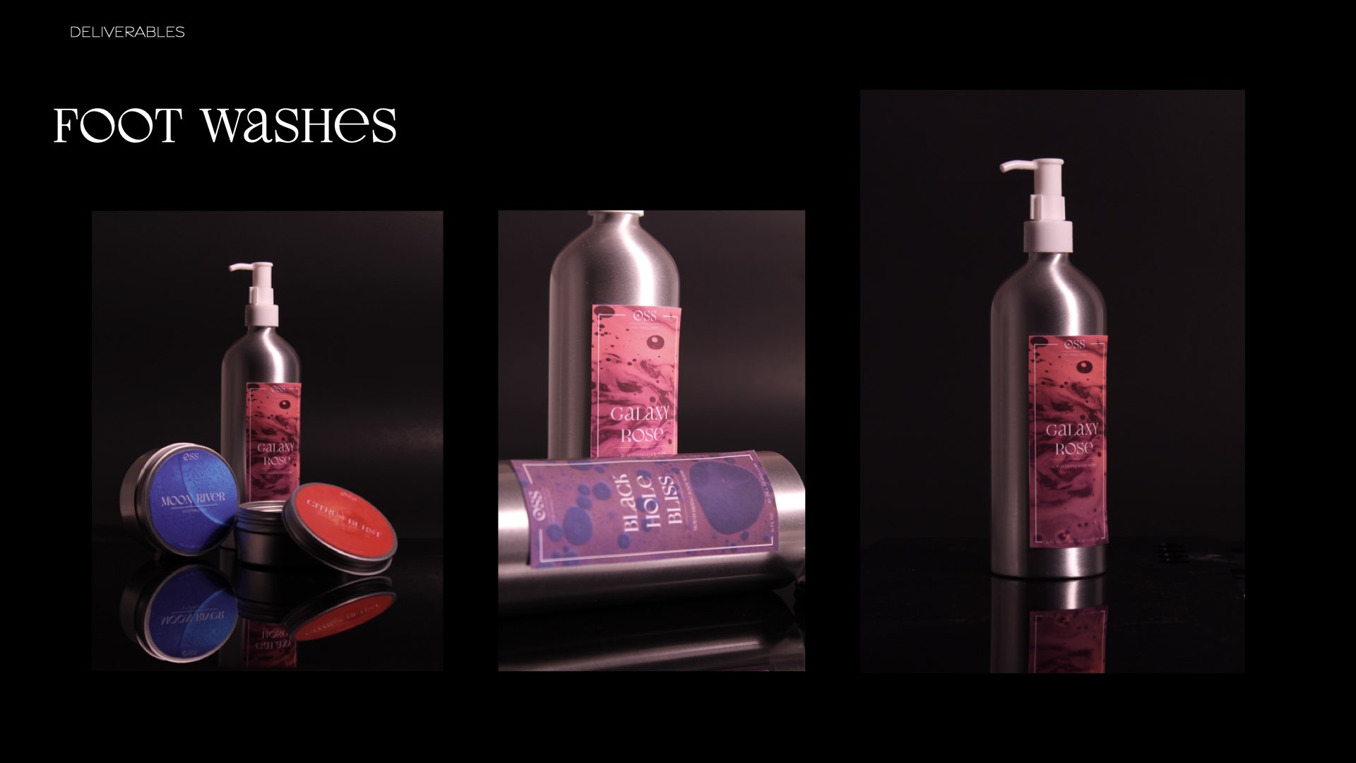
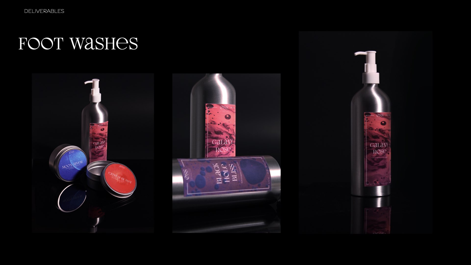
OSS is a retro space themed foot massage parlor with modern twist.We based our concept on the idea of transportation by foot and how people move from place to place.
We want to use space as the inspiration and theme of our brand because humans have started to explore space and because another name for immigrants is aliens.
In collaboration with Taylor Gunnells & Zhongwei Ren
Design responsiblites included Wordmark, Immersive experince ideation and video production, e-Ticket, Product packaging design
Design responsiblites included Wordmark, Immersive experince ideation and video production, e-Ticket, Product packaging design
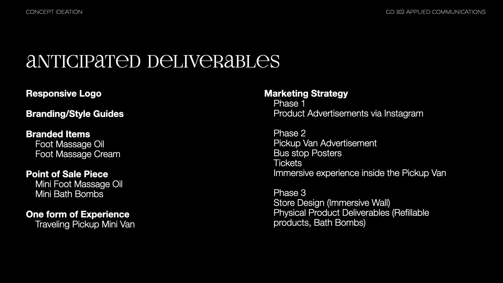
Project Components
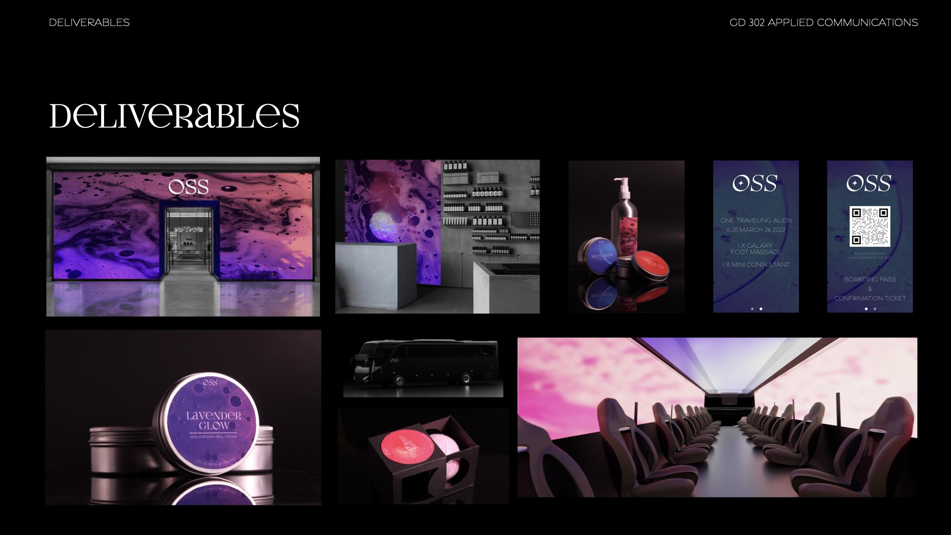
This was a multifaceted project with multiple deliverables.Wordmark
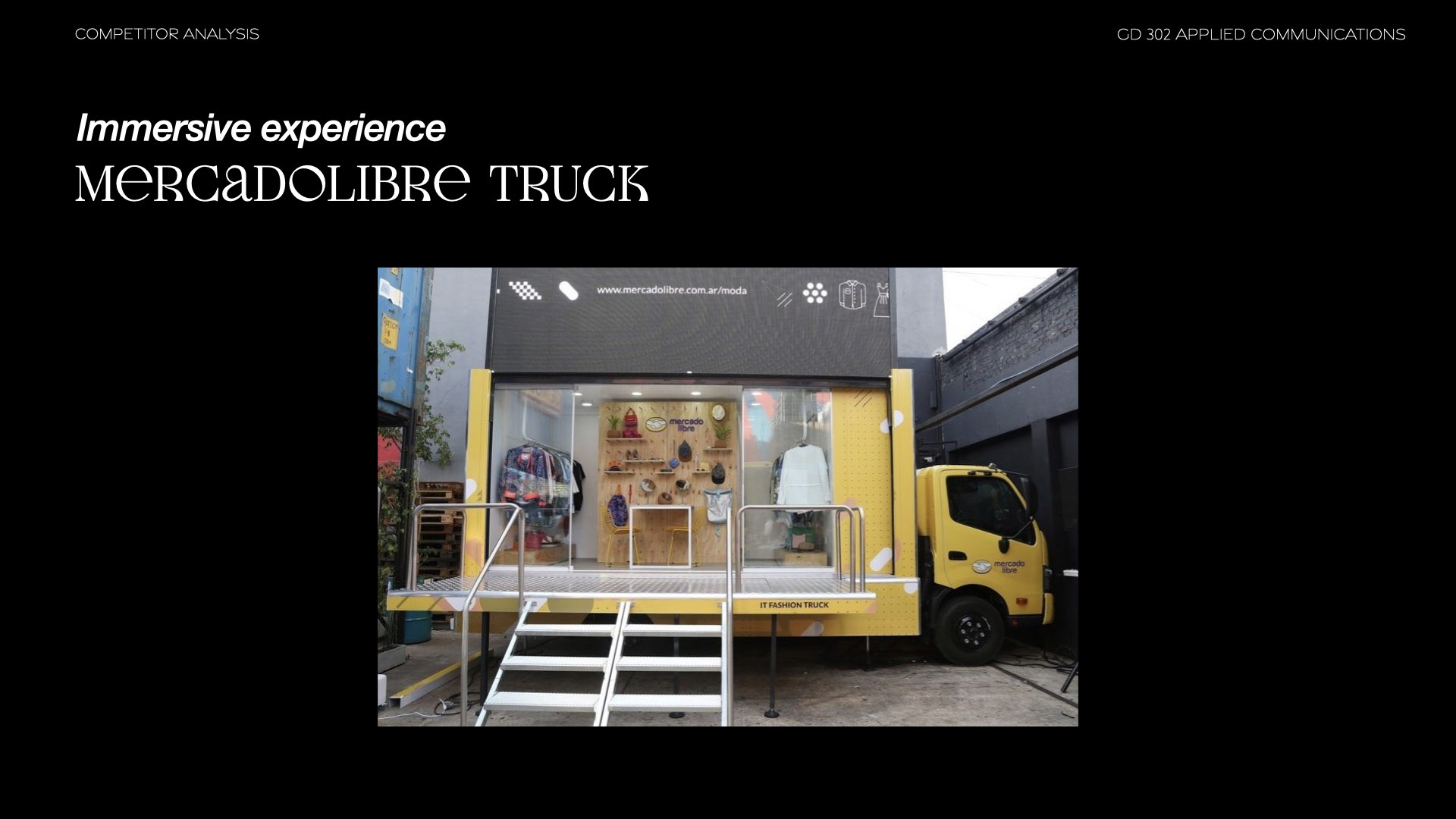
Immersive Experience
Website
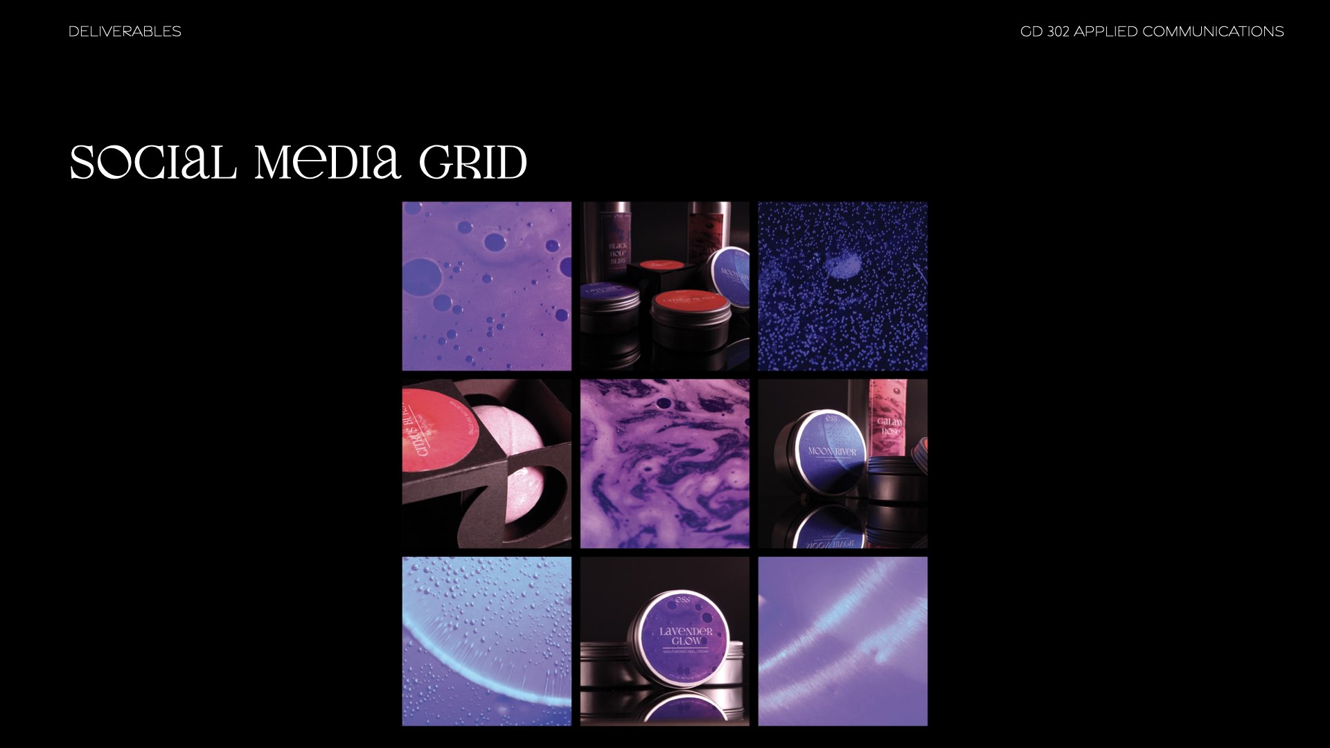
Social Media Grid
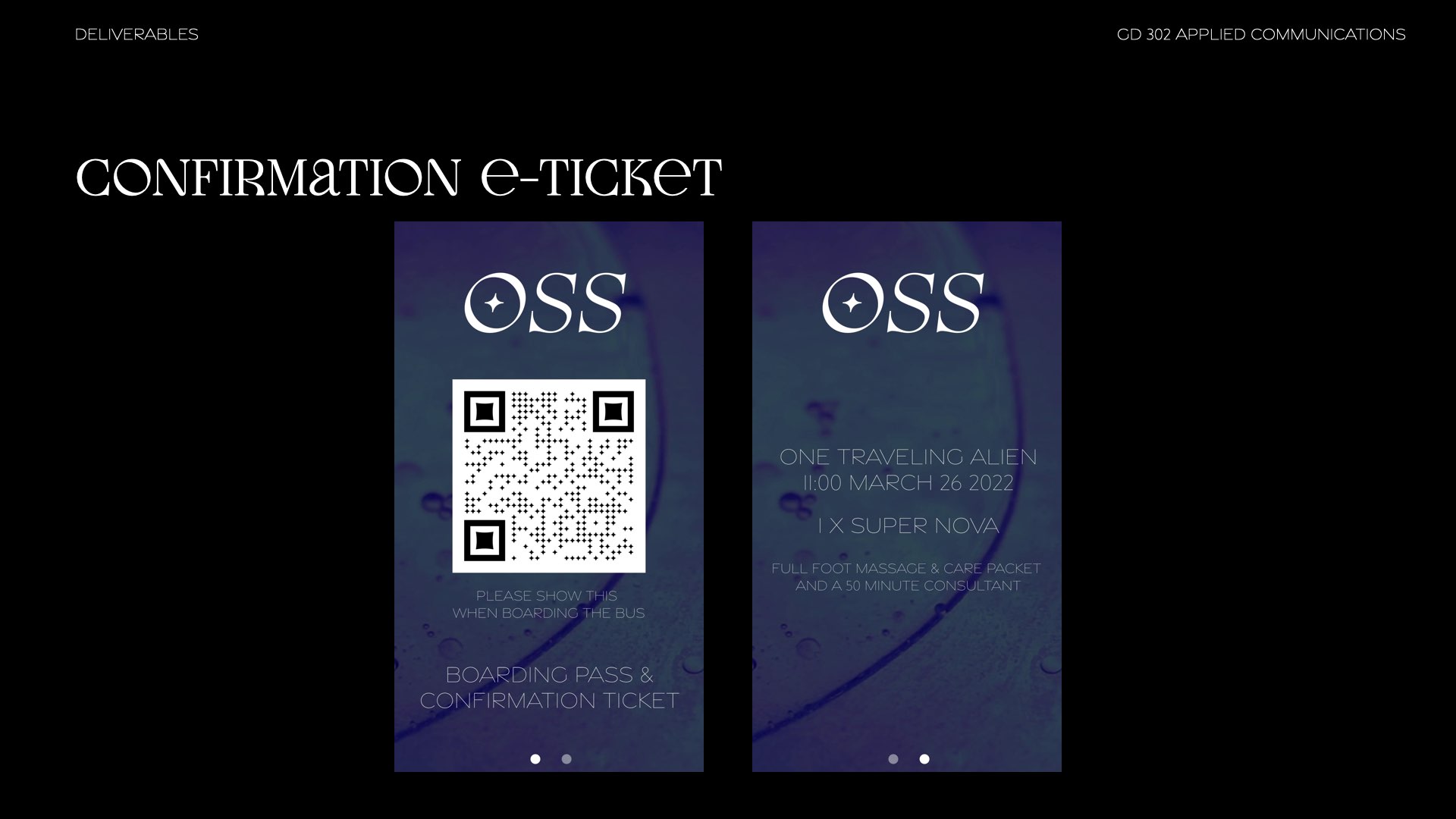
e-Ticket
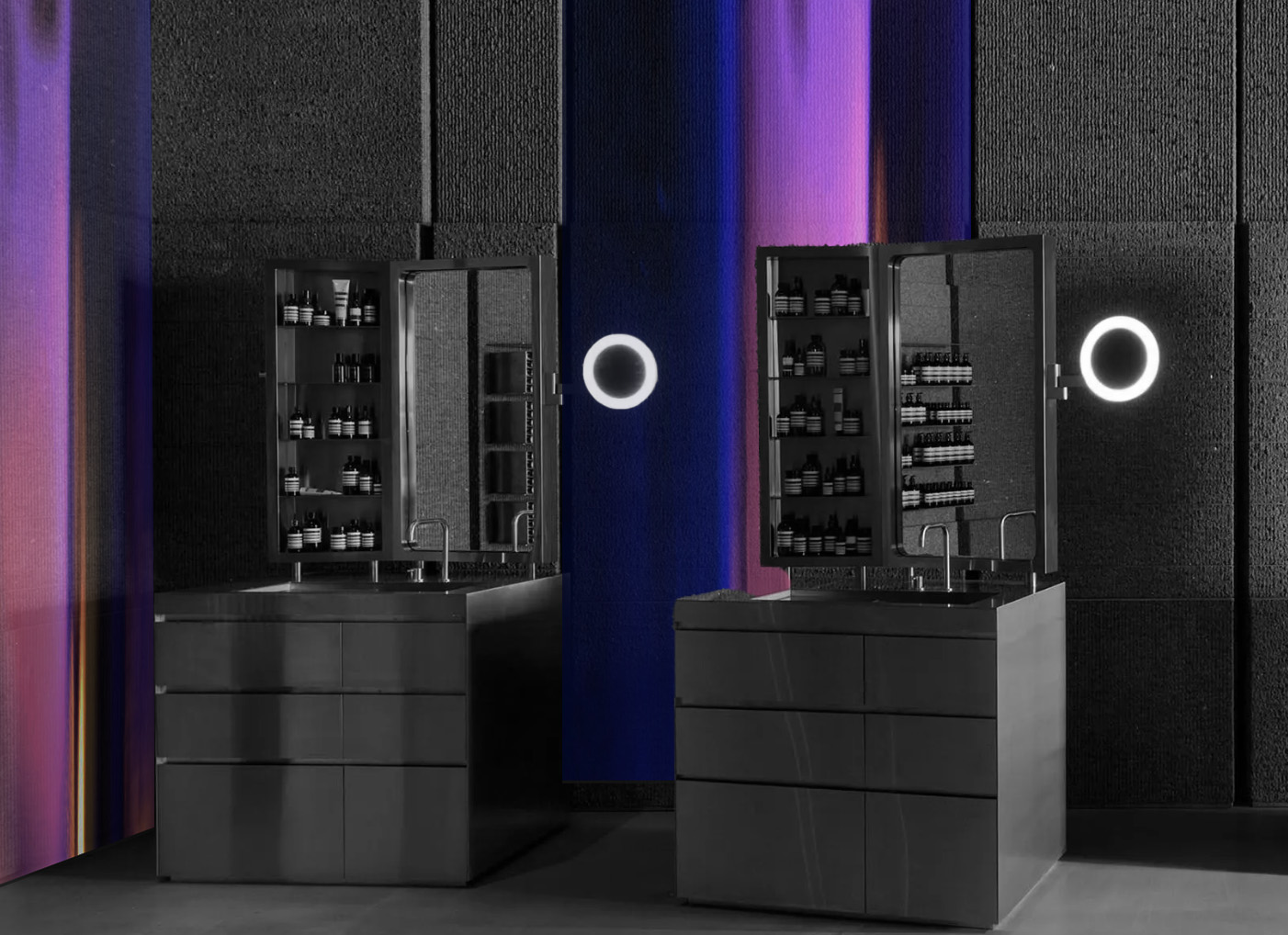
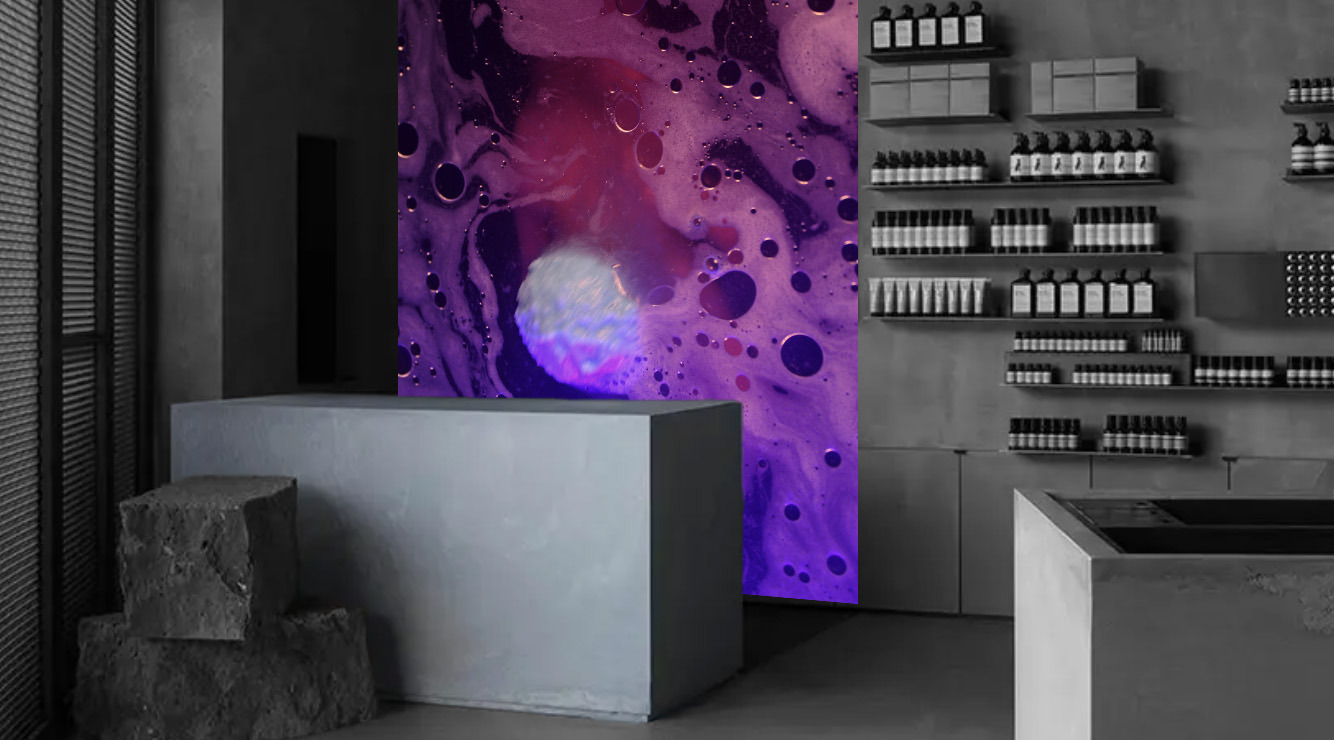
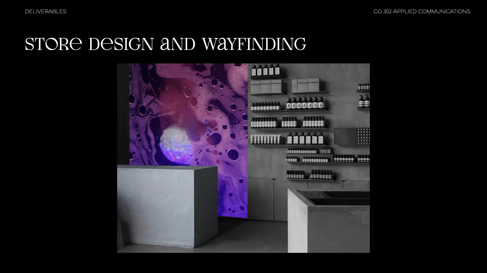
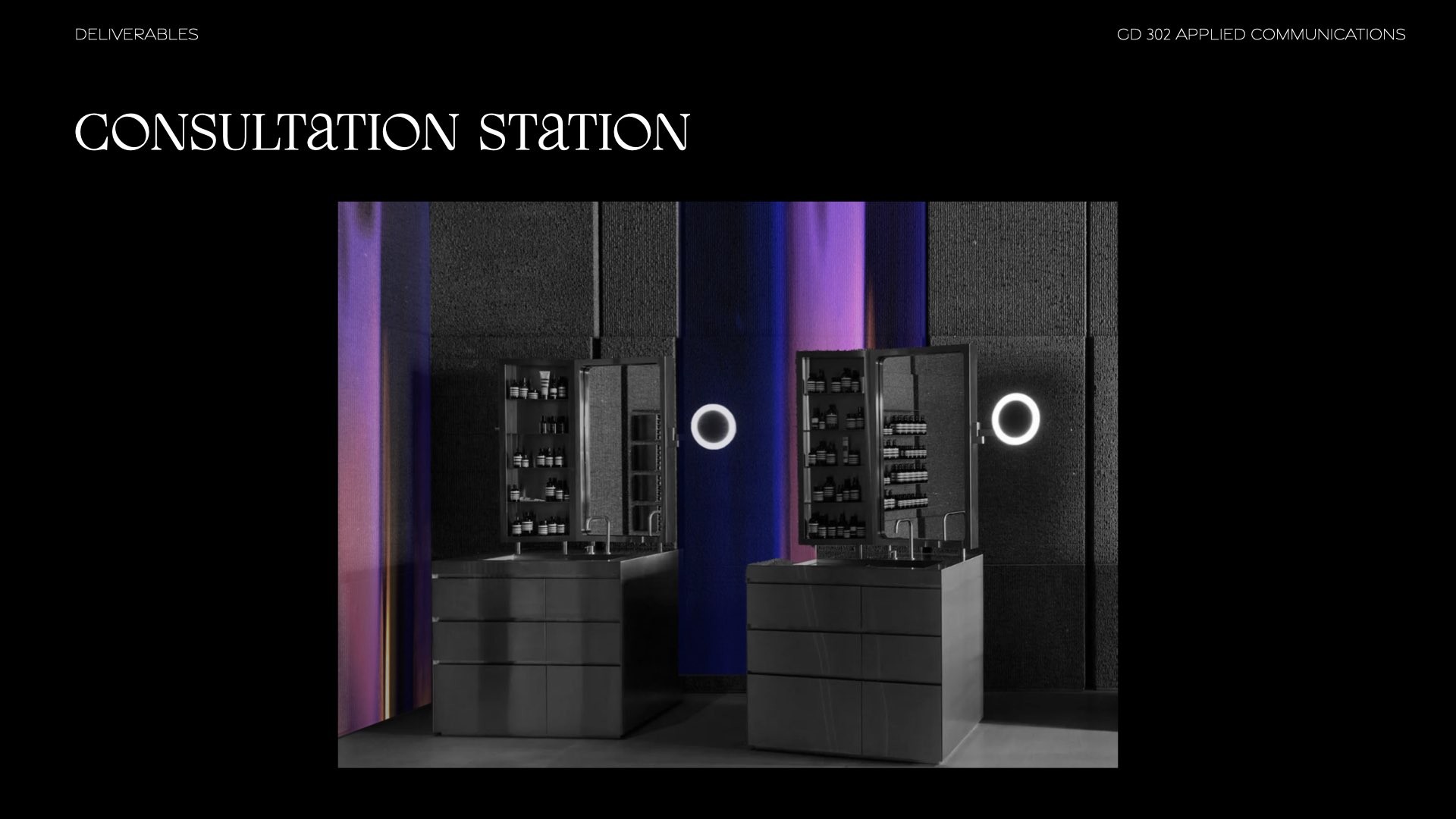
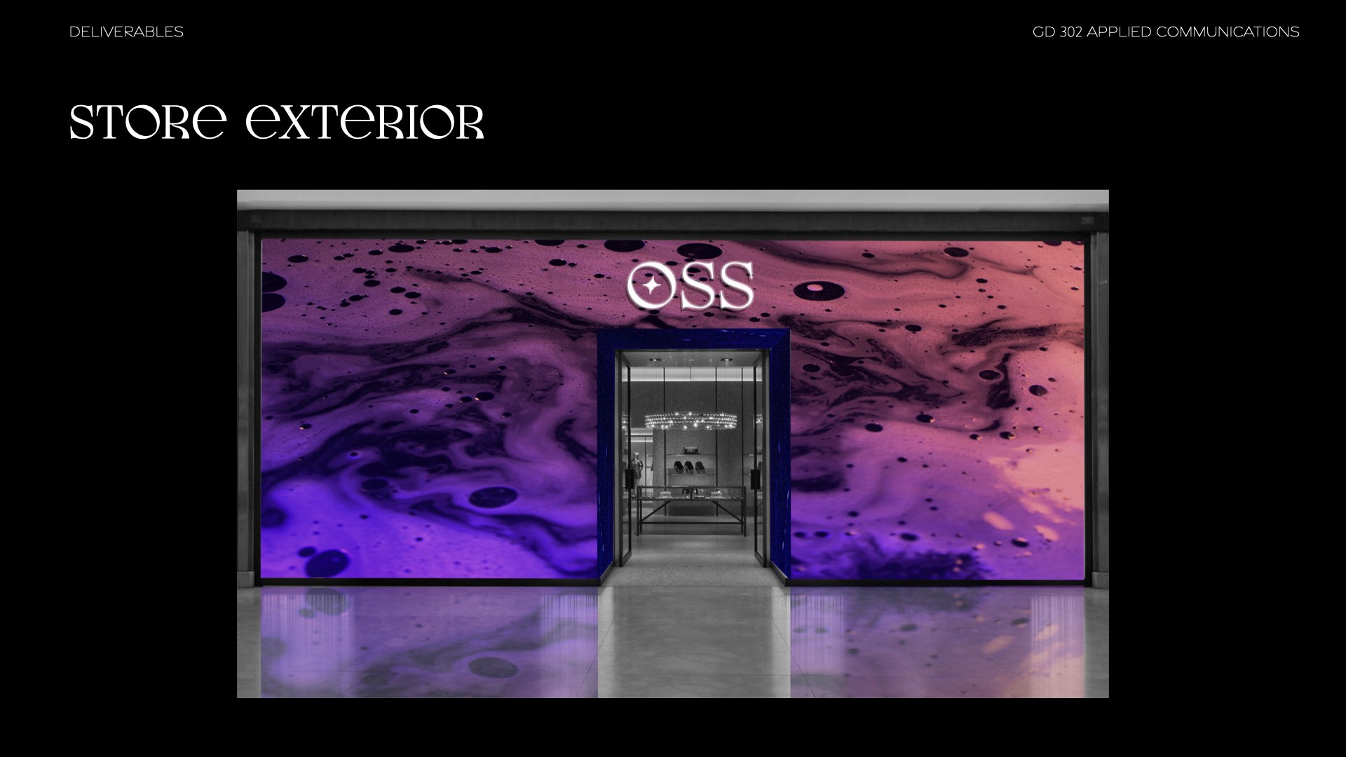
Store Exterior & Interior
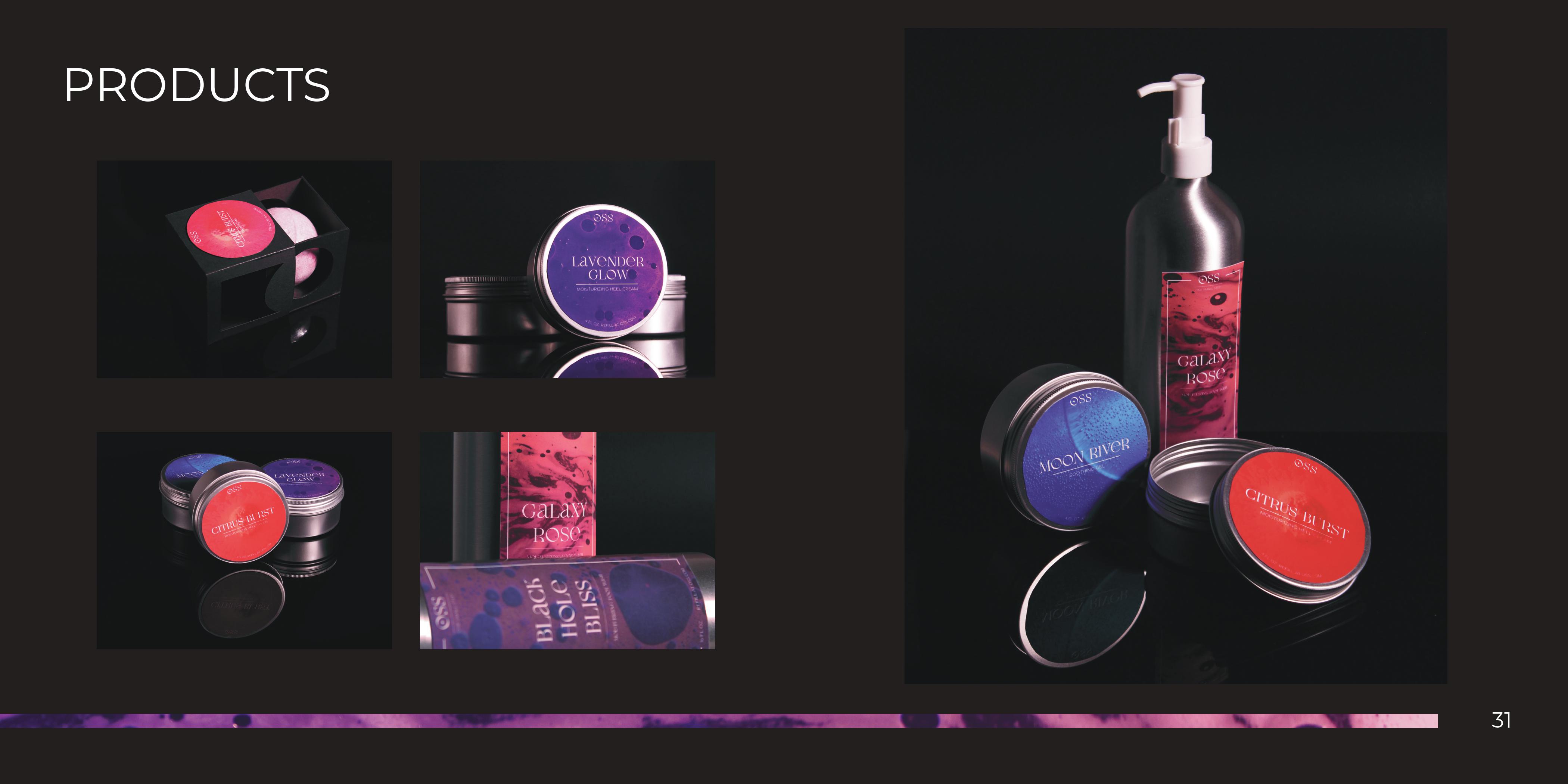
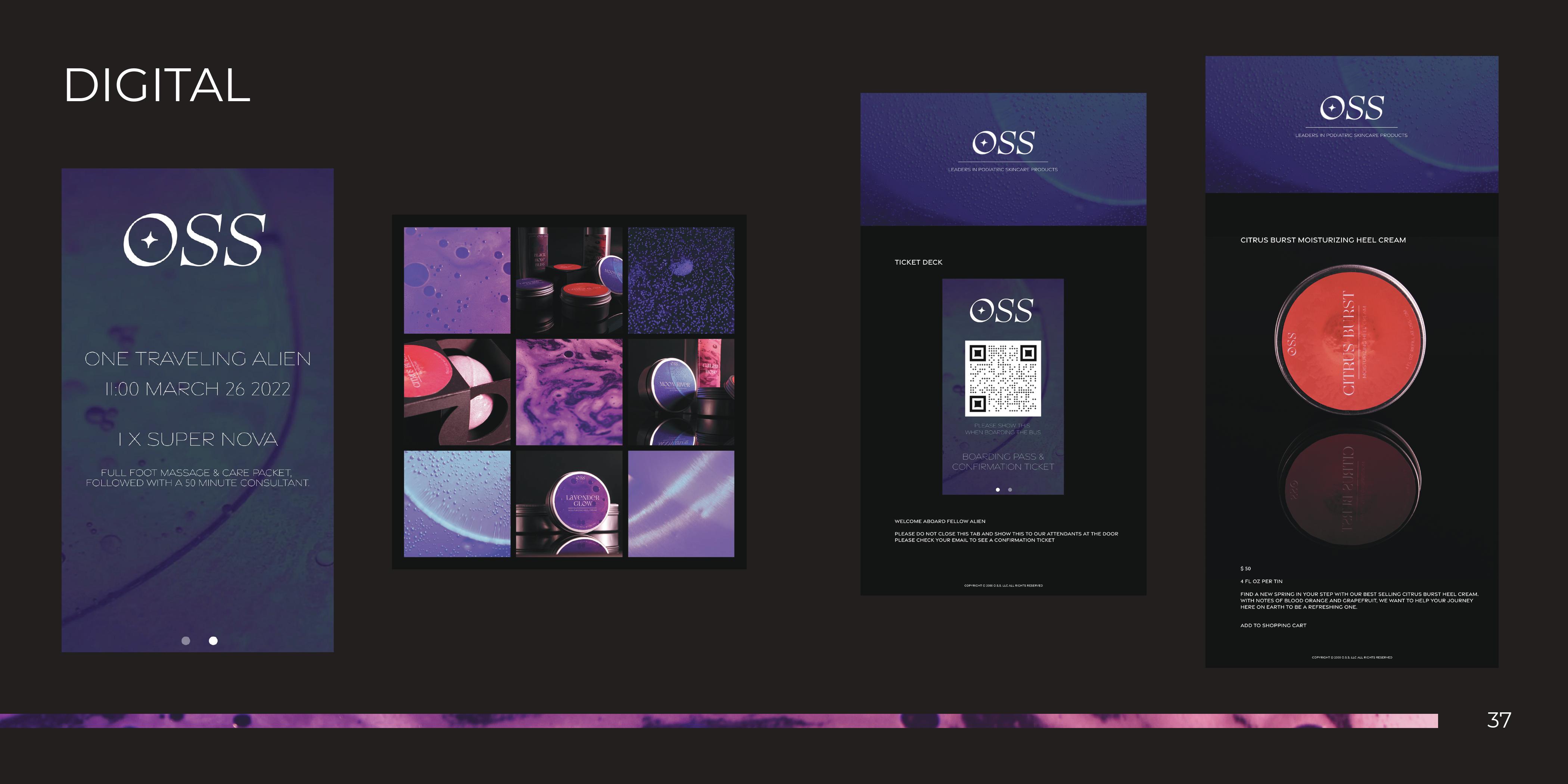
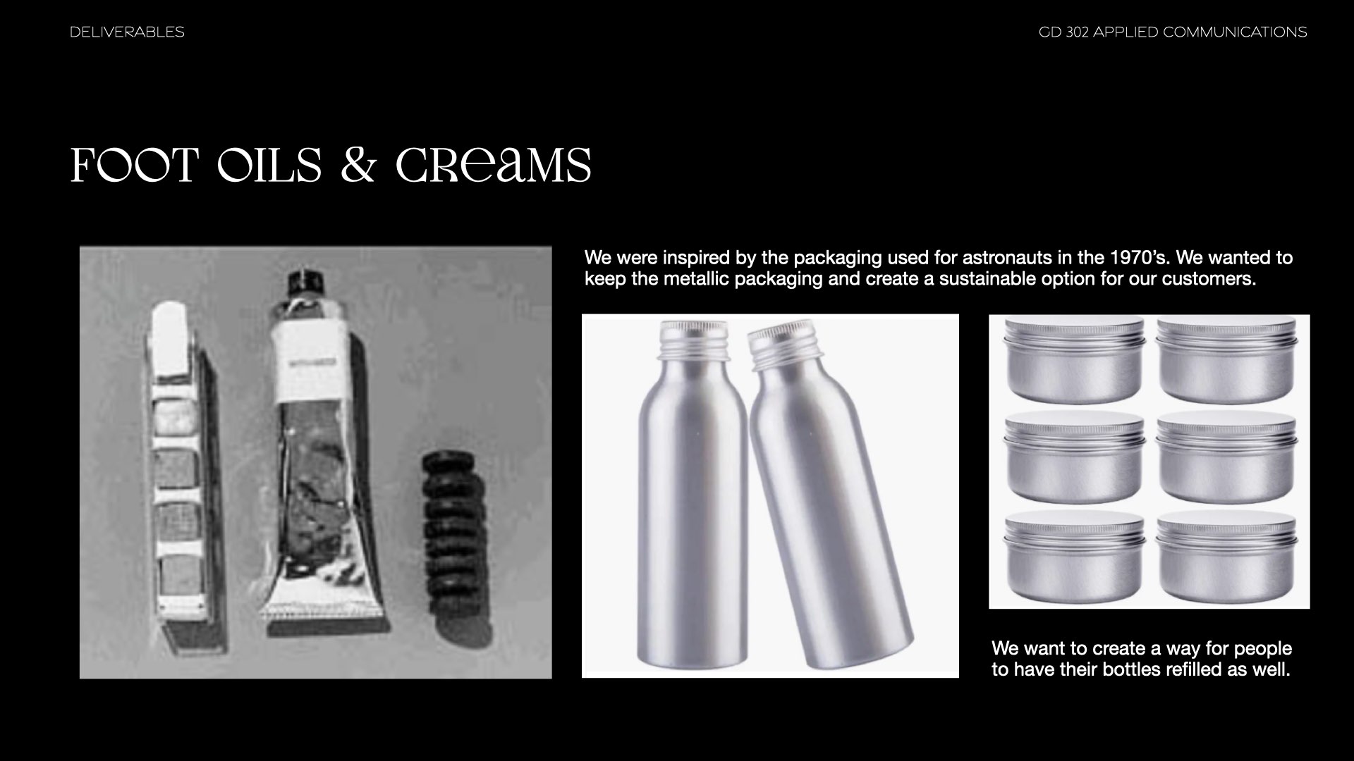
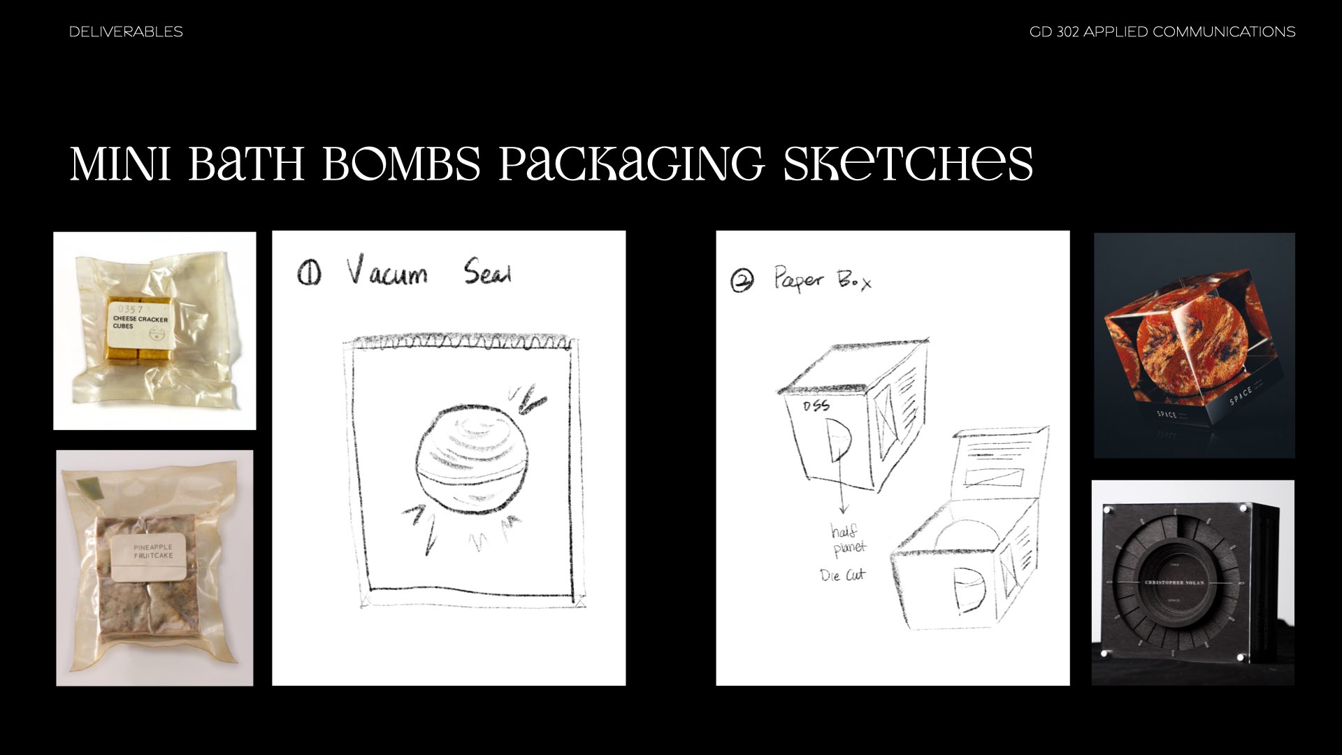
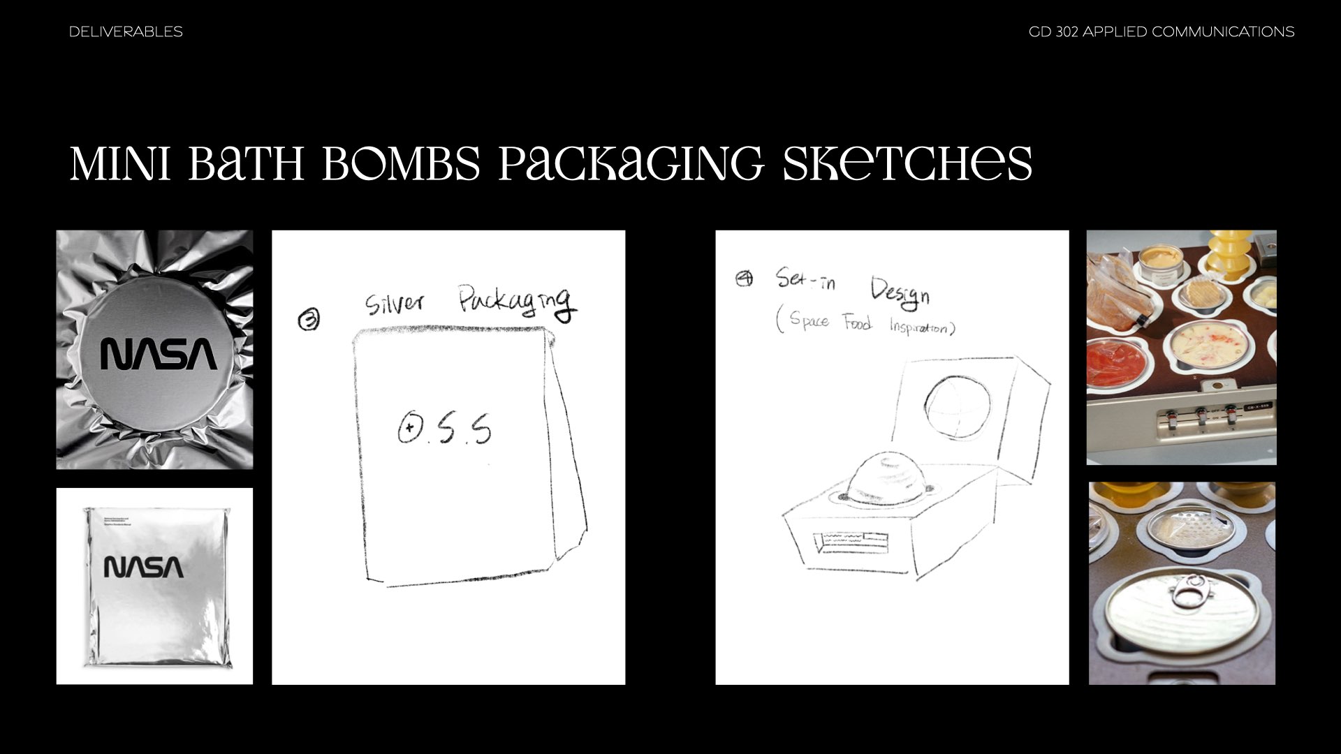
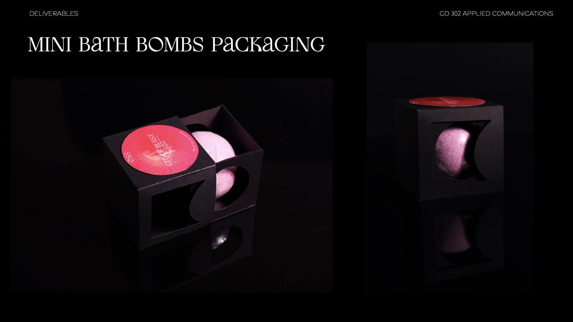
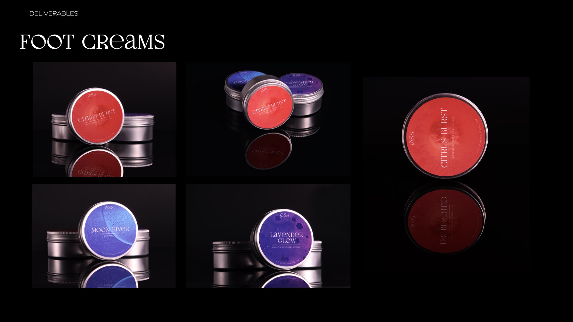
Product Packaging
Presentation
Research Booklet
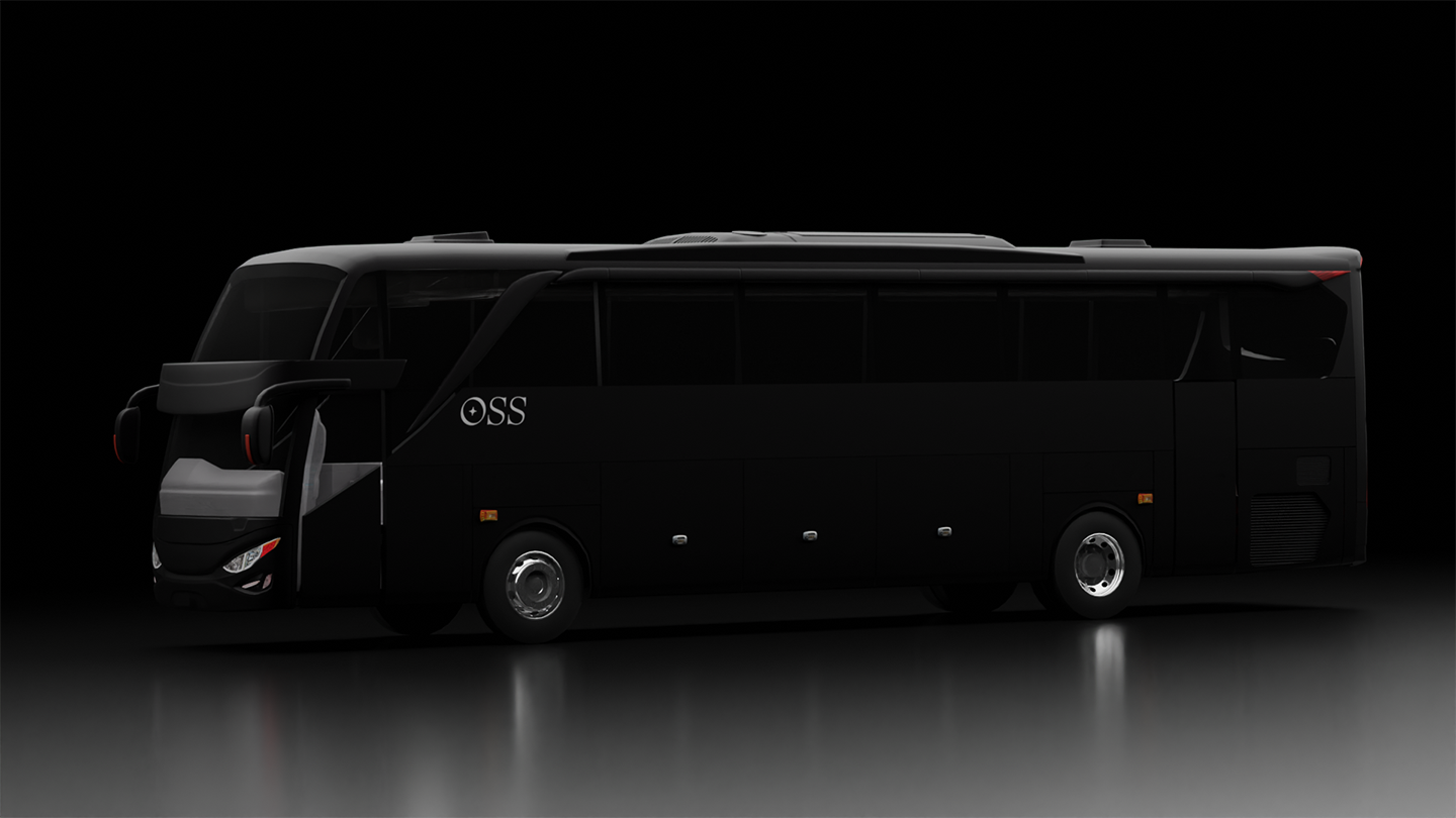
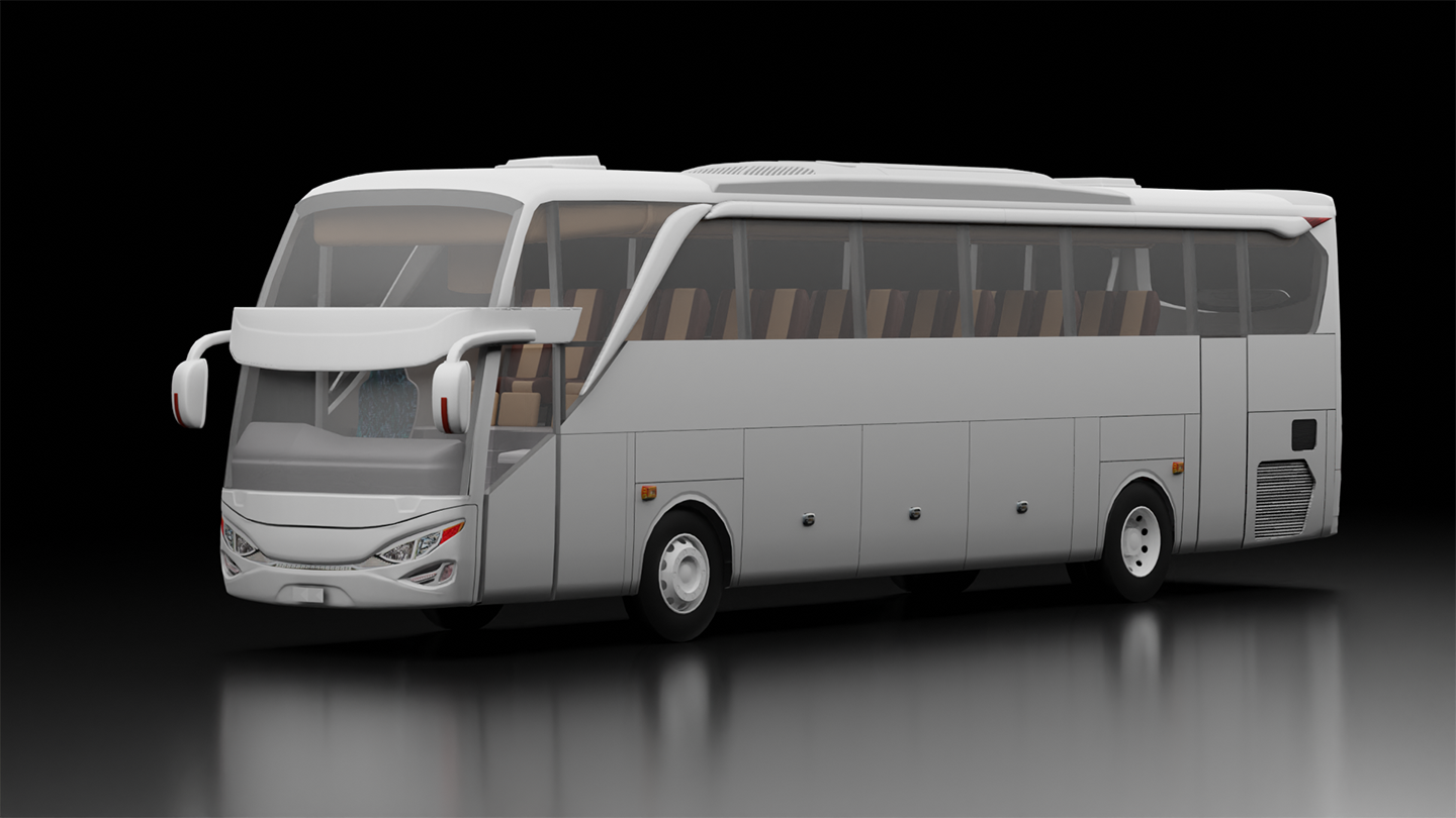
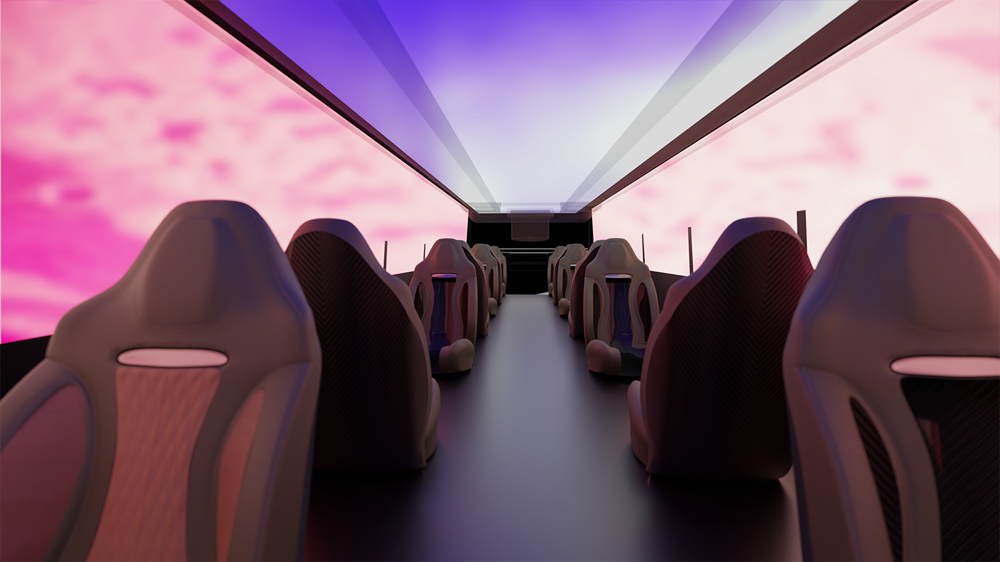
wordmark & immersive bus
bus immersive experience
immersive vide
website walk through
social media grid
e-ticket

Research
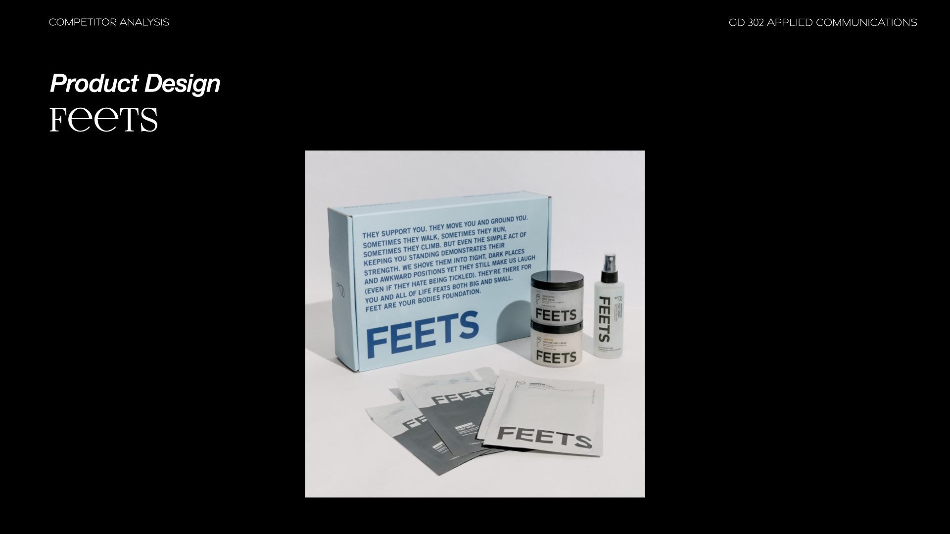
Our research first centered around competitors and a critical look at how they were defining themselves and how consumers were perceiving them.Later stages of our research, we also did some research into music and its impact on people in product heavy areas.
Inspiration
Seeing as our prompt for this project was “Immigration” & “Transportation”, our group had a few ideas.While I wanted to push for the bed idea and draw from my experience as an immigrant who moved across the globe, this was met with push-back from the group, as there didn’t seem to be an excitement to expand upon the idea.
The cat adoption idea was also scrapped due to it being a topic we all felt was overdone, and was not as exciting to us as other topics.
In the end, we mashed our ideas of a foot care centric store with space themes with a retro twist.


group brainstorming session
![]()
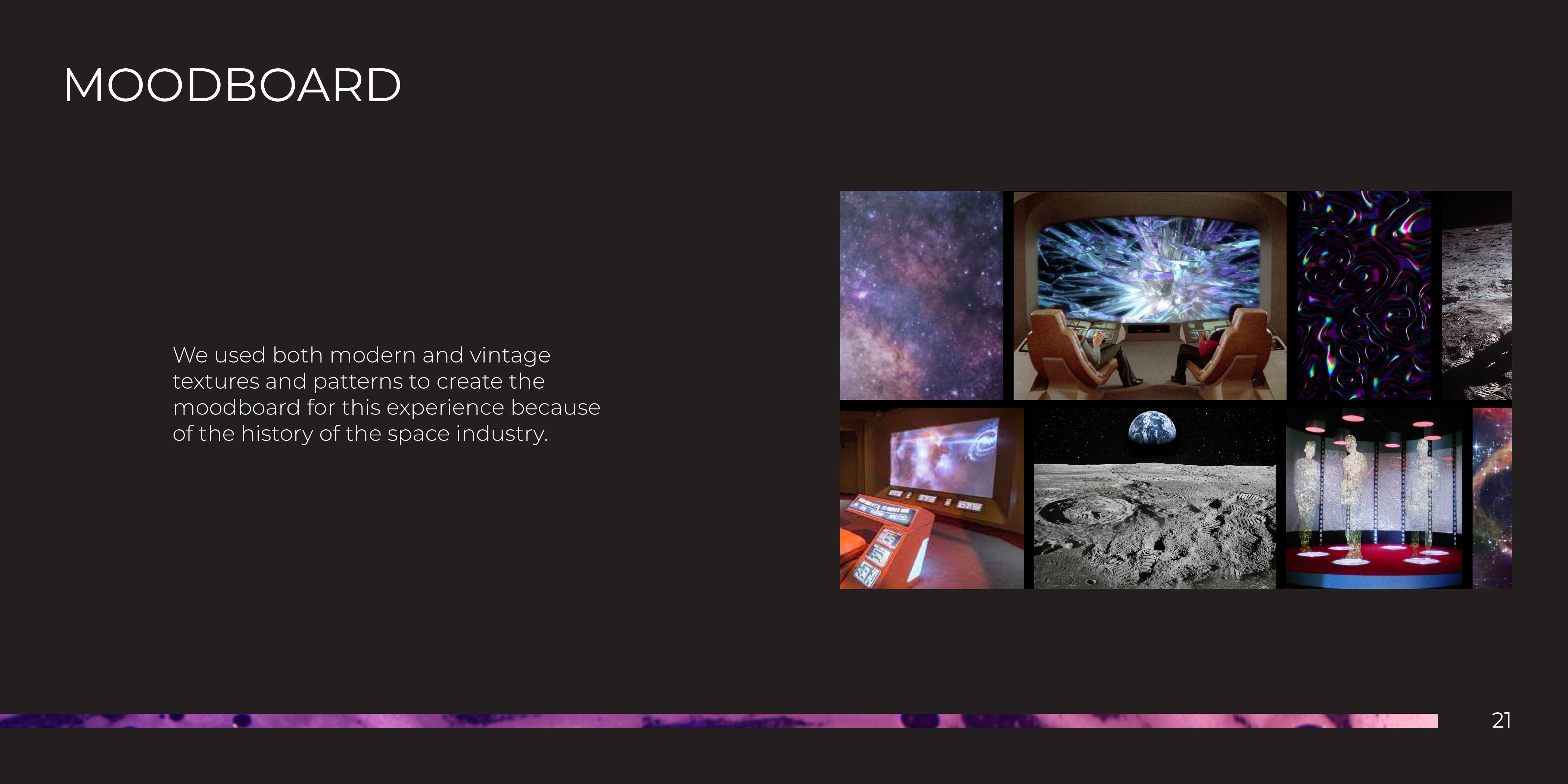
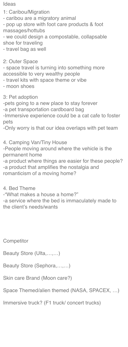
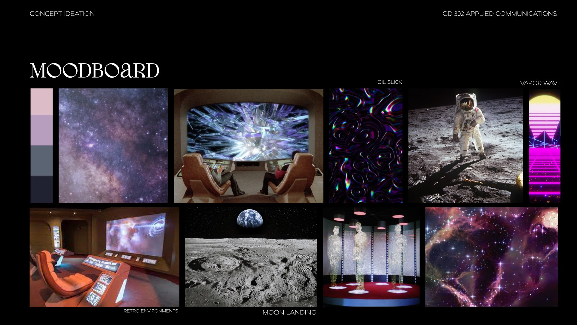
moodboard
![]()
![]()
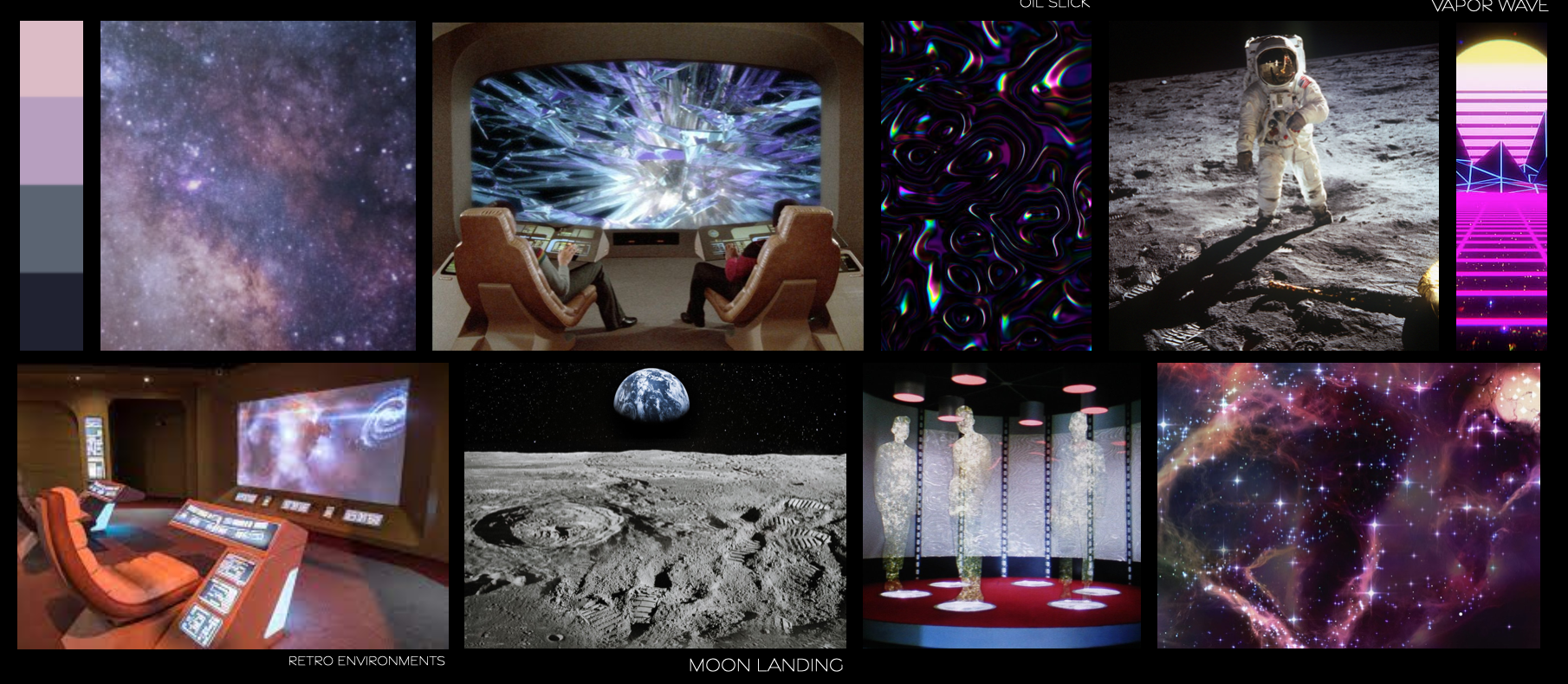
moodboard
Process
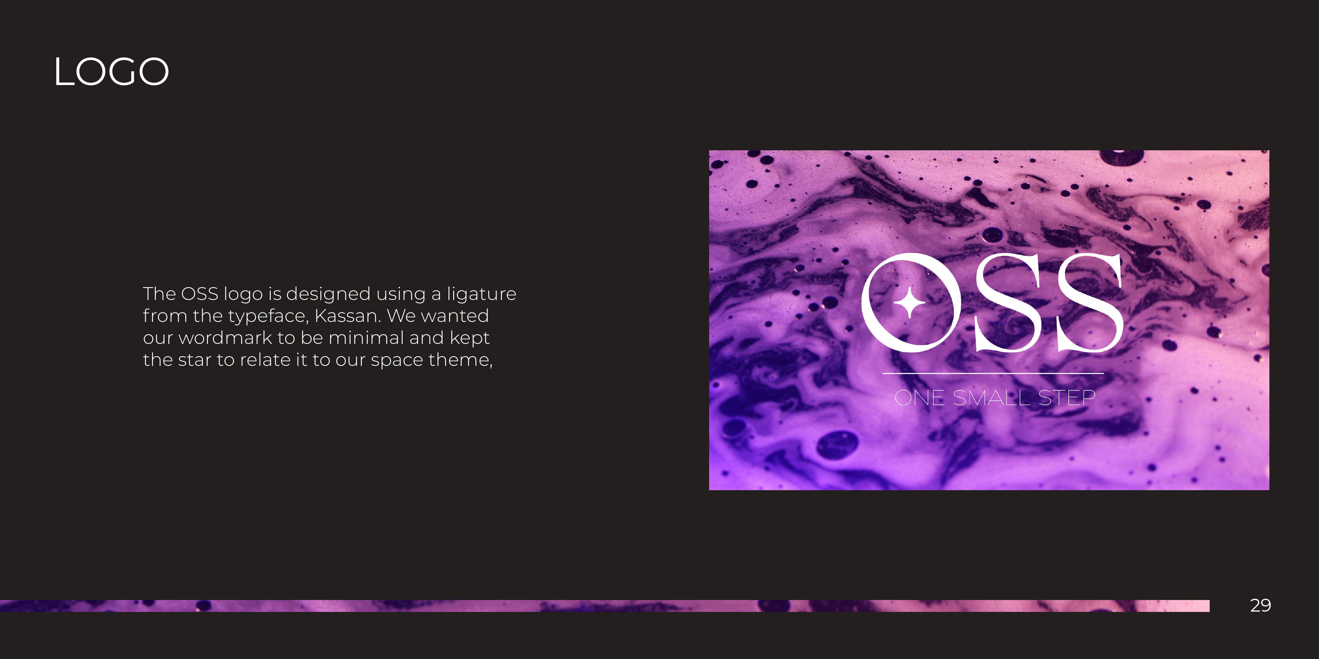
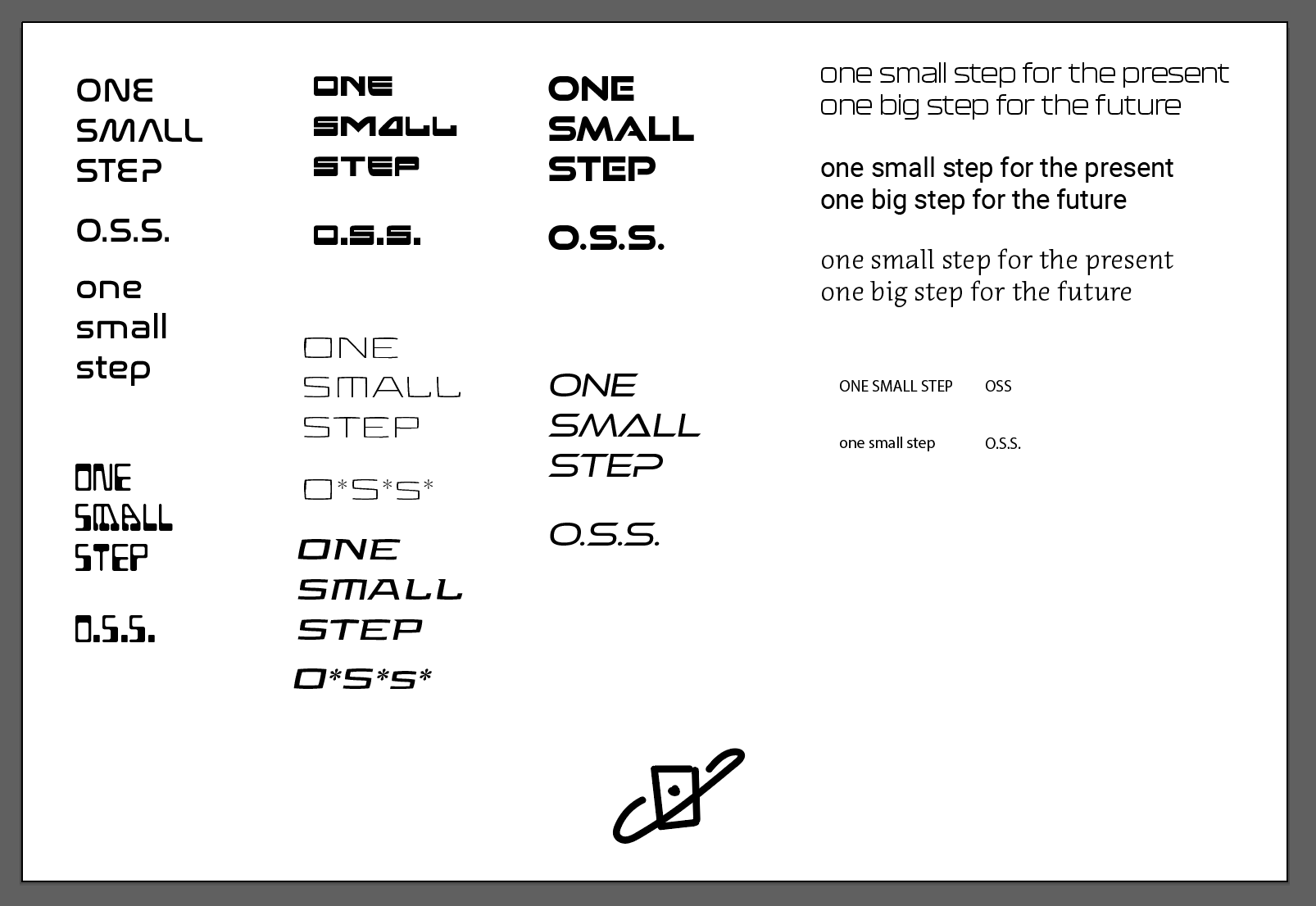
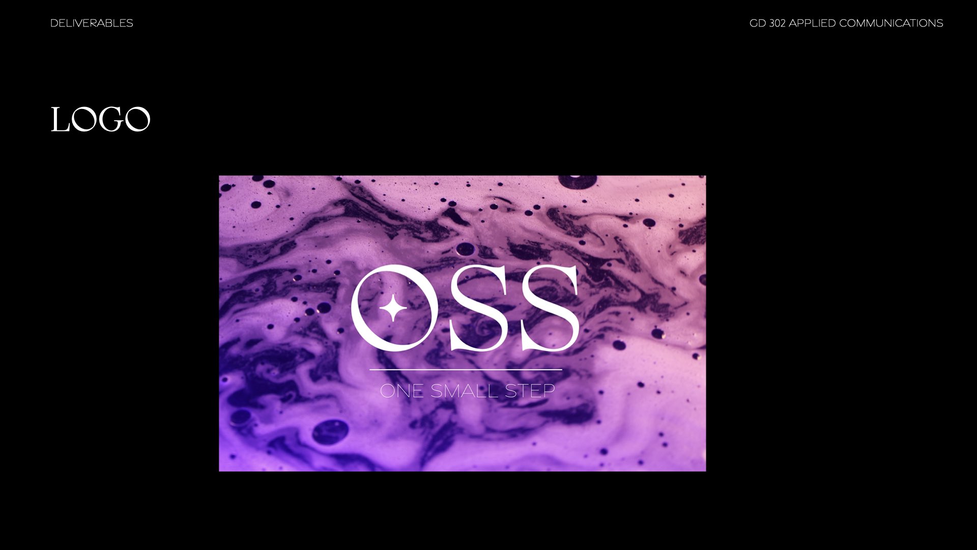
This project opened up the possibility of experimenting with different aspects of a branding project.Logo
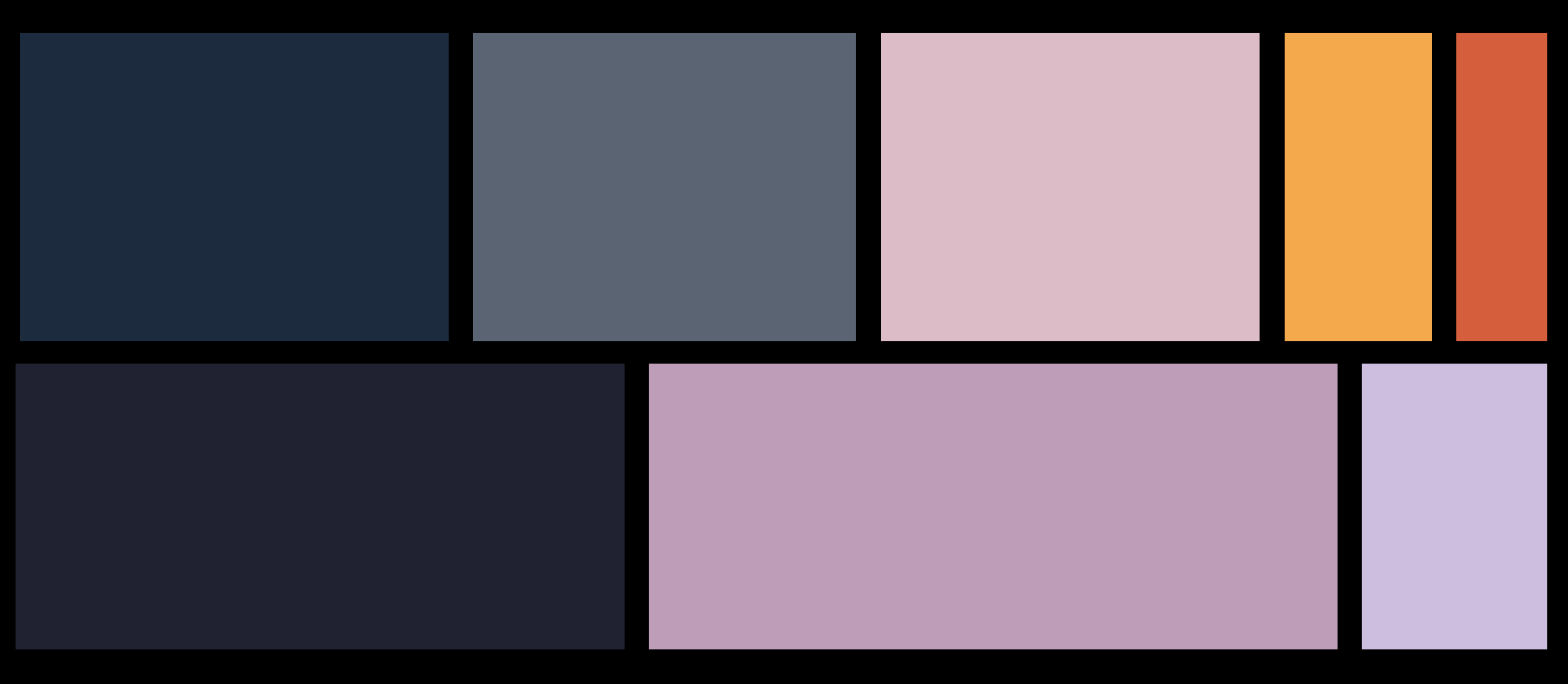
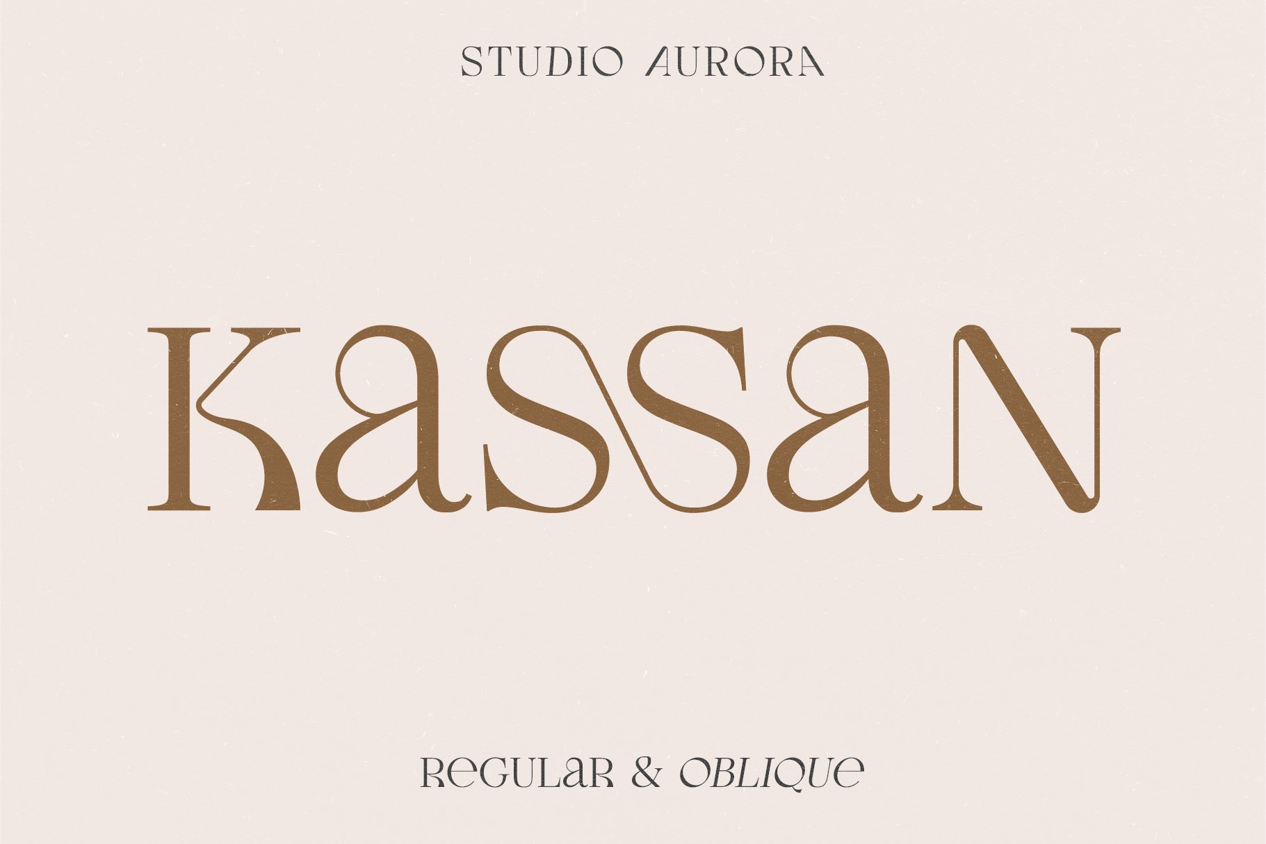
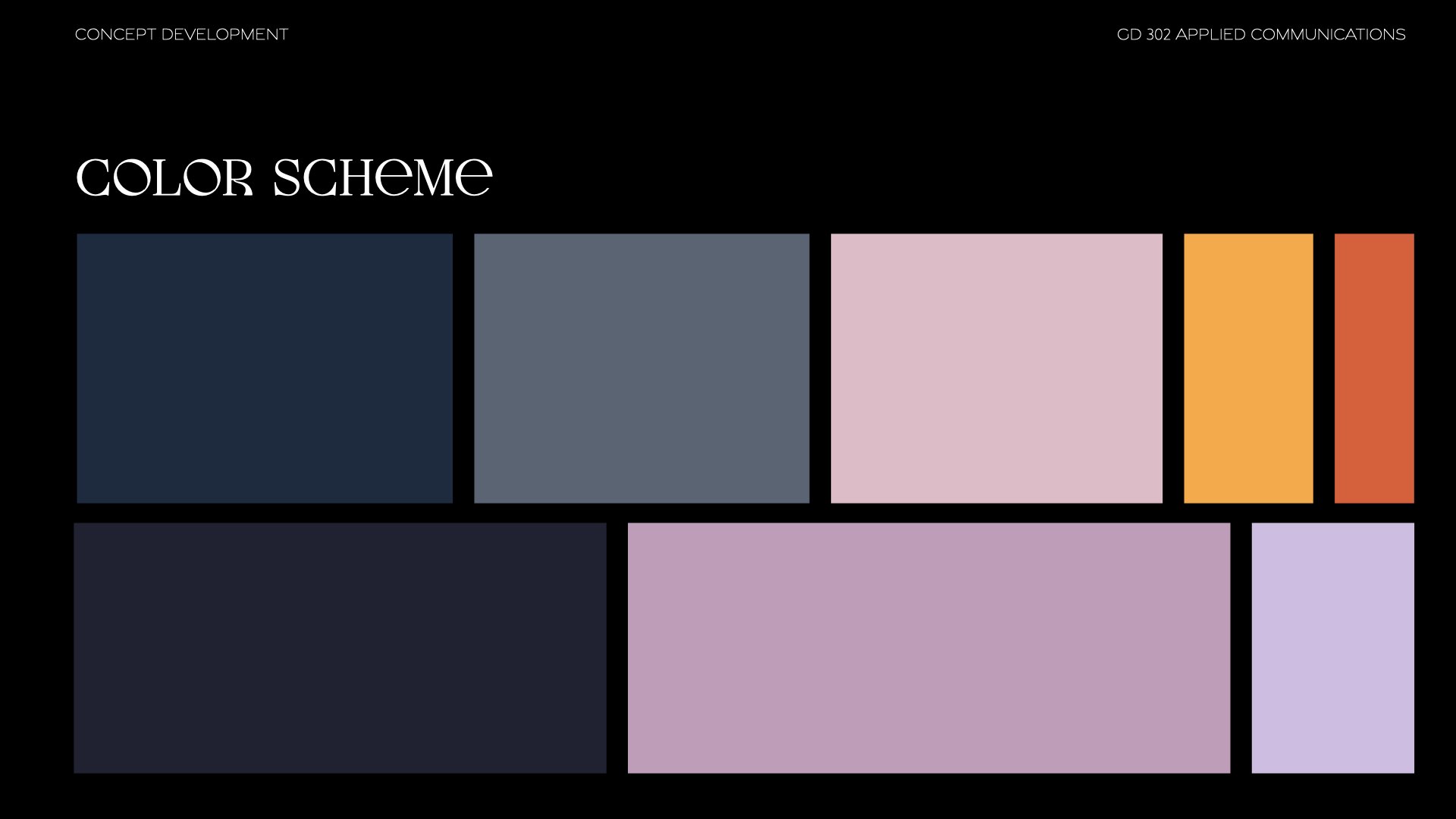
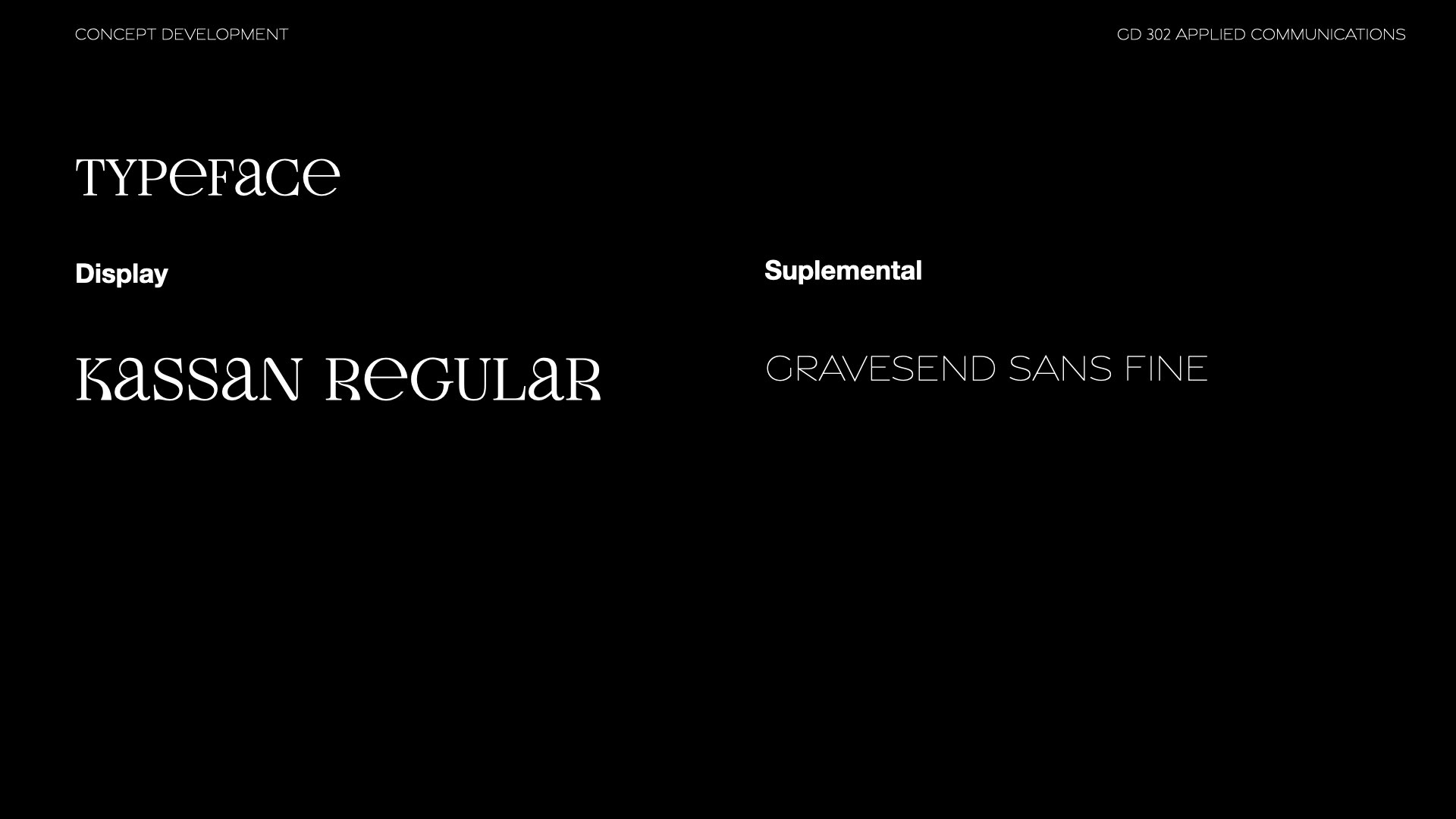
The name OSS came quickly as we named it One Small Step, derived from the famous quote by Neil Armstrong. It was shortened to an acronym to mimick that of a retro logo.Different typefaces were gathered to experiment with and see how they reflected the brand and interacted with each other. We started with retro typefaces, as well as the fluidity of a typeface. Through trial and error, we decided Kassan would be a good display typeface to be the face of our brand.
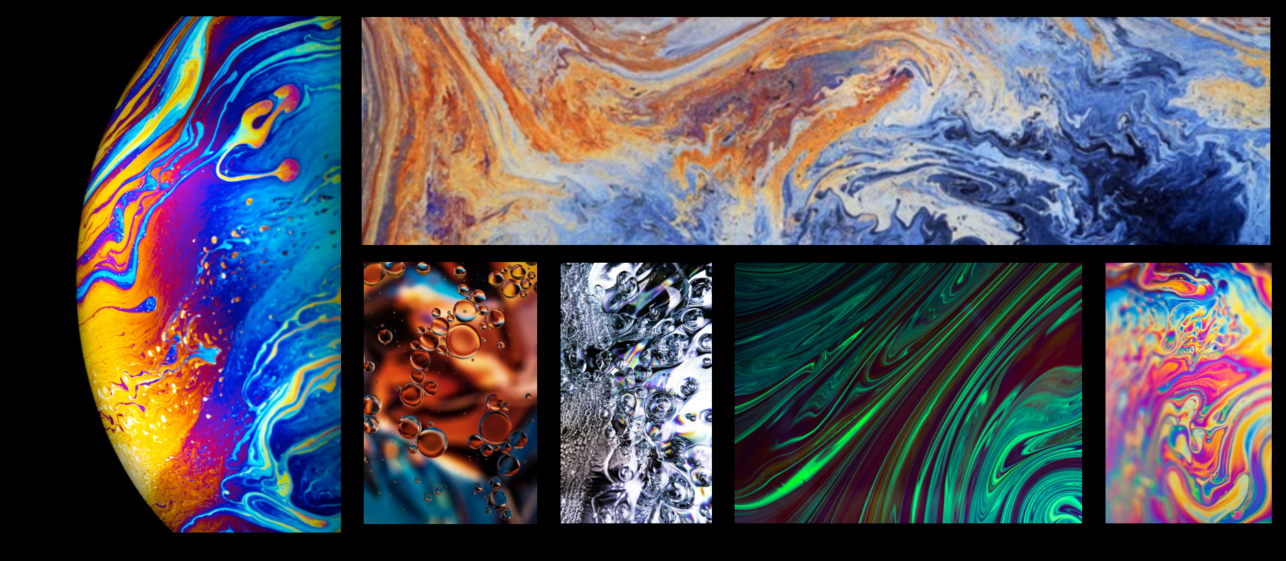
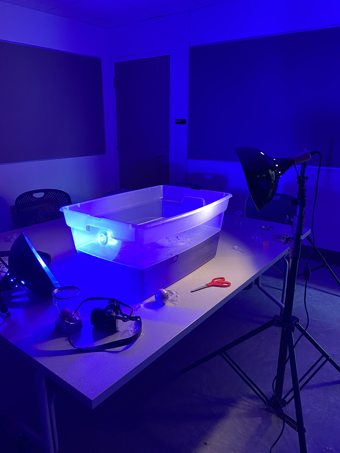
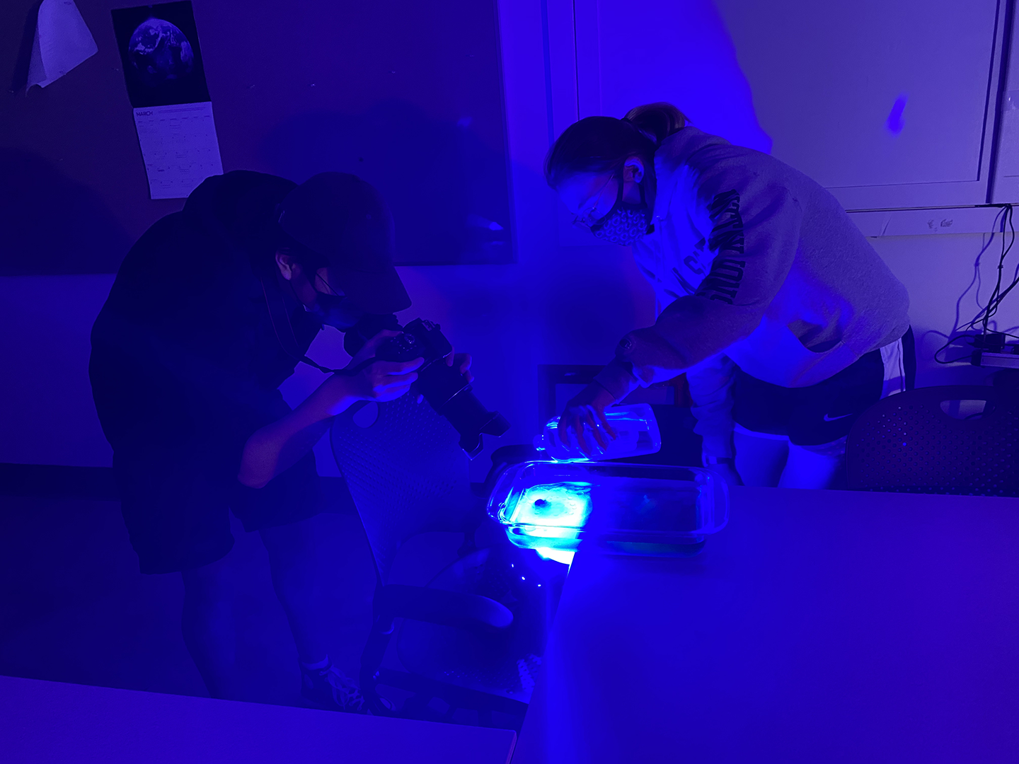
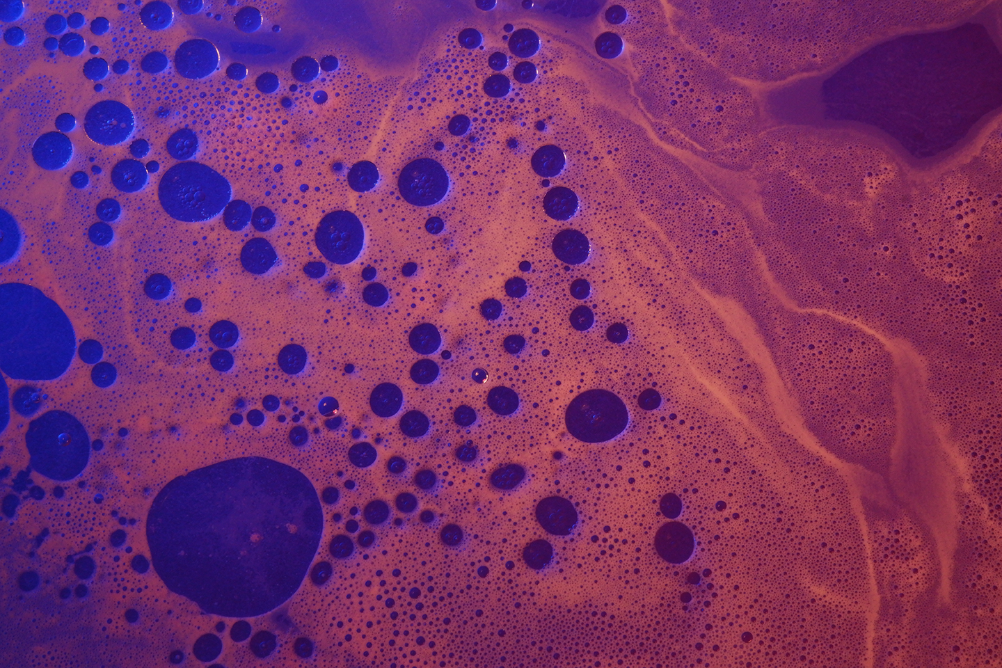
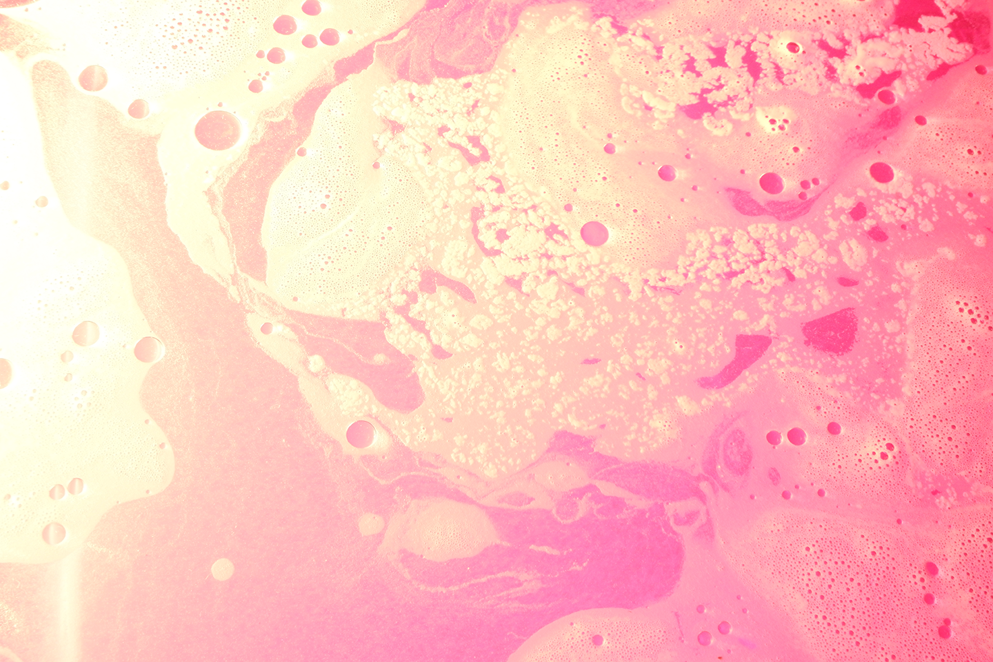
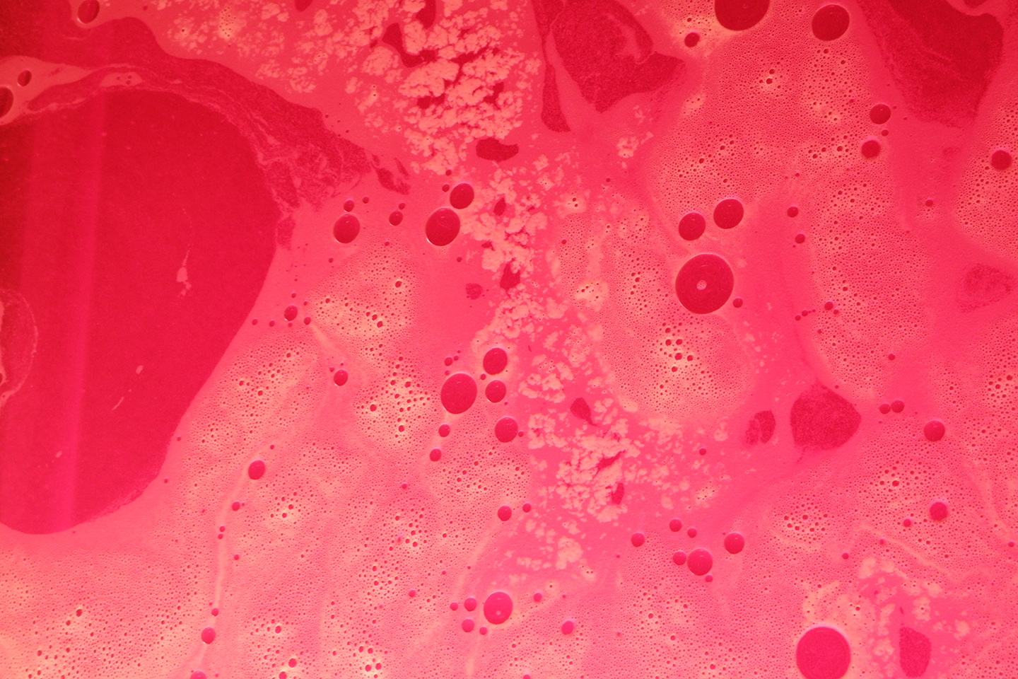
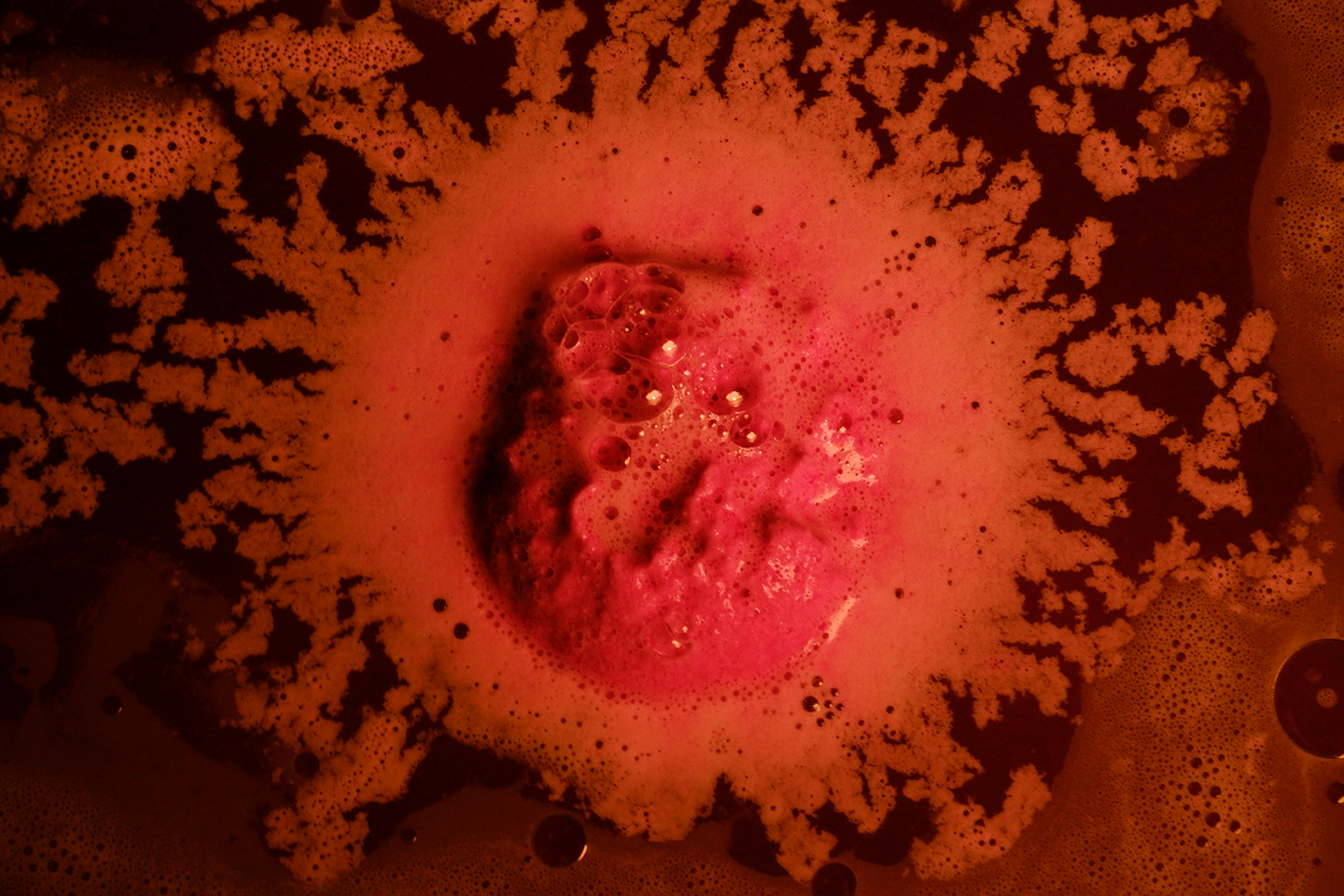
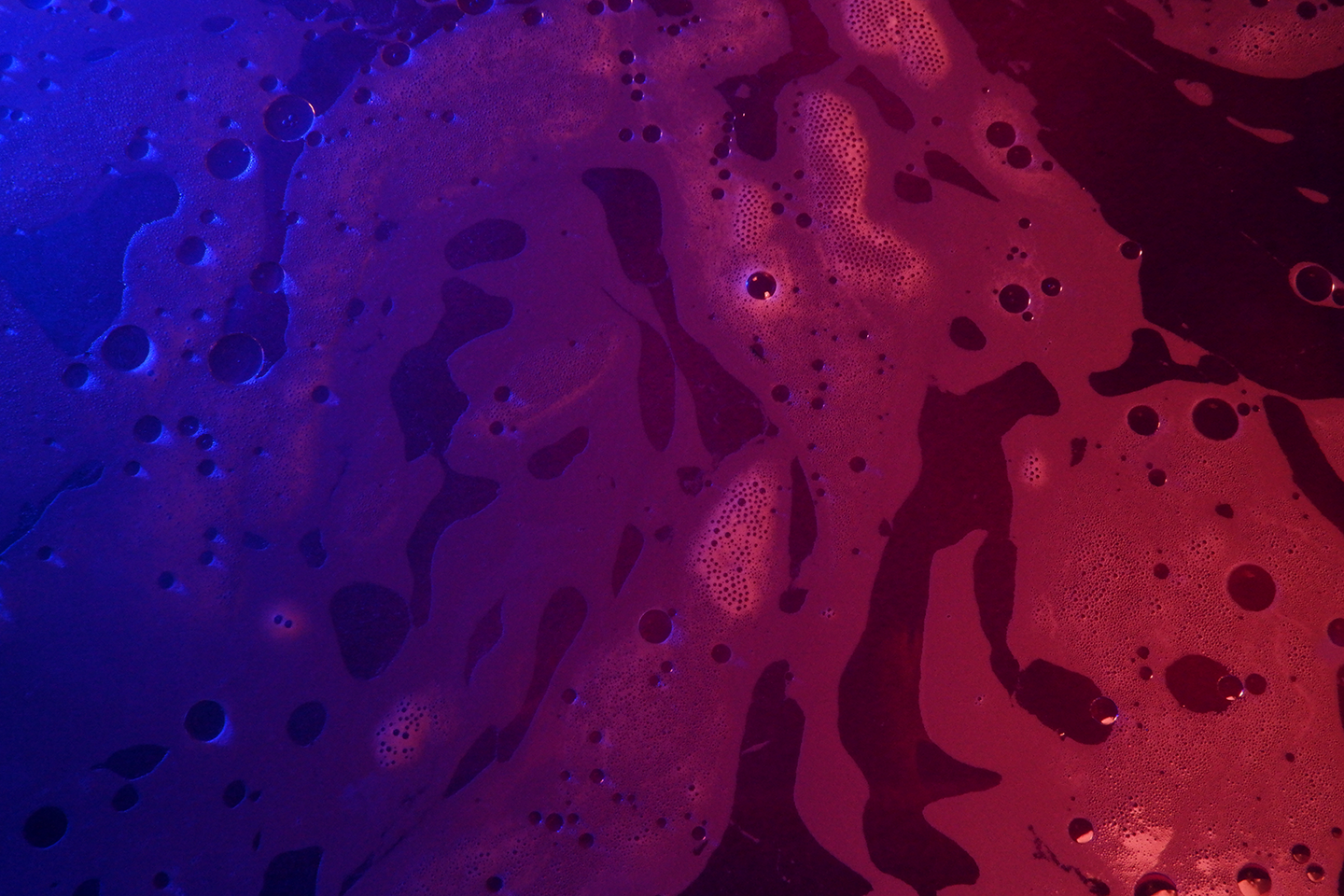
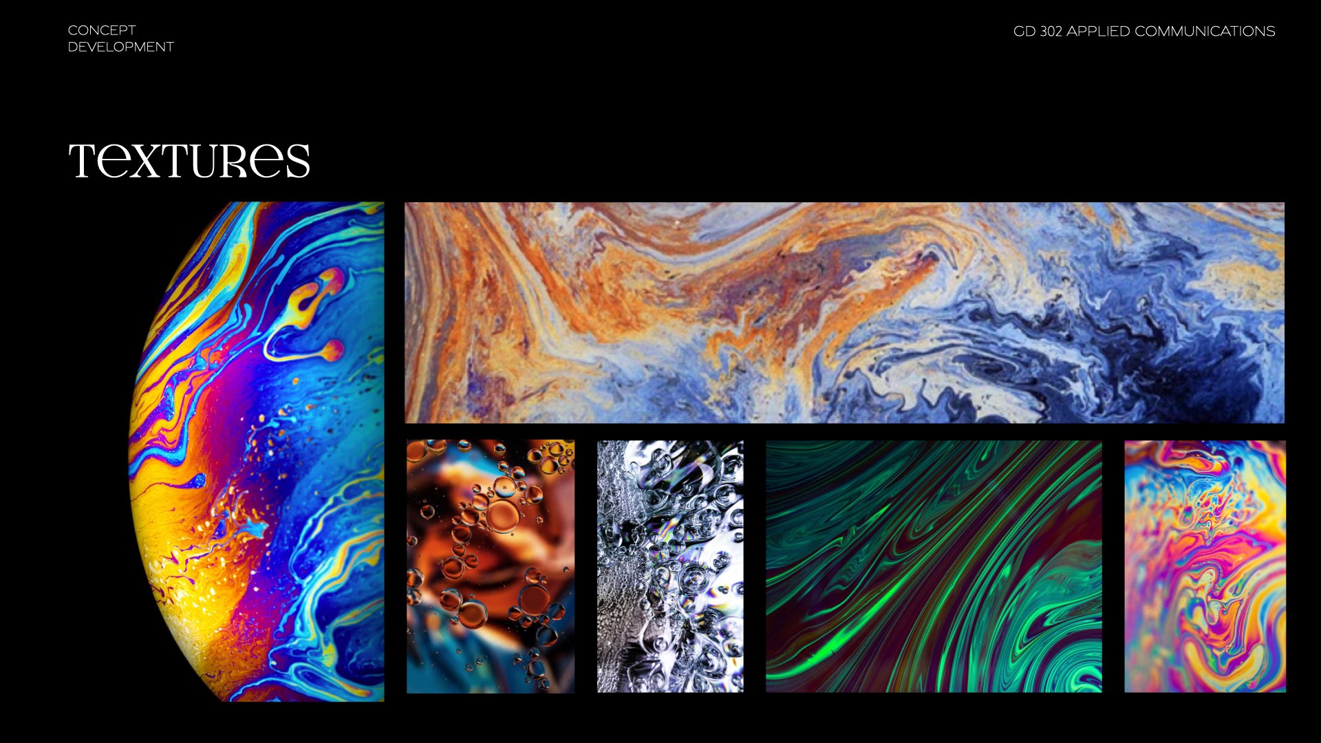
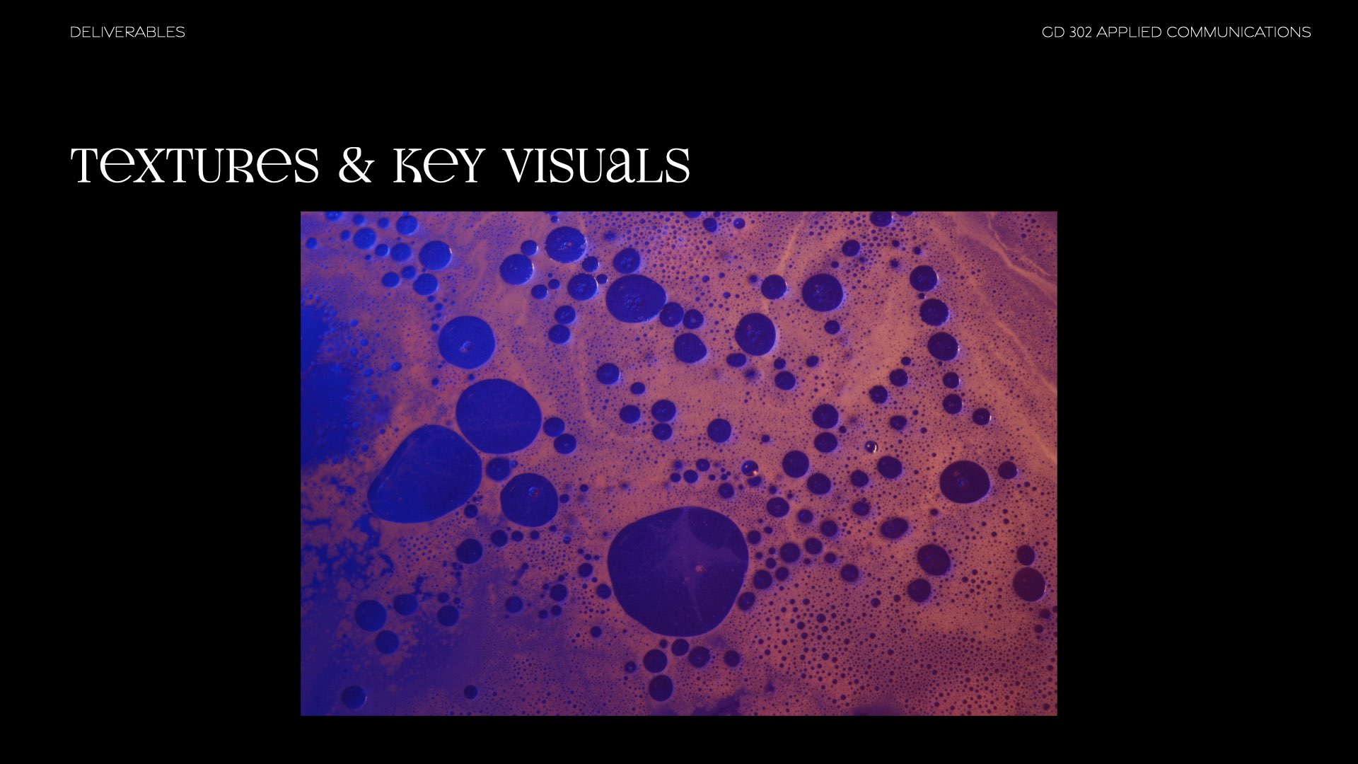
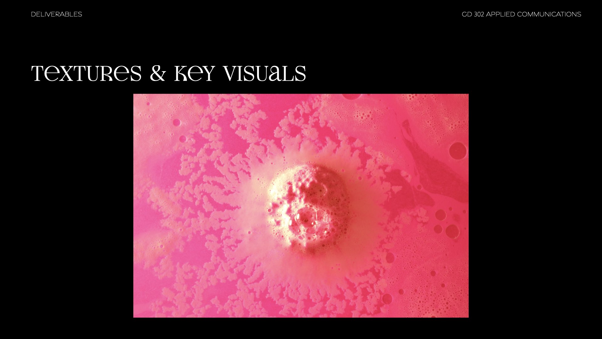
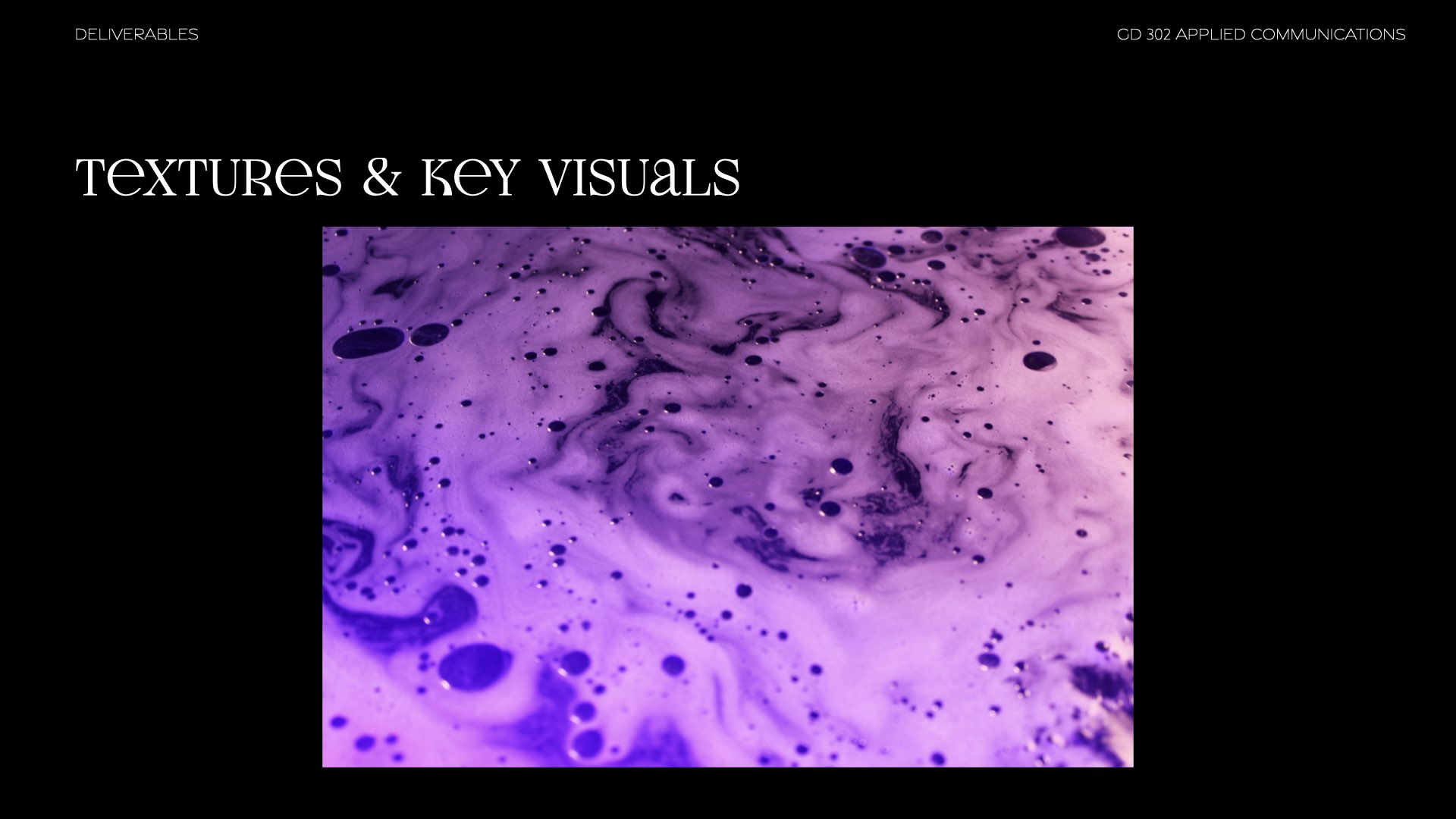
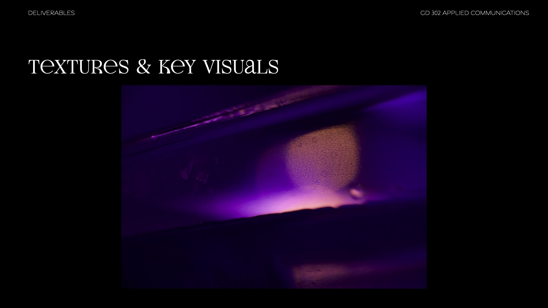
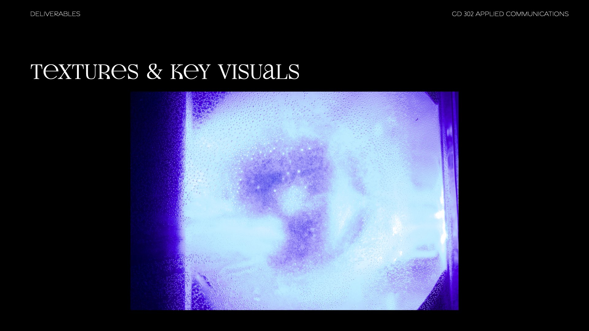
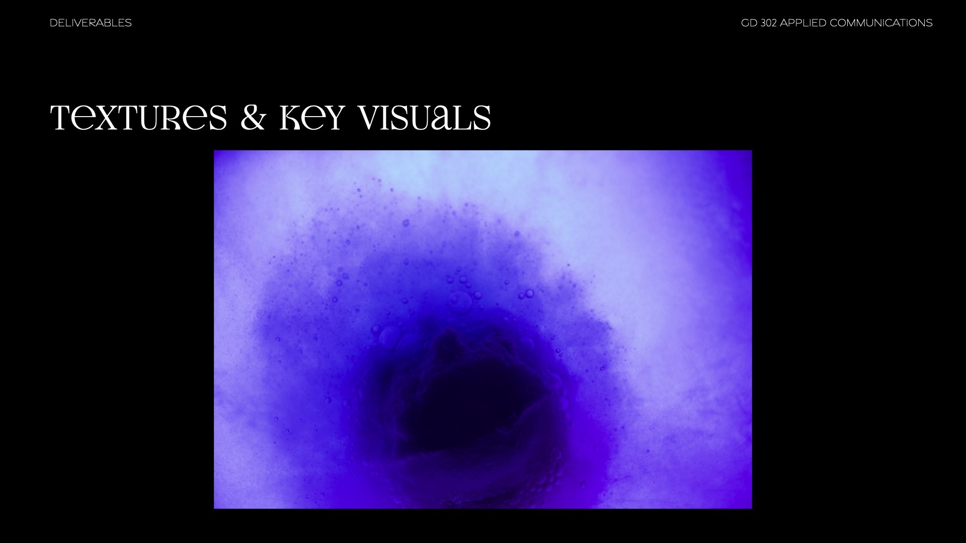
We also wanted some textures to compliment our Logo as well as the Typeface. We first wanted to experiment with water, oil, and light.
We settled on water and oil to keep with the theme of a foot massage parlor. The oil slick texture was also a great inspiration as it closely related to our theme, but also gave a nod towards the space theme.


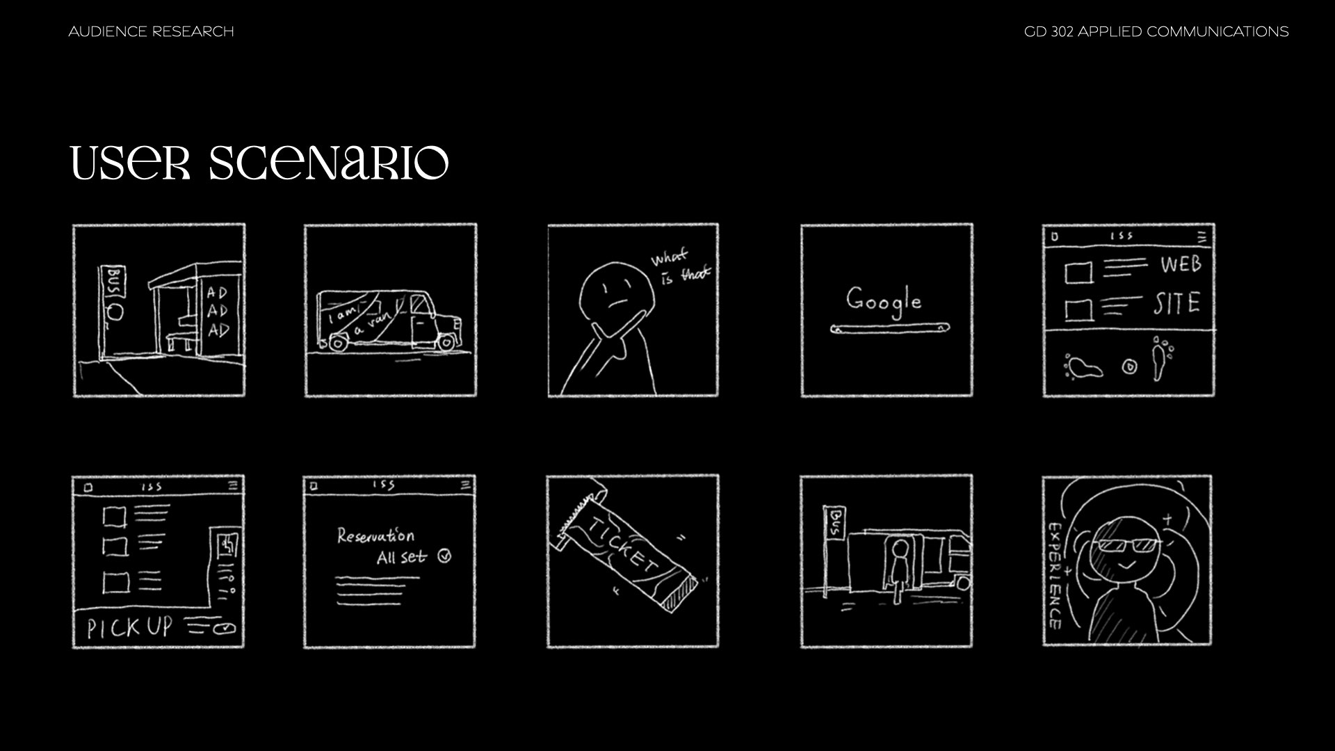
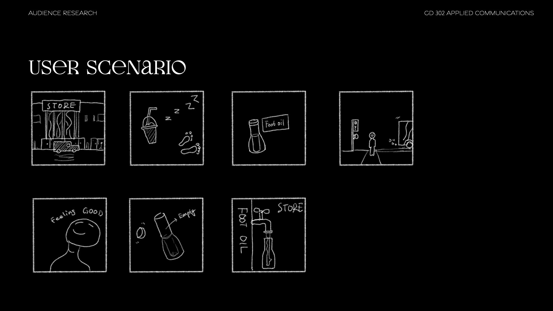
User Journey
While a user journey was not part of our main deliverables, it was key to establishing our deliverables and target audience.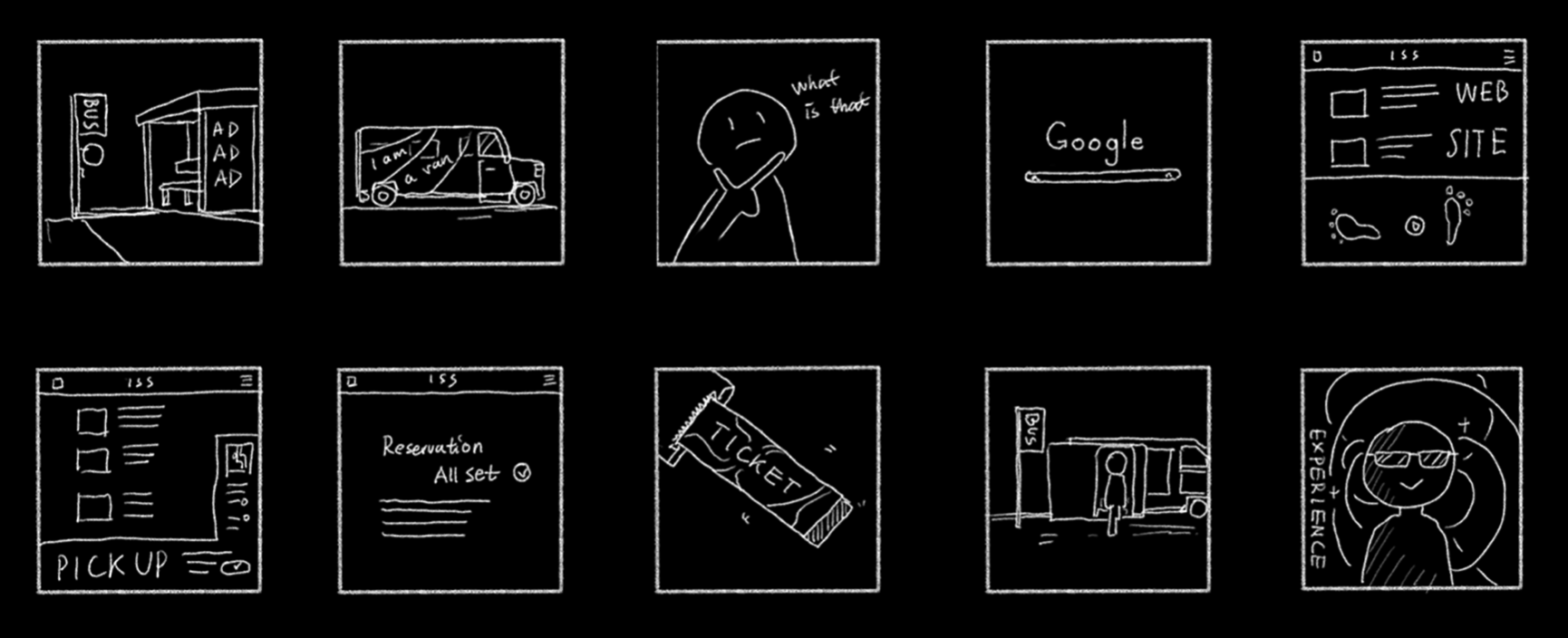
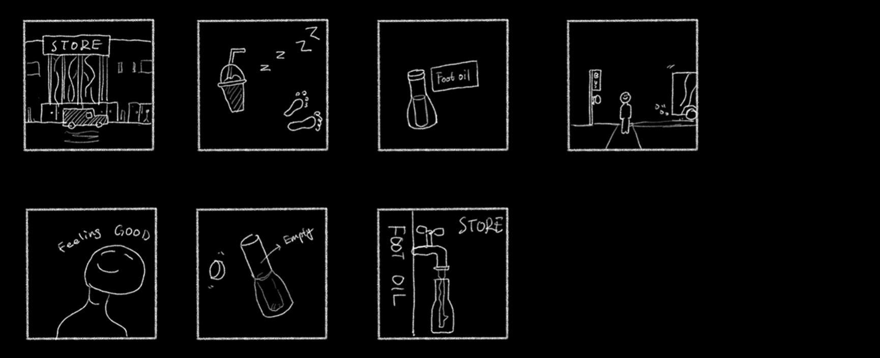
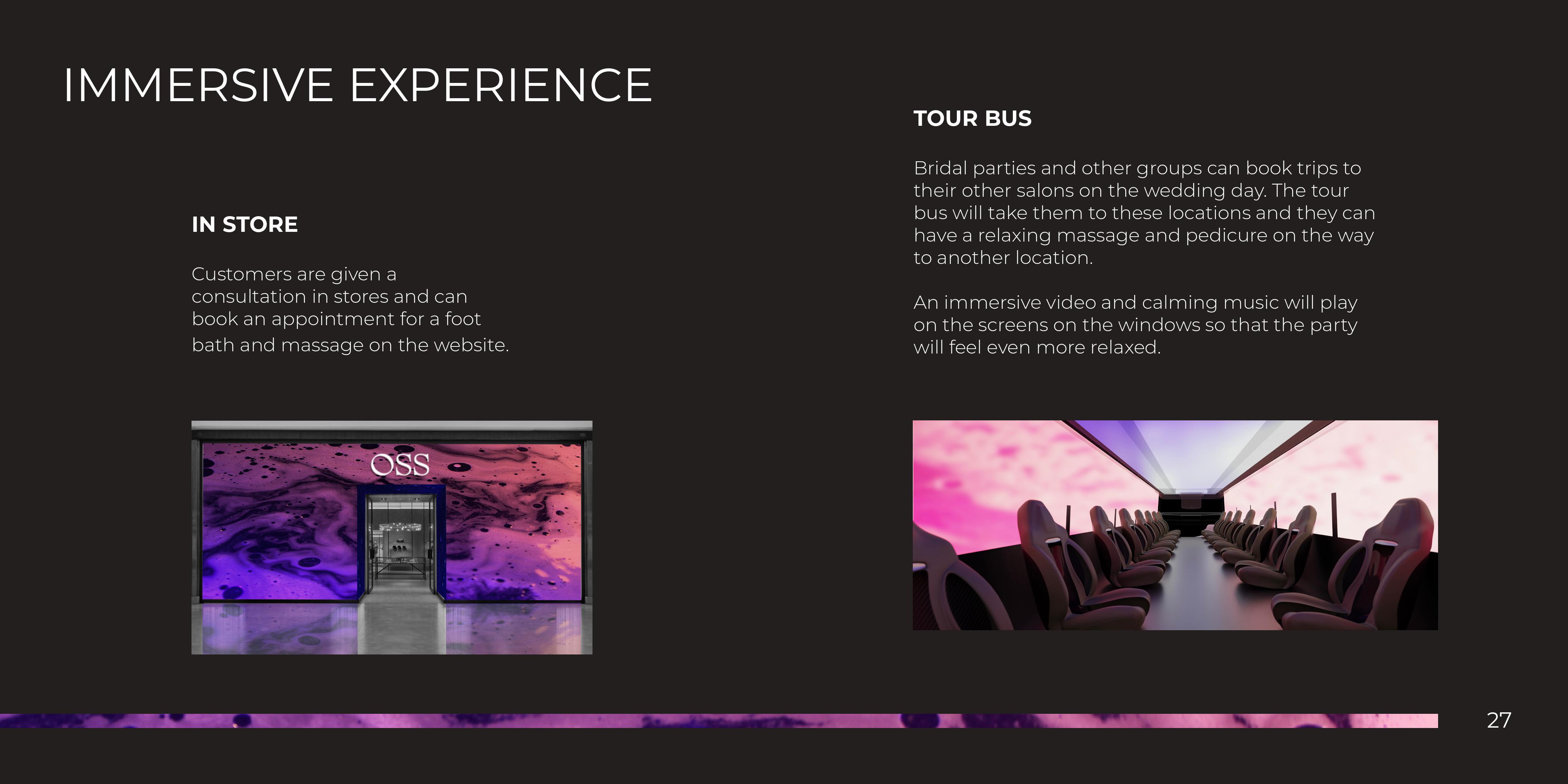
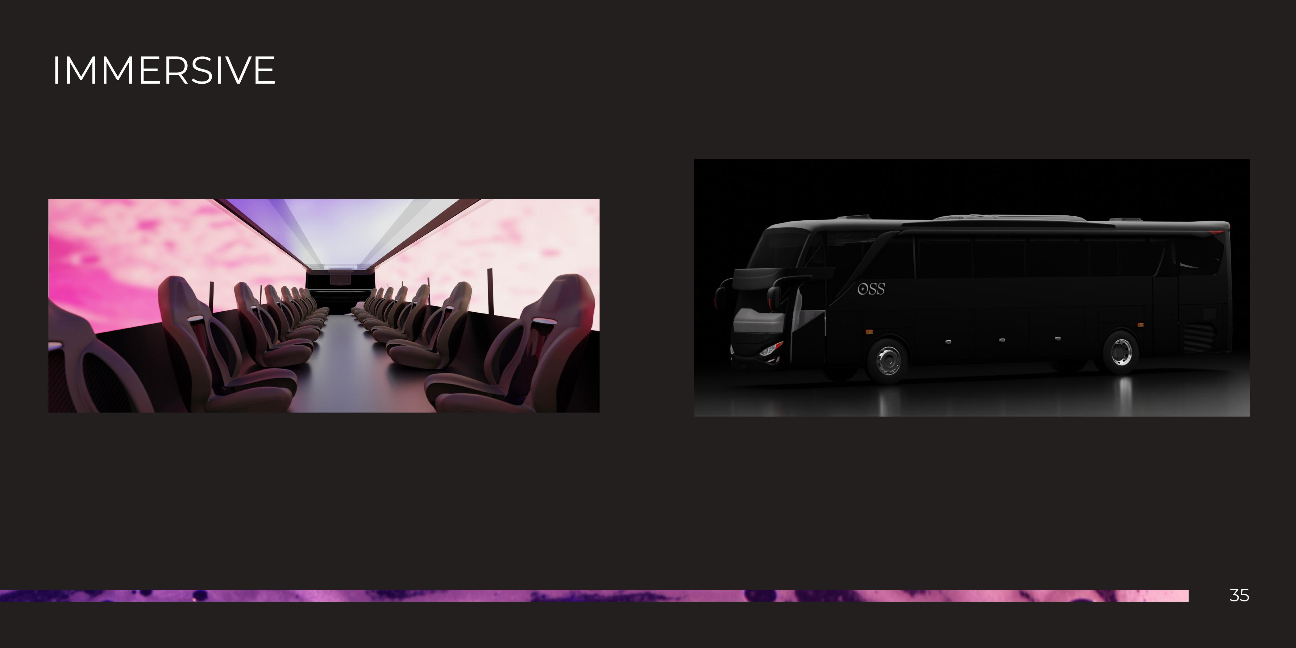
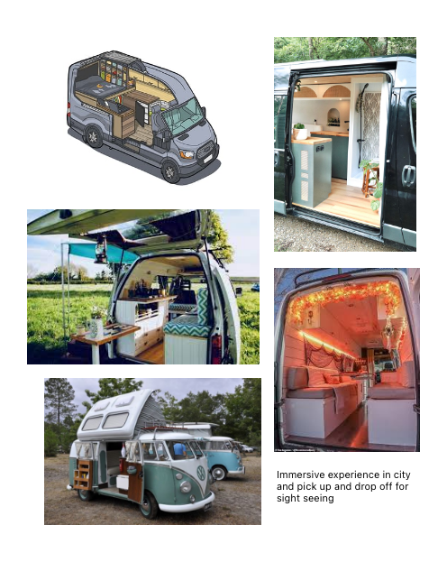
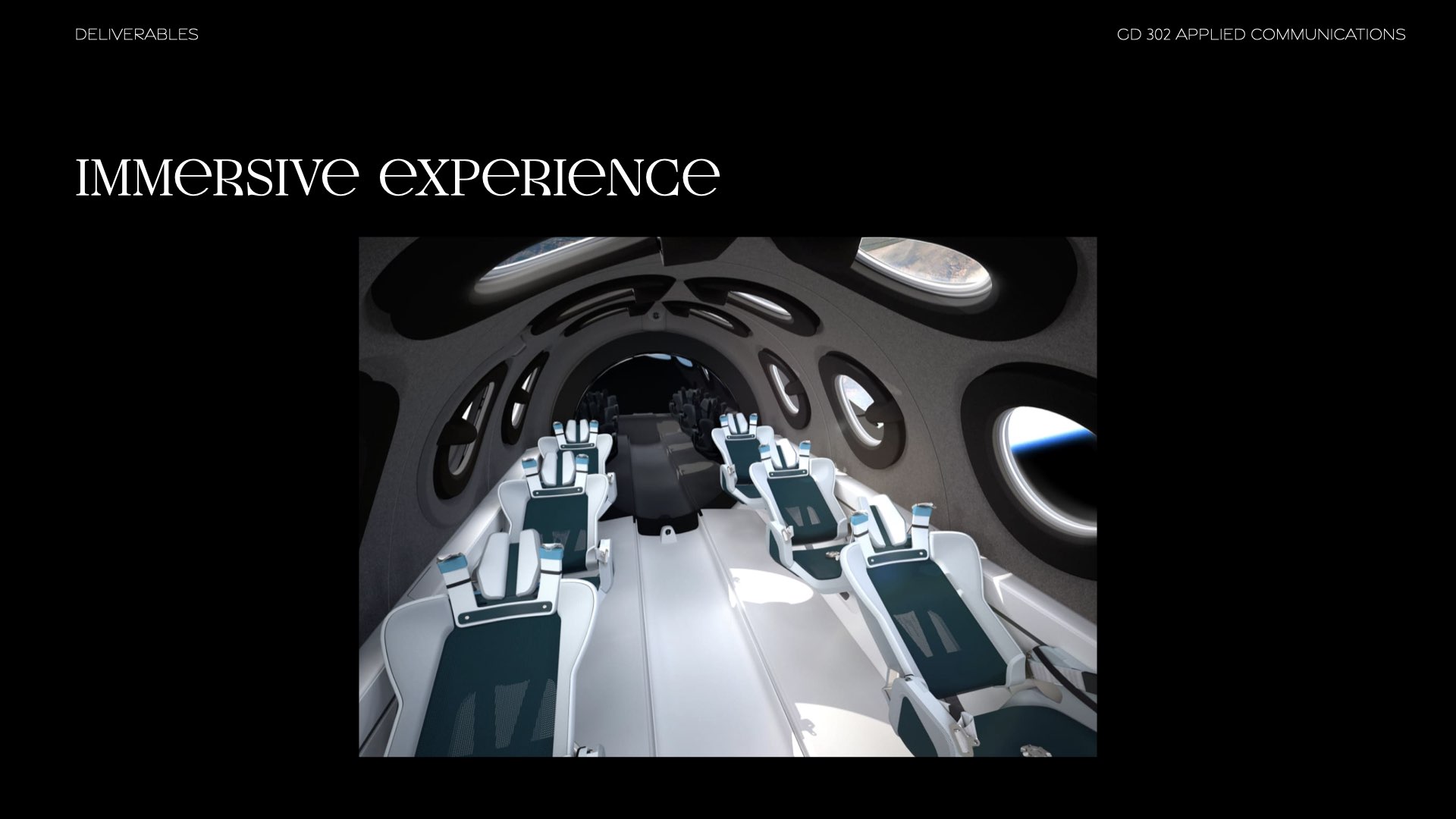
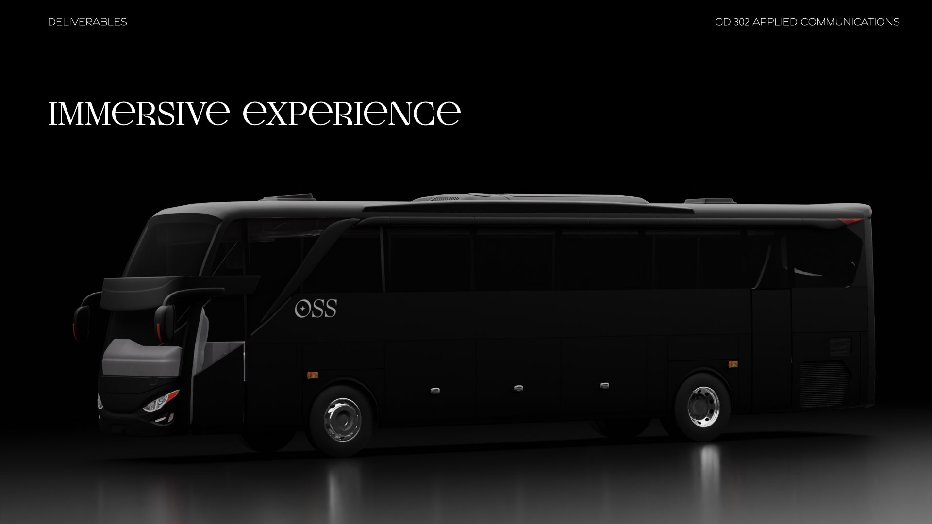
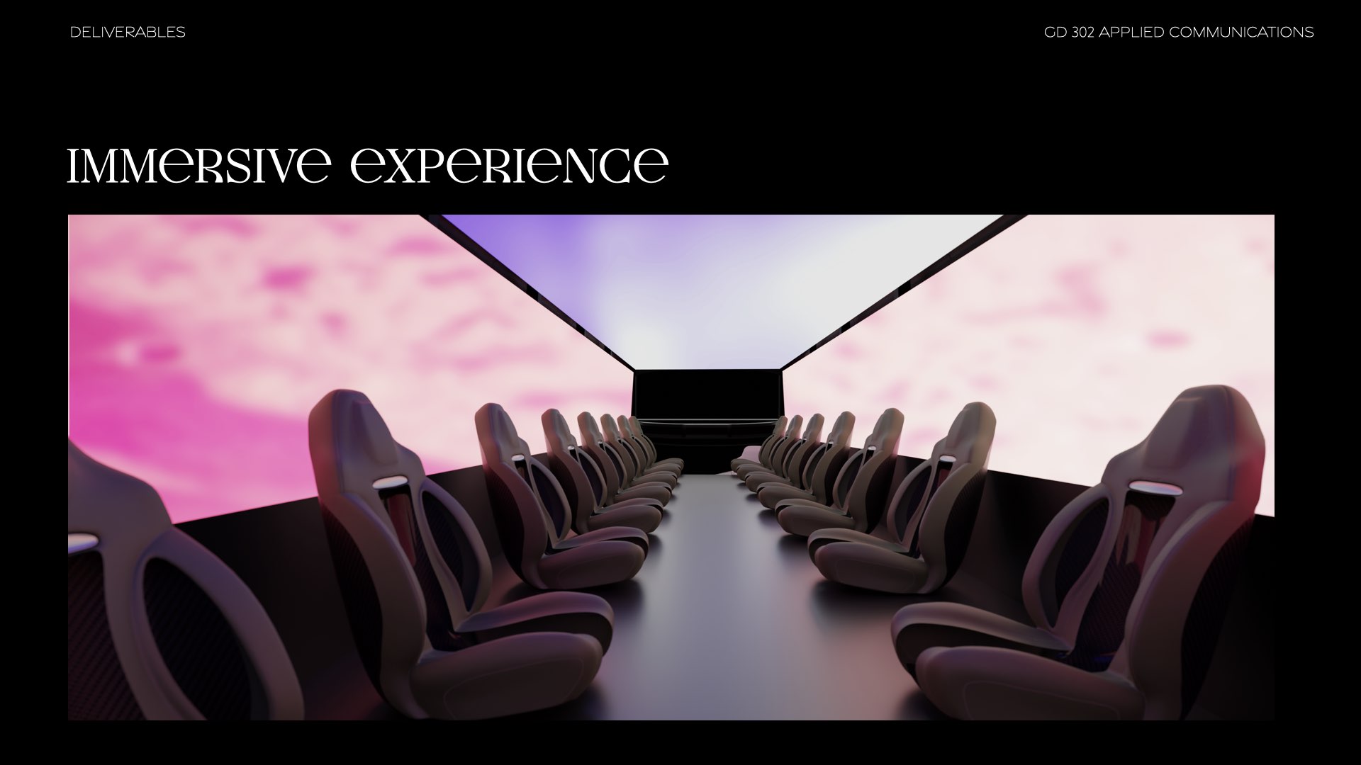
Immersive Experience
The bus was designed with the intent to be used by groups of customers. We mirrored the bus modeling after party limousines with the seats facing each other.We made it so that there would be full screens with a video playing to fully immersive
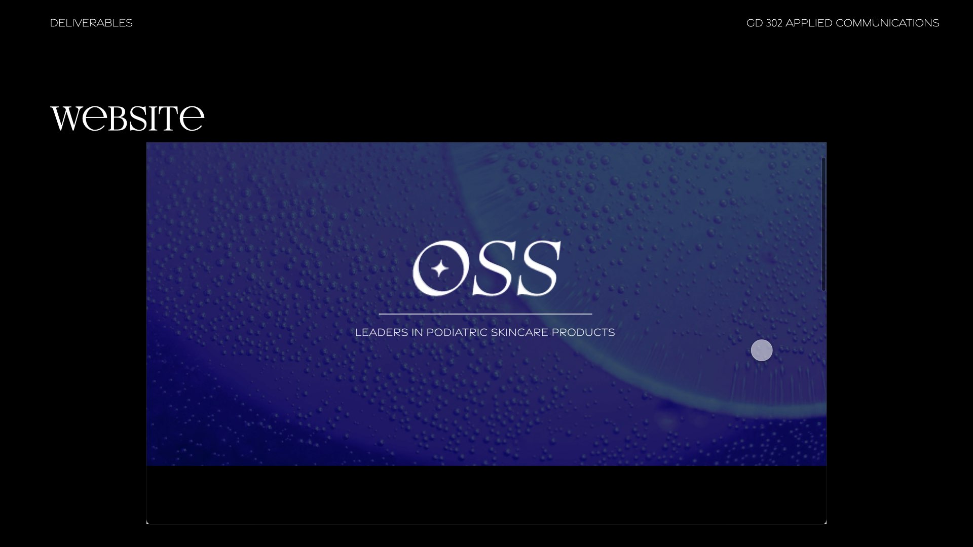
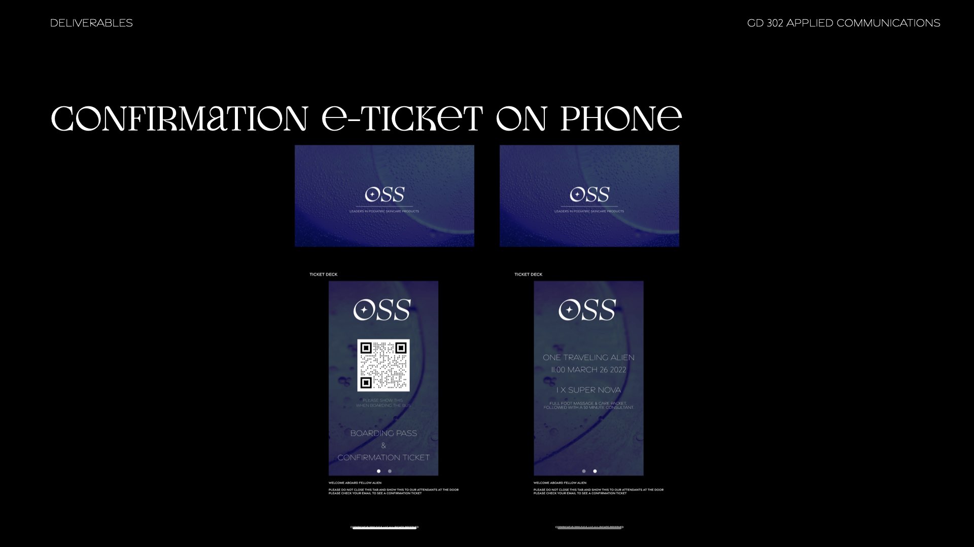
Website & e-Ticket
Seeing how our target audience was 25-35 year old people we thought the best way to incorporate the ticketing system would be an e-Ticket.This e-Ticket would be part of the website, and as long as the customer leaves the tab open, they can access the ticket through our website. This was done after some research where we found out that people from that age range find this to be the most popular way to access a confirmation ticket.
website on phone
Presentation
This project also focused on presenting my work and interacting with a hypothetical client.This meant dressing in appropriate business attire and presenting my work in a confident manner that reflected all the decisions made for this project.
Our full presentation relfects how there were changes made to the existing presentation and how in each meeting, there were different things that we hightlighted to showcase to our client.


full presentation


final presentation